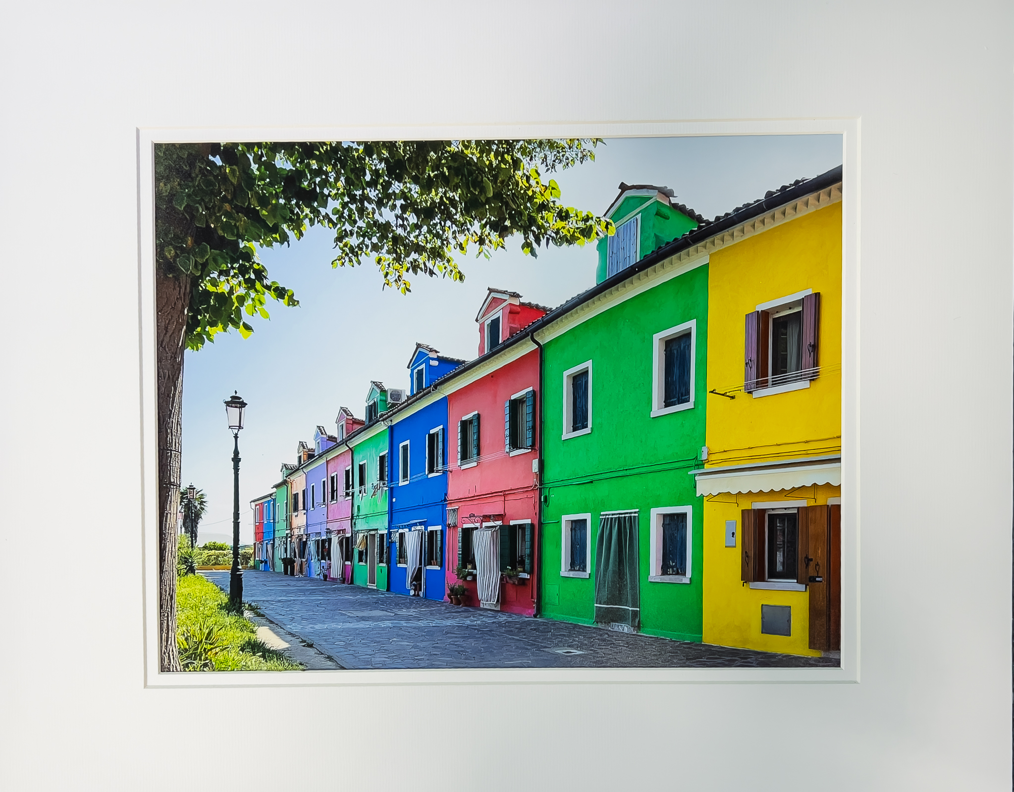
2025 Winners
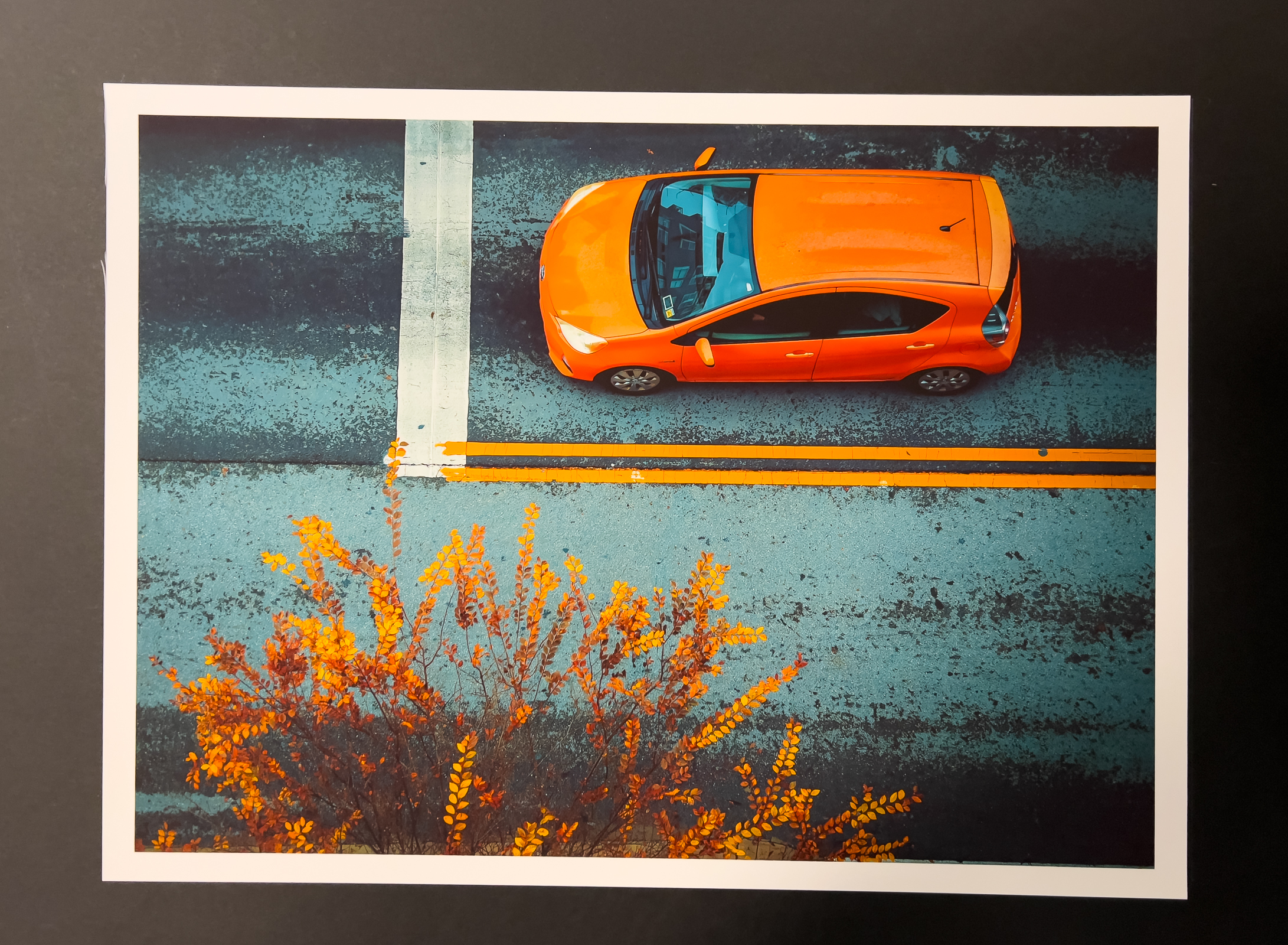
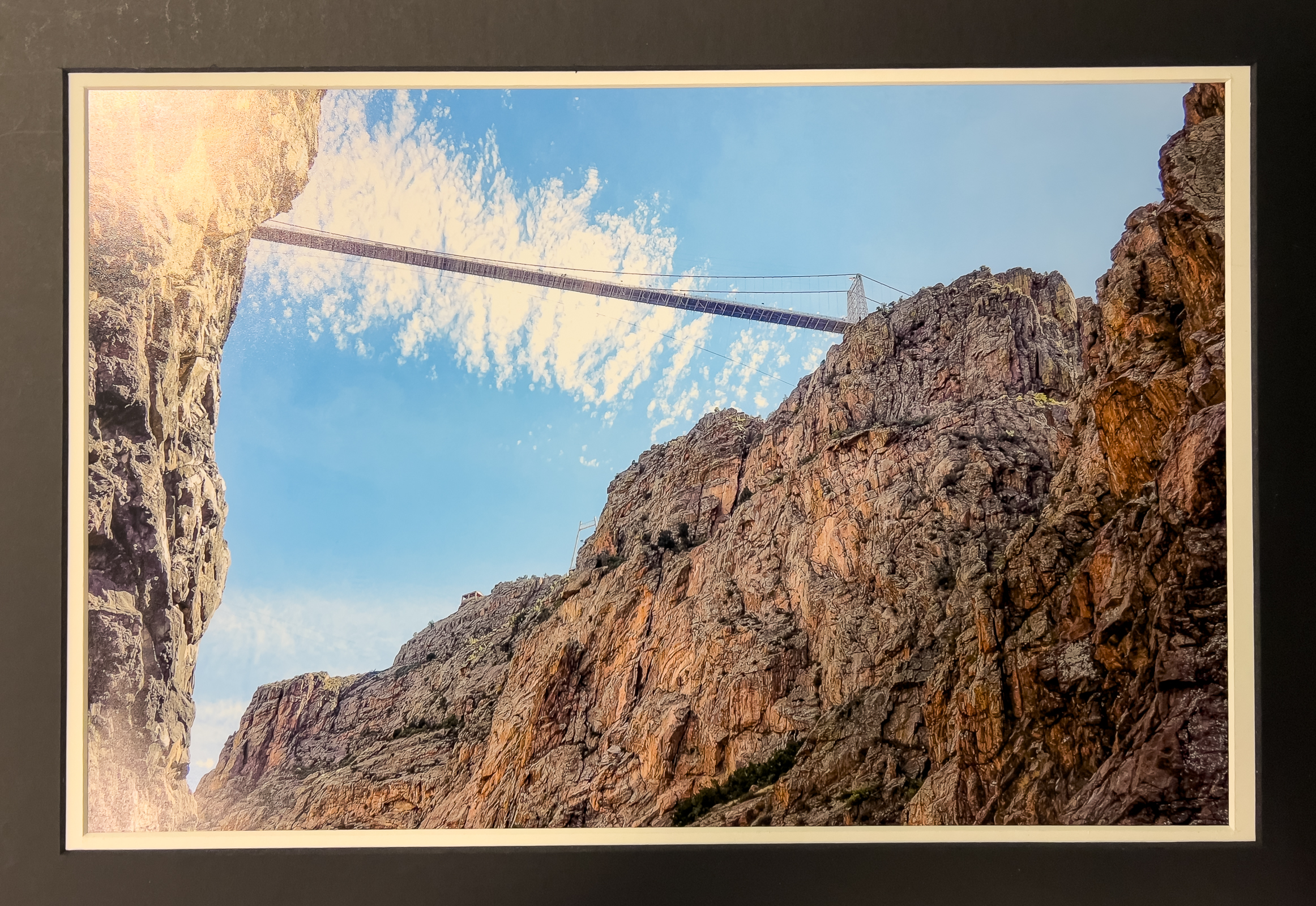
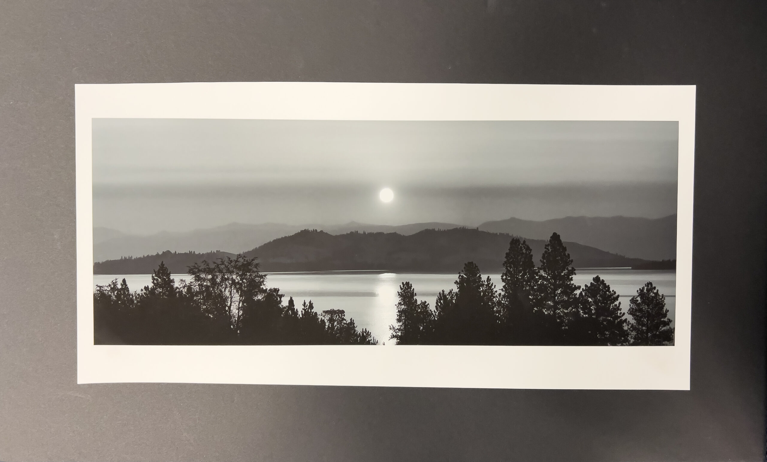
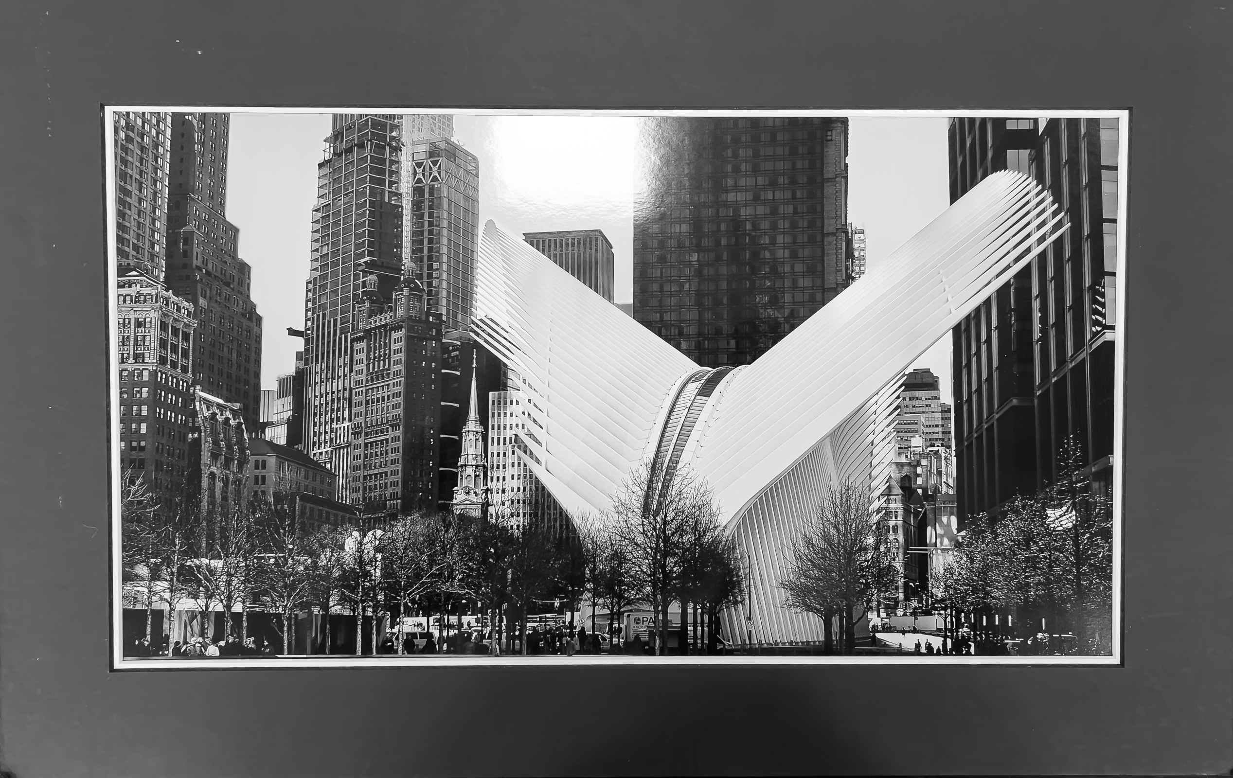
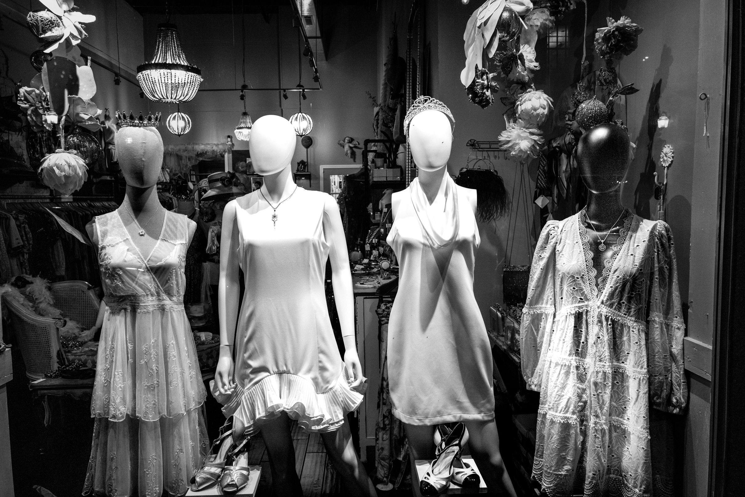
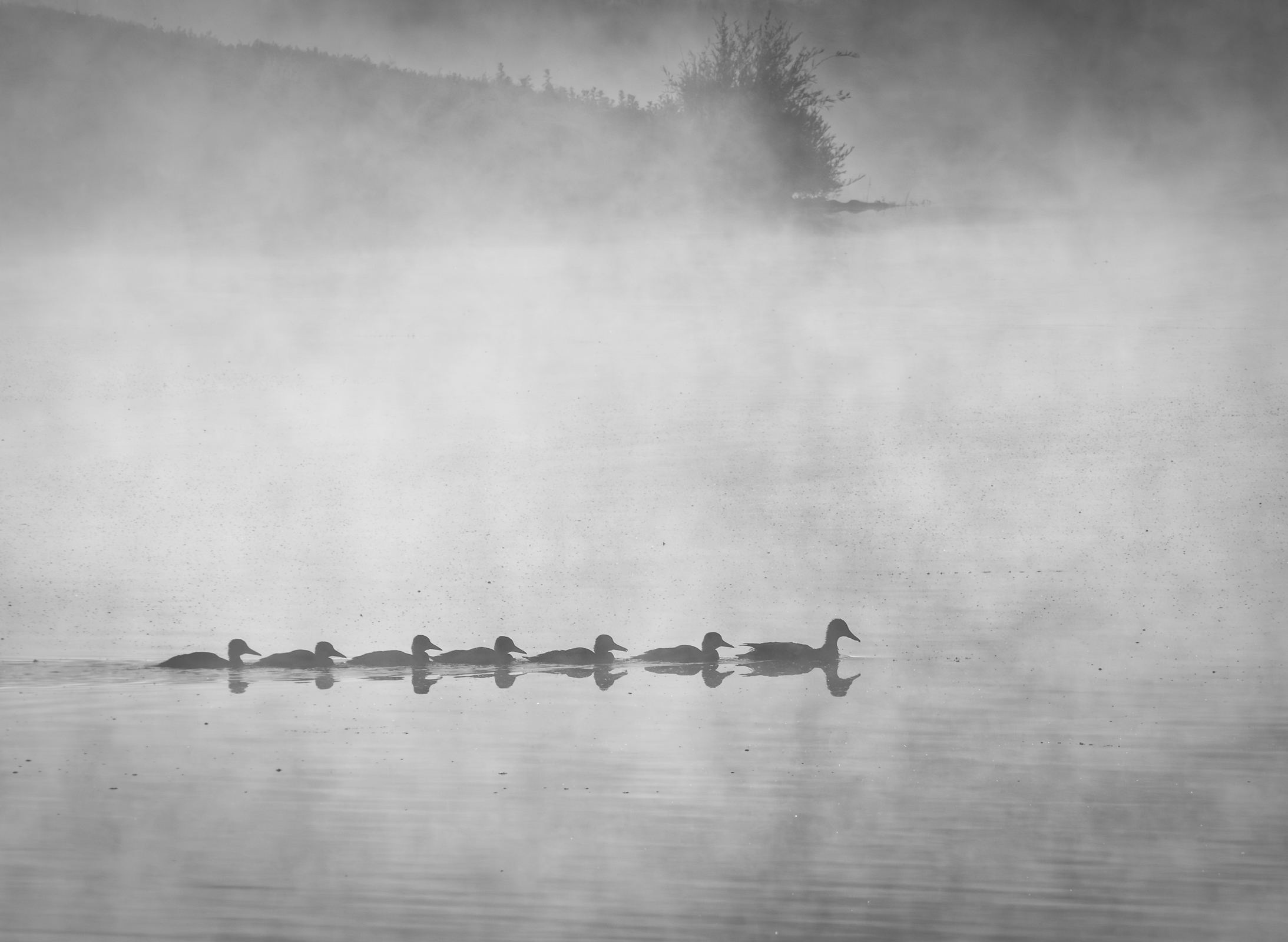
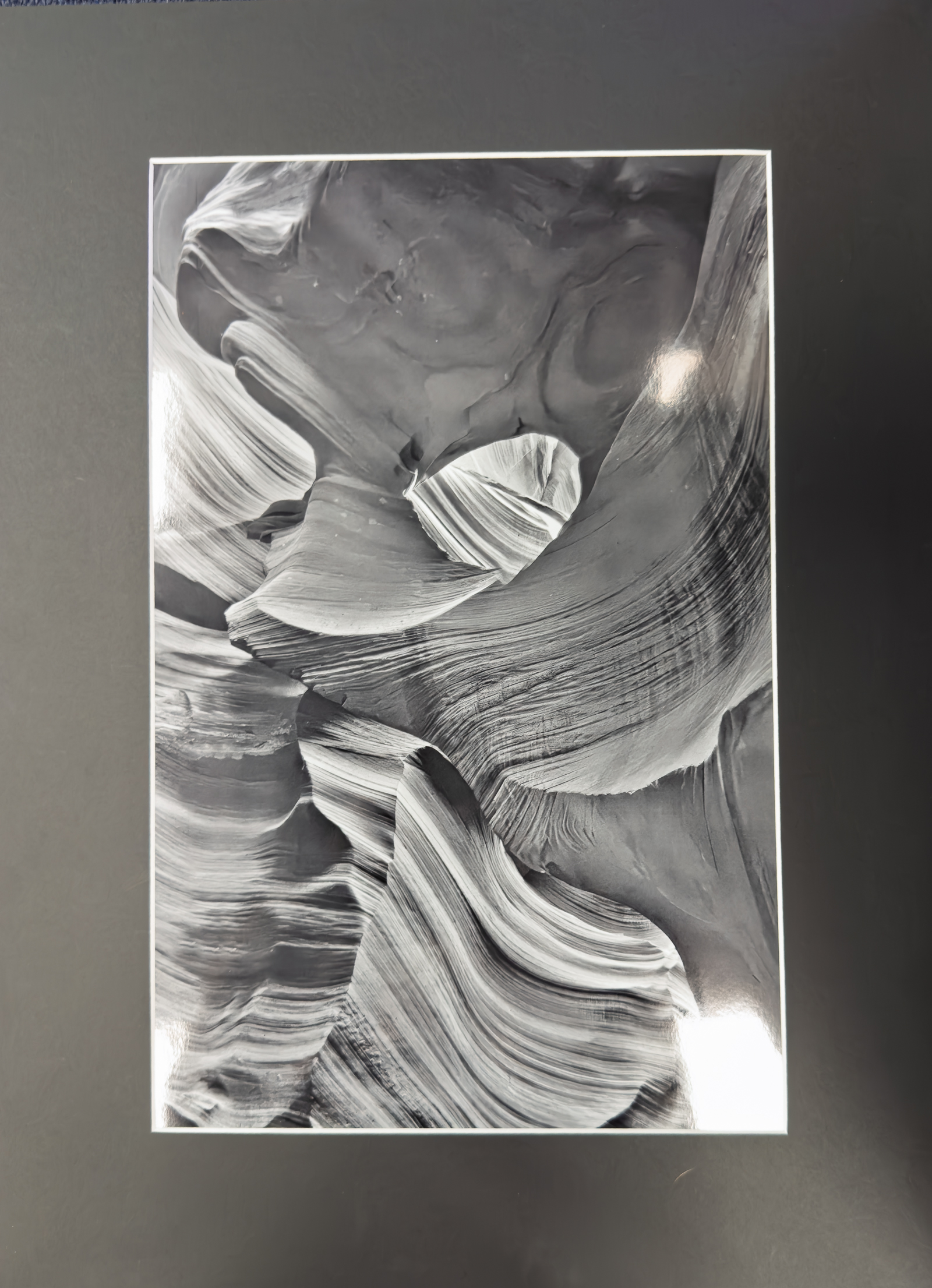
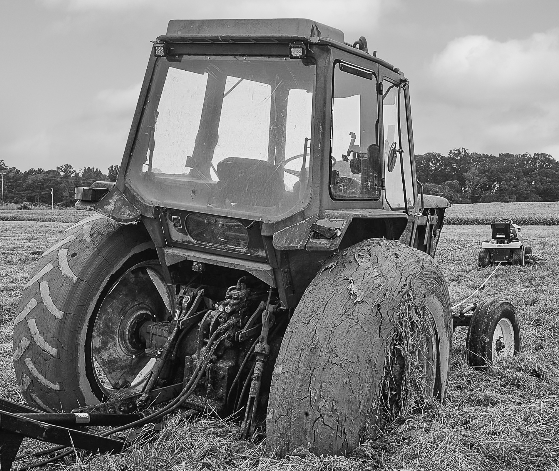
January – “Looking Up / Looking Down”
Total Entries: 158; Color Digital: 59 ; Mono Digital: 54 ; Color Prints: 22 ; Mono Prints: 23 ; Judge: Jose Betancourt

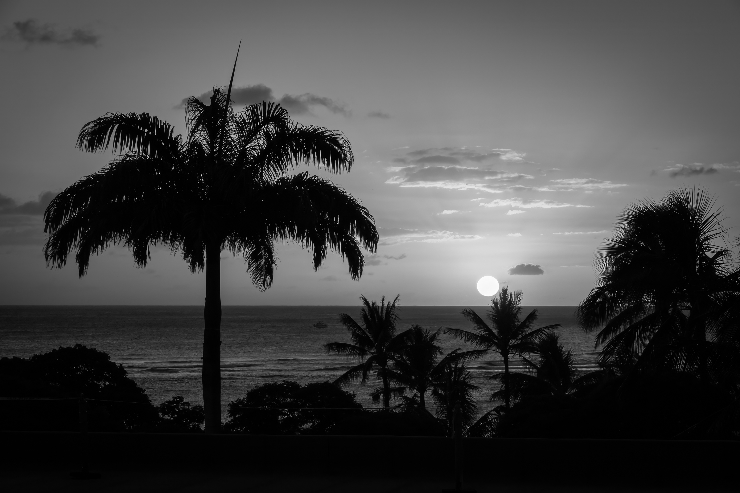
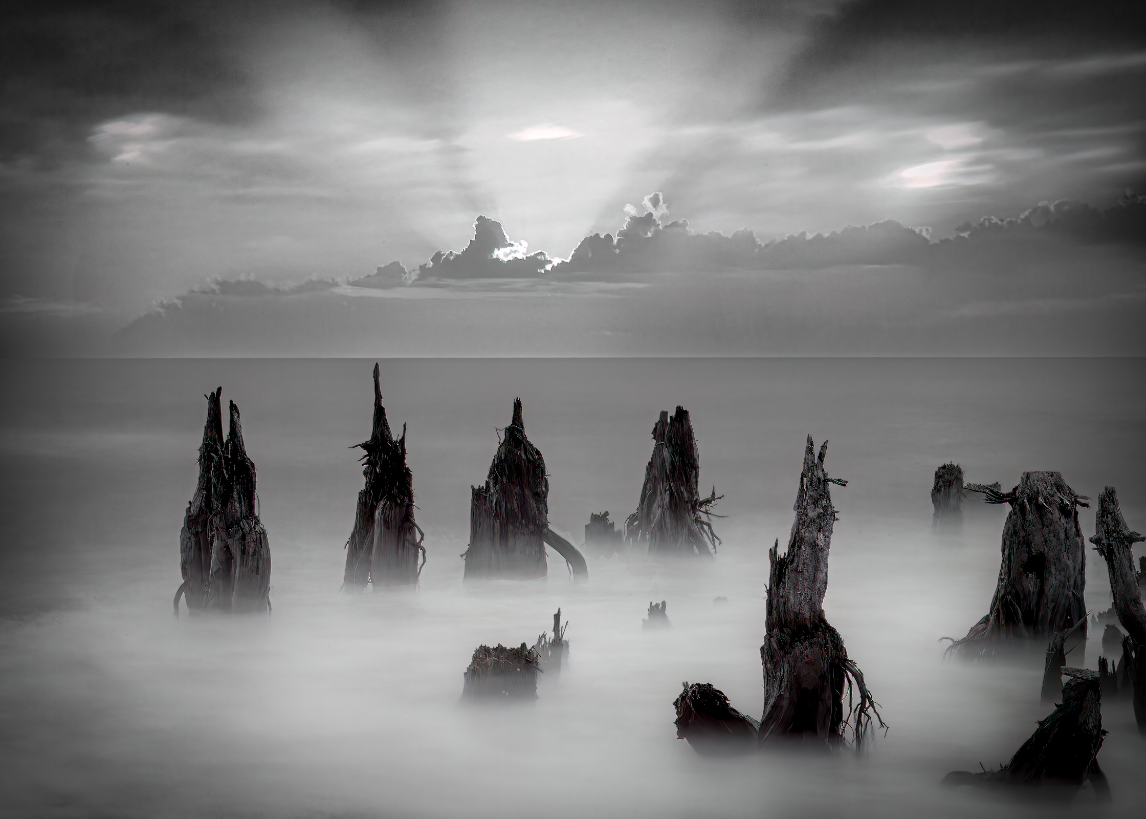
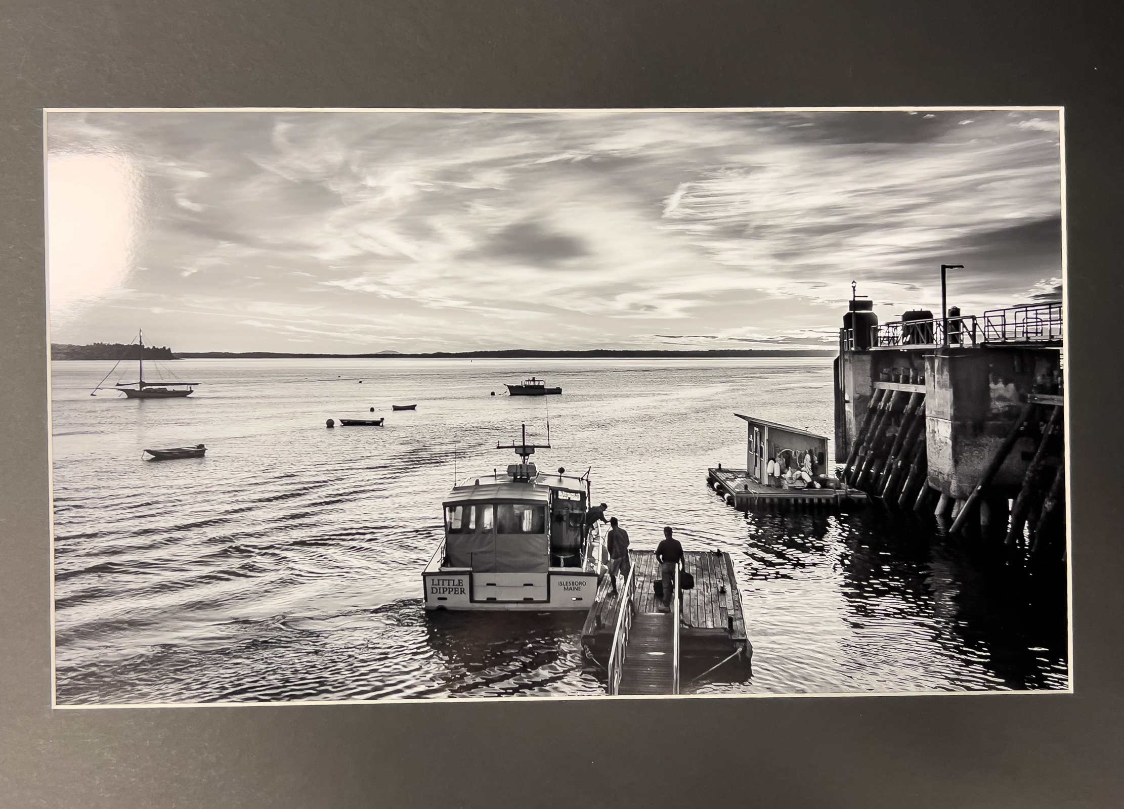
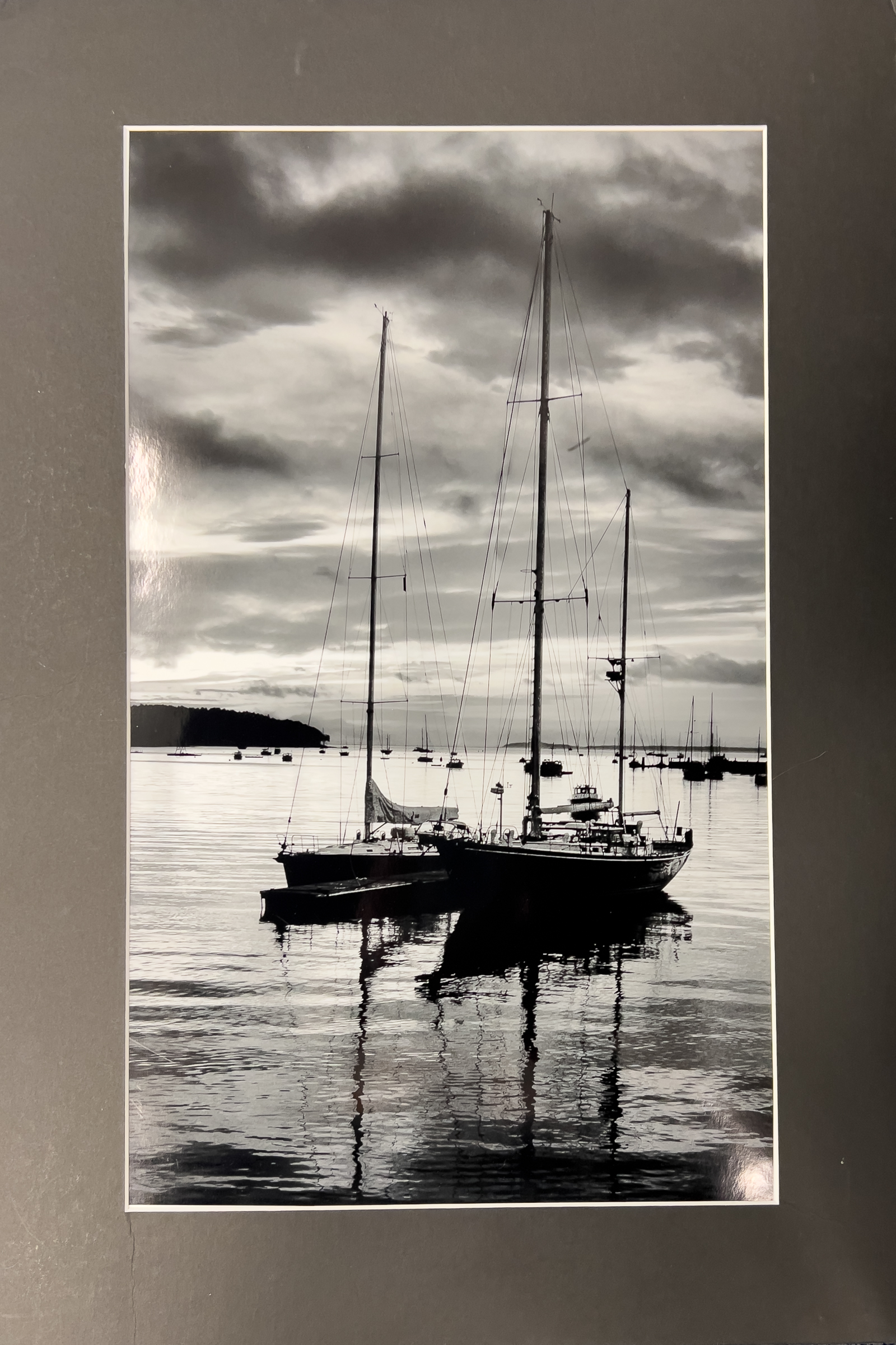
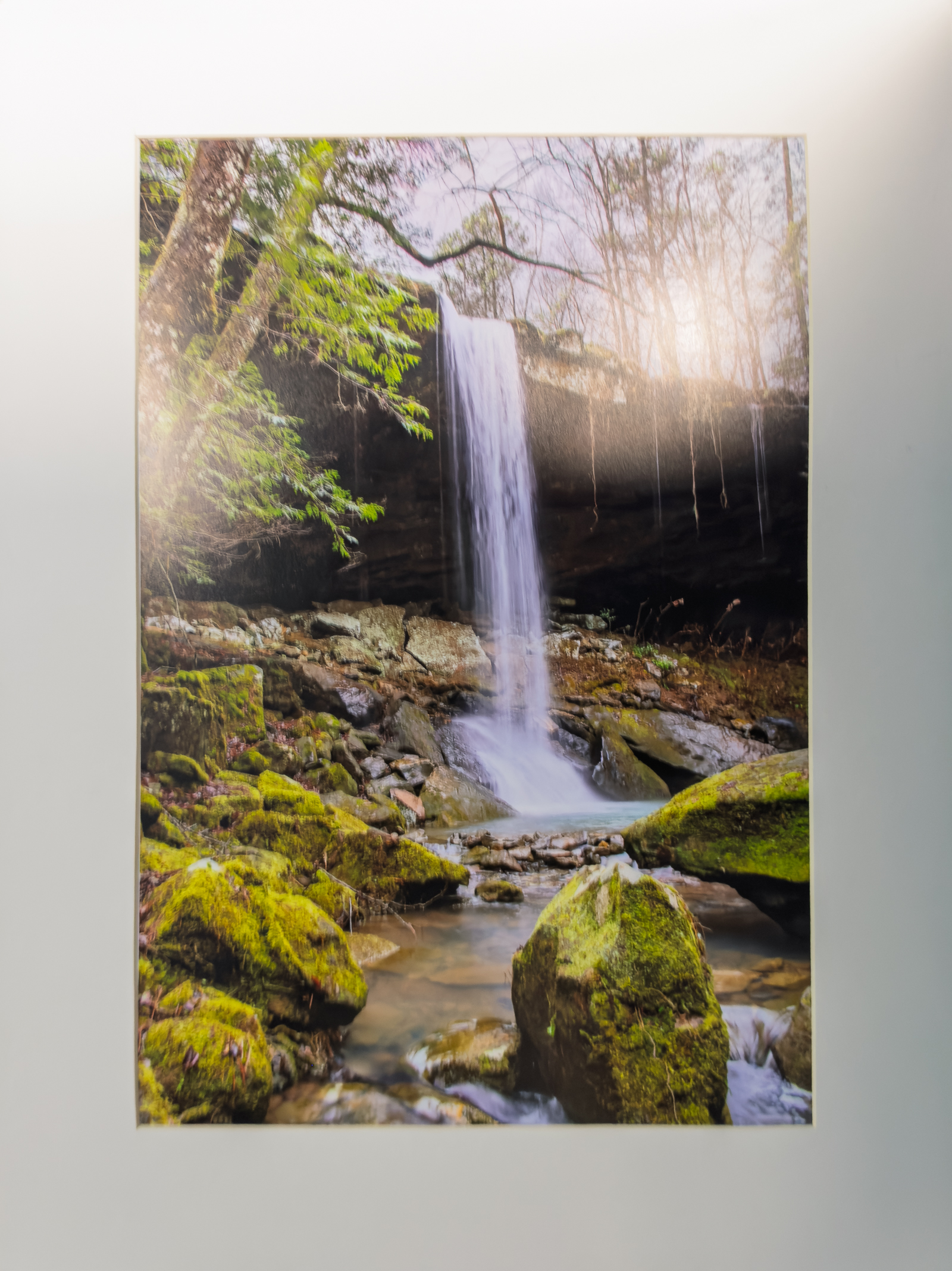
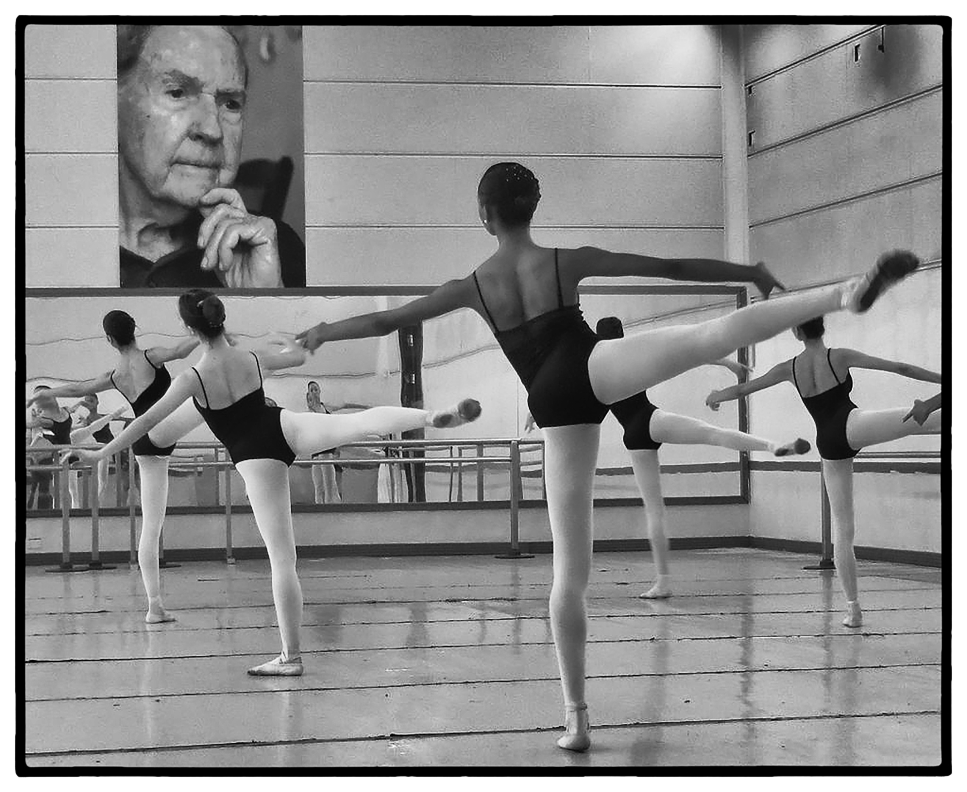
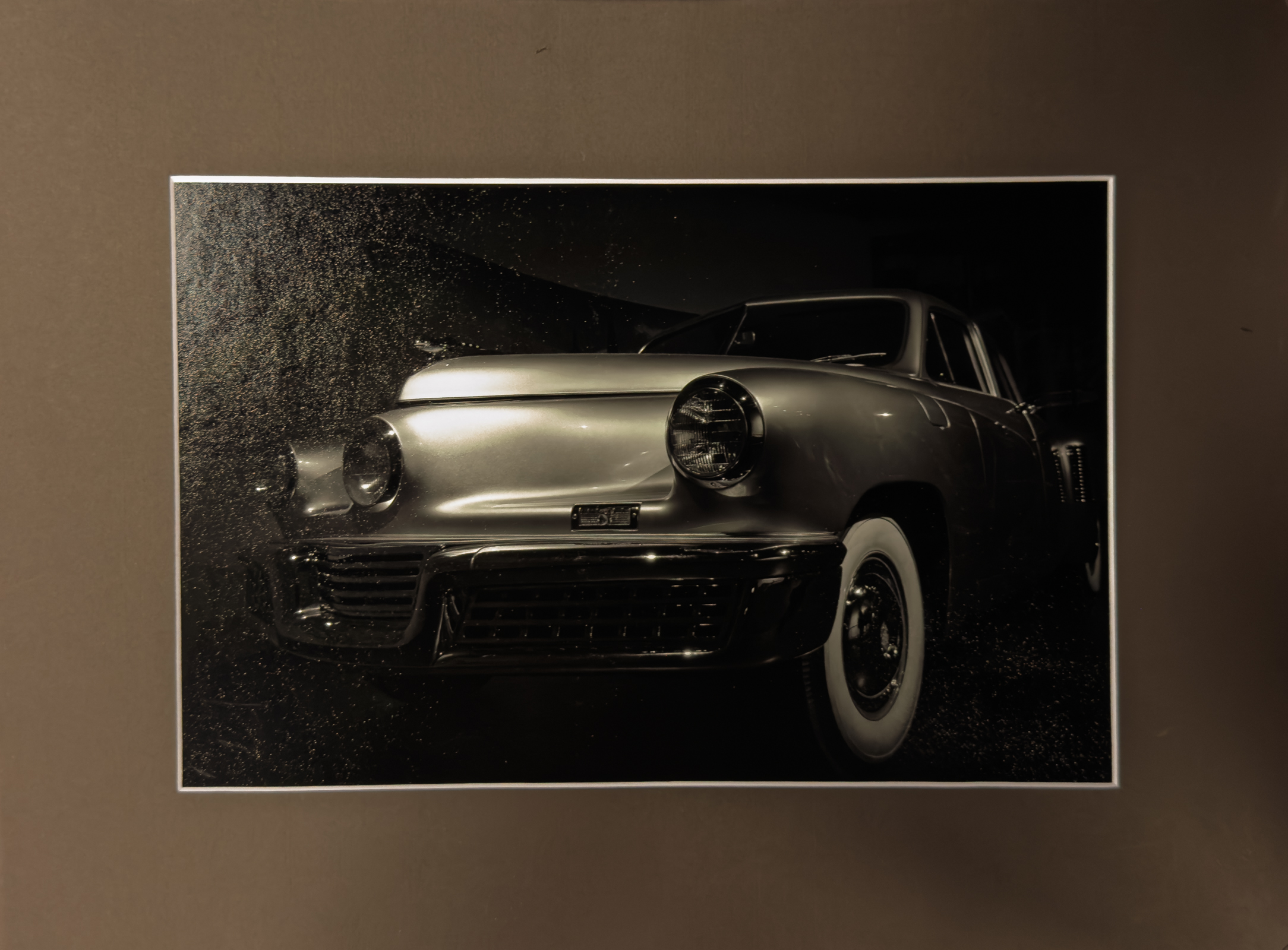
1st Mono Print – Barbara Staggs
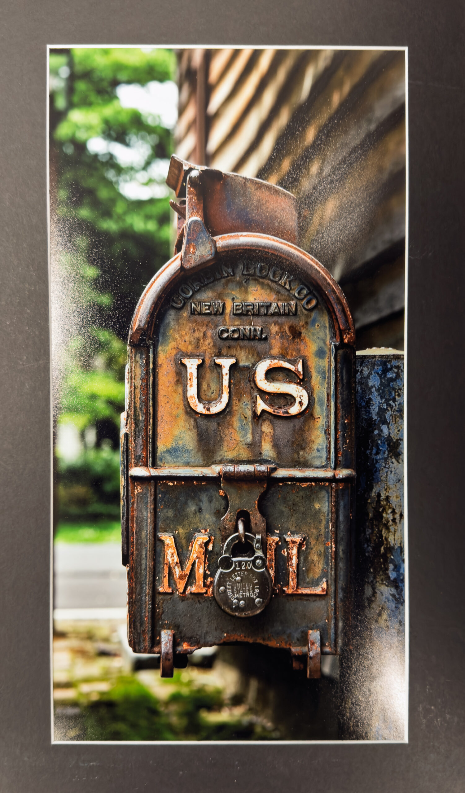
2nd Mono Print – Michael Cook
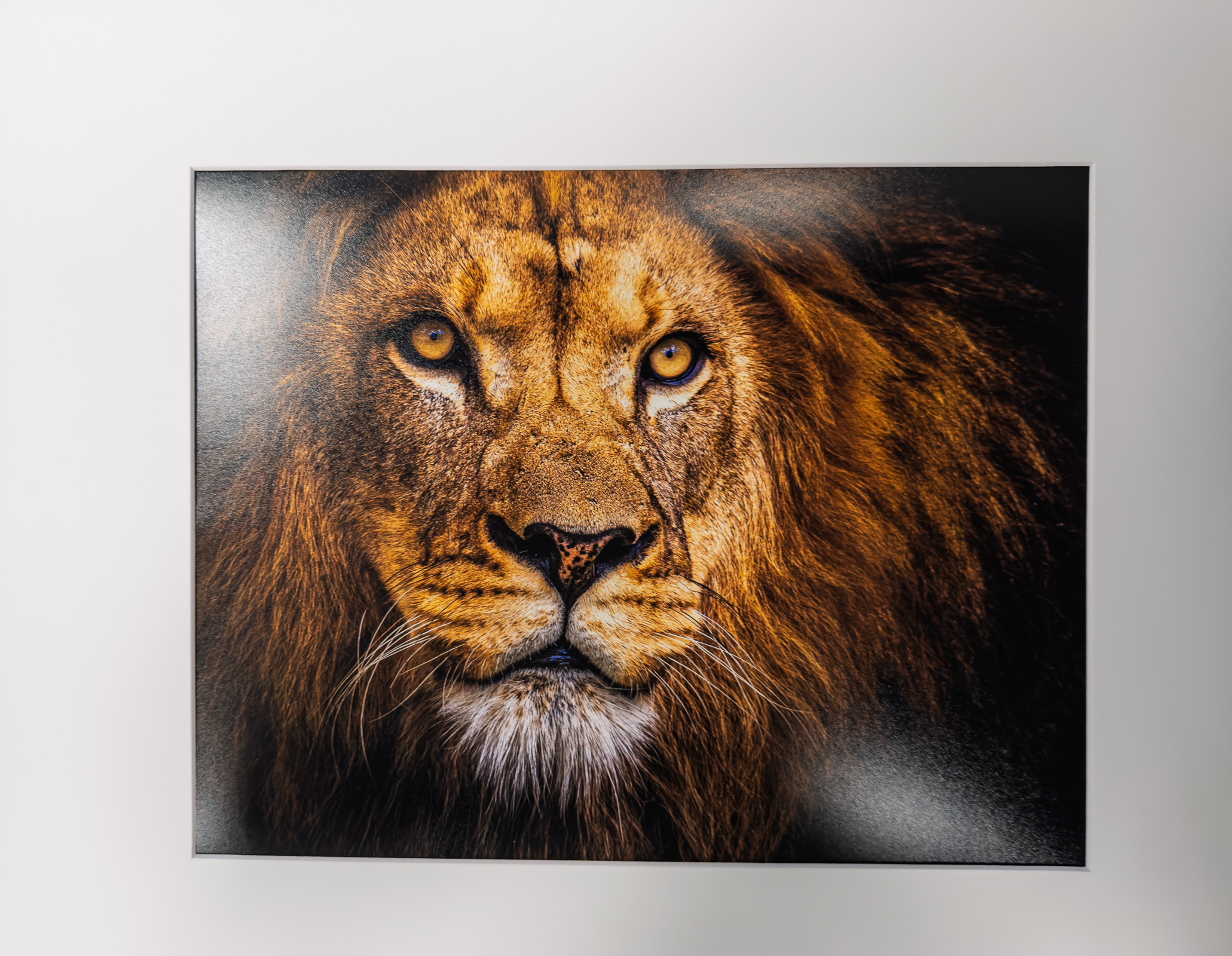
3rd Mono Print – Philip Hallmark
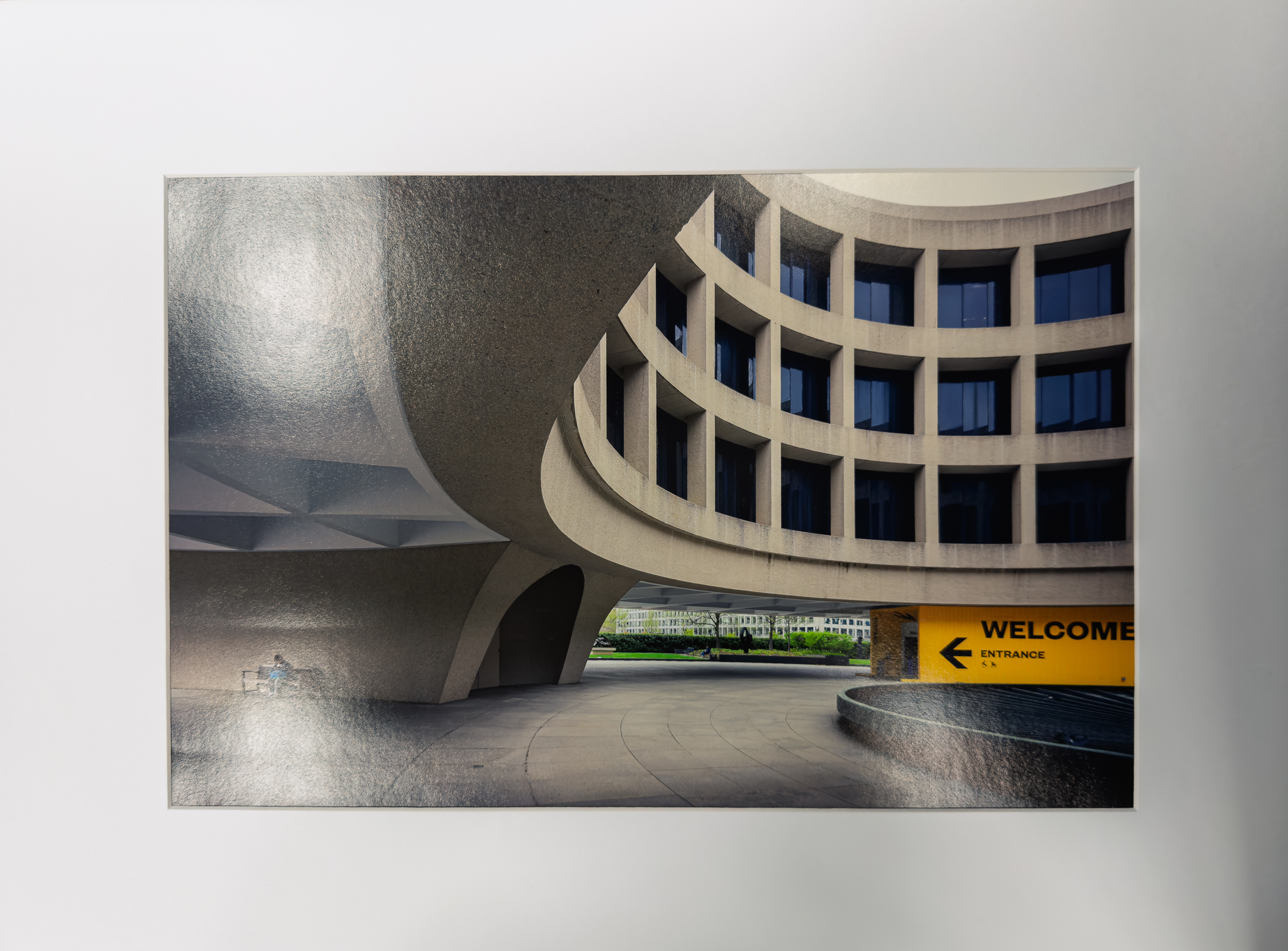
HM Mono Print – John Shriver
HM Mono Print – Charles Leverett
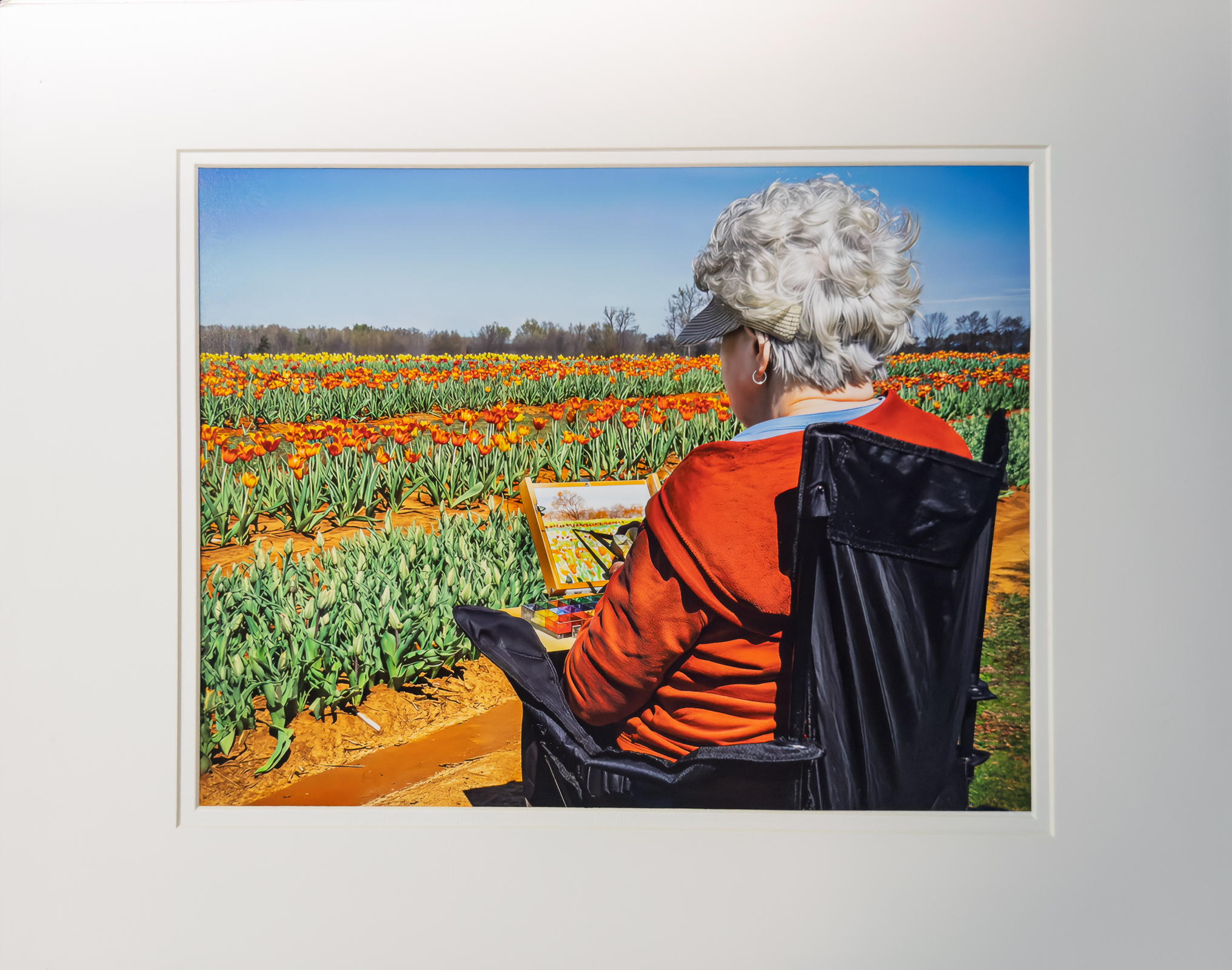
1st Color Print – Philip Flowers
2nd Color Print – Doris Leverett
3rd Color Print – Doris Leverett
HM Color Print – Joy Henderson
HM Color Print – Eddie Sewall
1st Digital Mono – Emily Saile
2nd Digital Mono – Julia Gary
HM Digital Mono – Alice Searcy
HM Digital Mono – Allen Gary
HM Digital Mono – Mat Bevill

HM Digital Mono – Chris Baker
HM Digital Mono – Eric Deylius
1st Color Digital – Allen Gary
2nd Color Digital – William Farnsworh
3rd Digital Color – Chris Baker
HM Digital Color – Philip Flowers
HM Digital Color – Carol Edison
HM Digital Color – Trevor Hall

HM Digital Color – Carolyn Spinoso
HM Digital Color – John Dillingham
HM Digital Color – Chris Baker
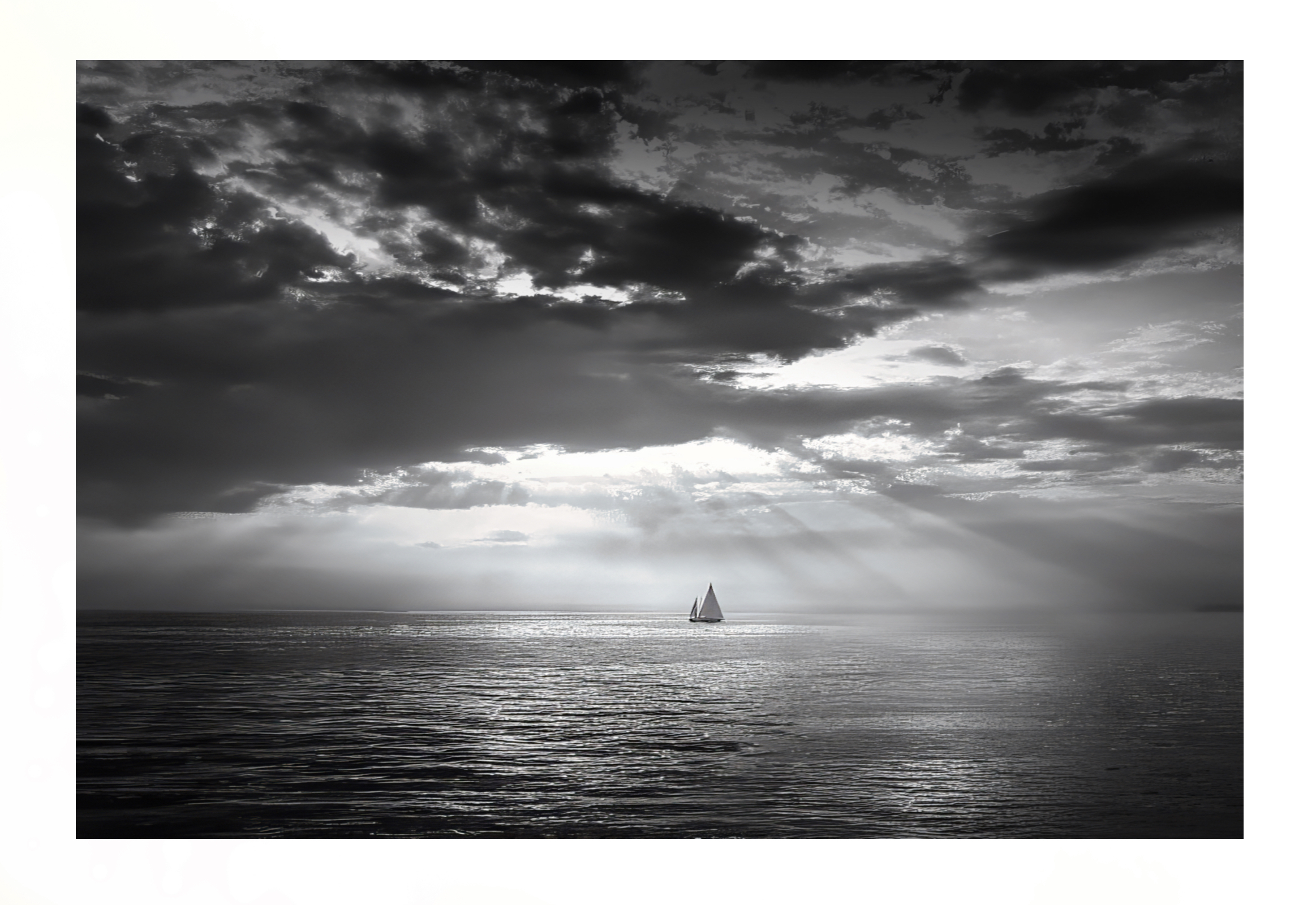
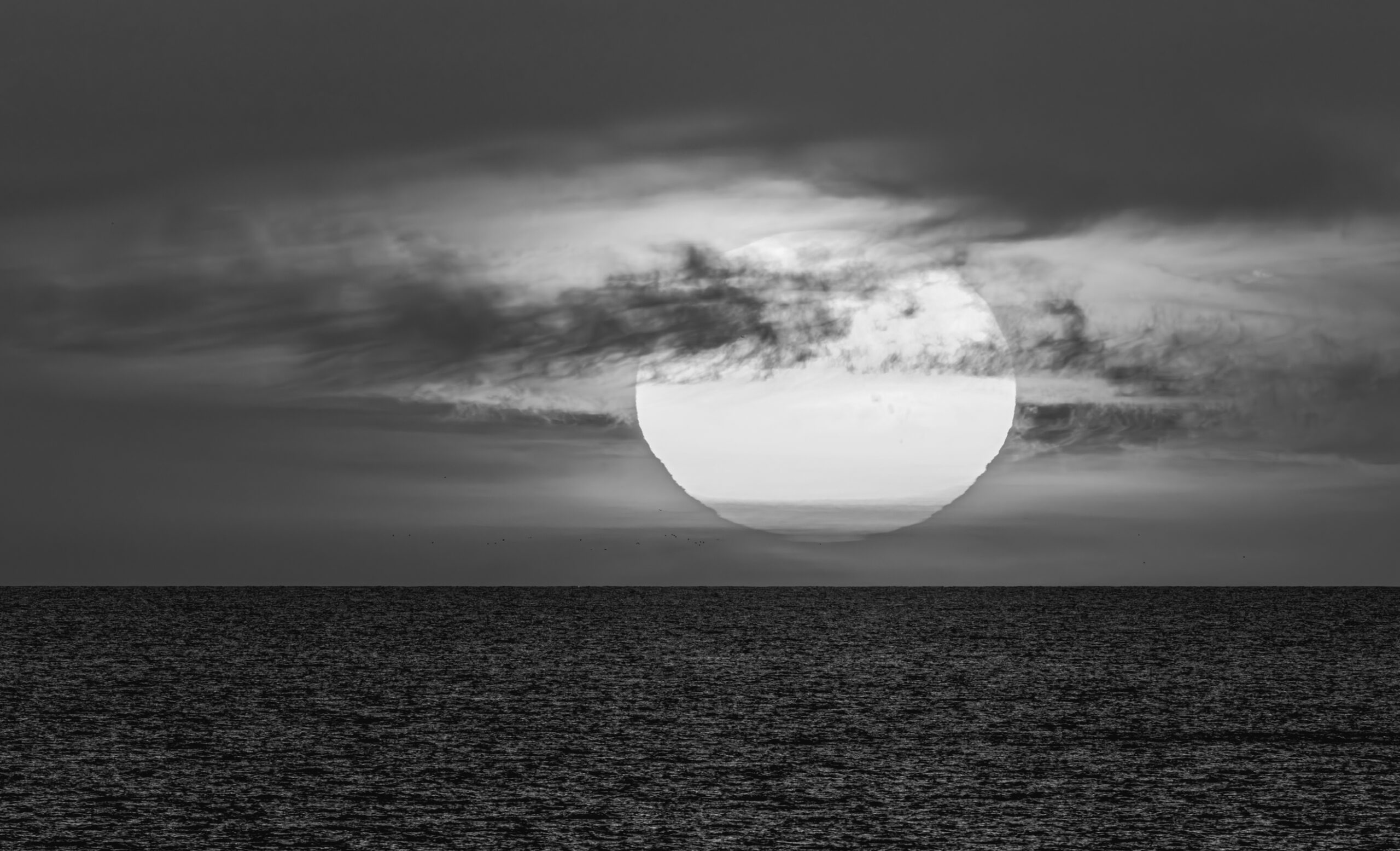
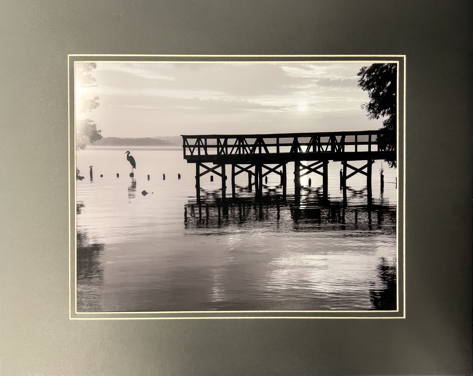
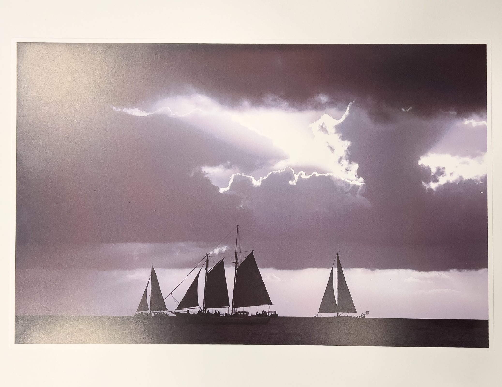
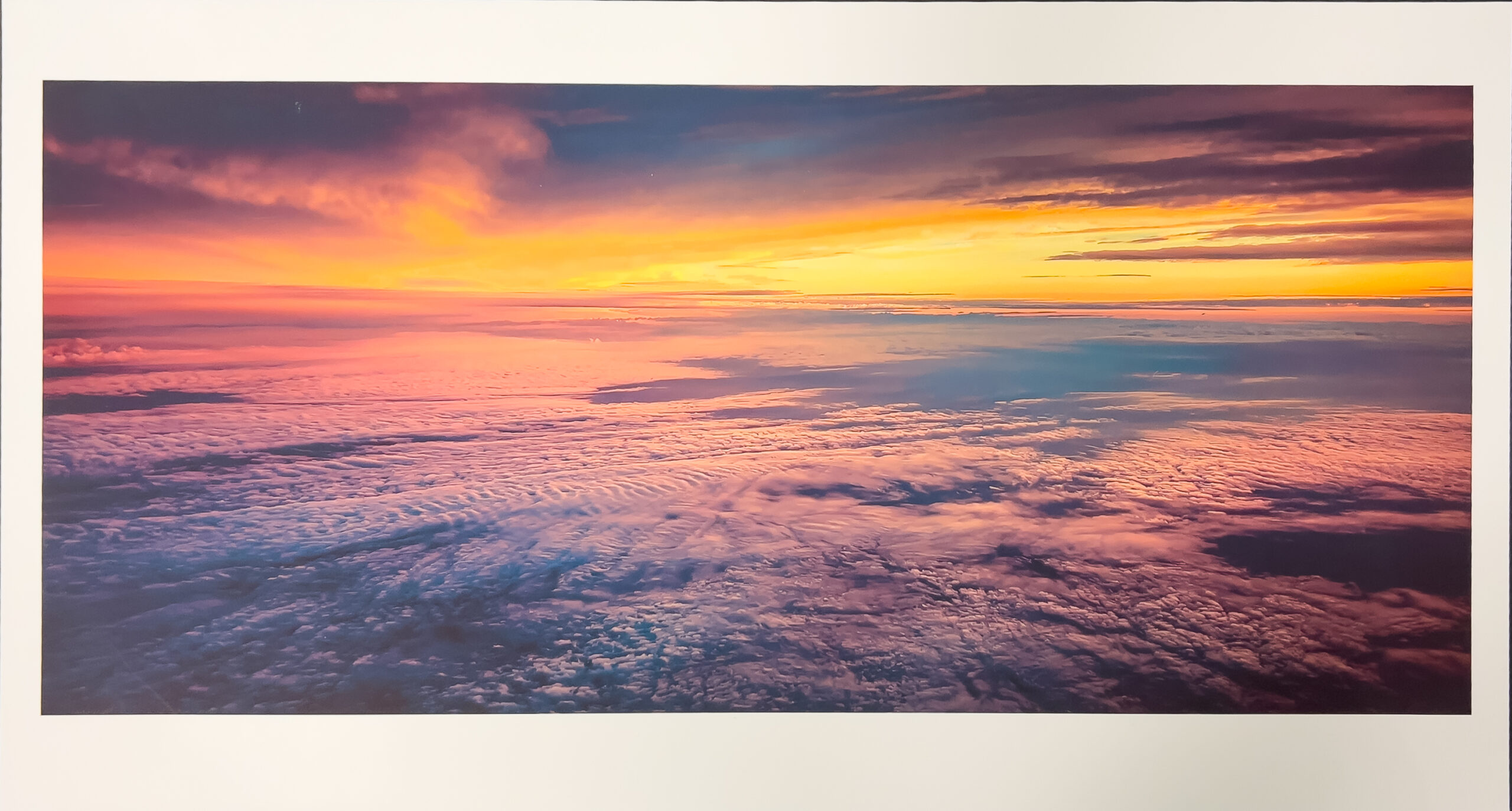
February – “Sunrise / Sunset”
Total Entries: 141 ; Color Digital: 62 ; Mono Digital: 45 ; Color Prints: 19 ; Mono Prints: 15 ; Judge: Bob Gathany

1st Digital Color – Jack Eidson
Good planning to capture sunset thru the foreground. Good exposure. Could crop off some of sky at top.
2nd Digital Color – John Dillingham
Great exposure, maybe HDR. Nice composition with leading lines. Image fills the frame.

3rd Digital Color – Cecilia Yarborough
Nice exposure of clouds. Sun pulls your eye in one direction, bird pulls your eye in the other.

HM Digital Color – Susan Chi
Nice glow of sunrise/set and use of foreground but could ne cropped more panoramic.
HM Digital Color – Mat Bevill
Interesting use of foreground subjects with sunset but foreground to dark, sun too centered and could be cropped differently.
HM Digital Color – Julia Gary
Nice glow before or after sunrise/set. Not over saturated. Could be cropped differently. Good to place sun on left.

HM Digital Color – Chris Baker
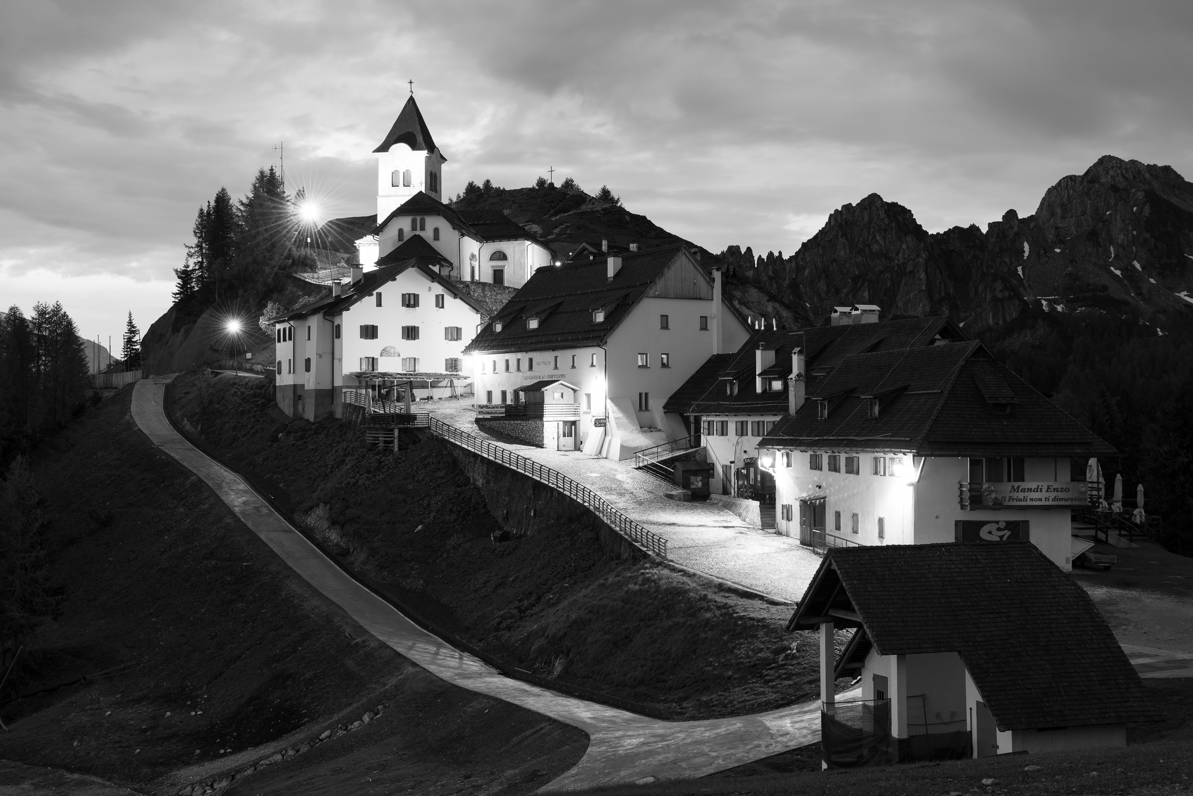
Nice image of church and snow covered hill with sunrise/set glow but sky too overexposed.

HM Digital Color – Chris Baker
Good exposure of sun but too centered and could be cropped more panoramic.

HM Digital Color – Casey Johnson
Nice panoramic cropping and exposure of sky but too centered. Good to place sun on left.
1st Digital Mono Jack Eidson
Nice detail and exposure throughout image. Would make a nice panoramic if you cropped off some of the foreground.
2nd Digital Mono – Chris Baker
One of few images that emphasizes elongated shadows at sunset/sunrise.
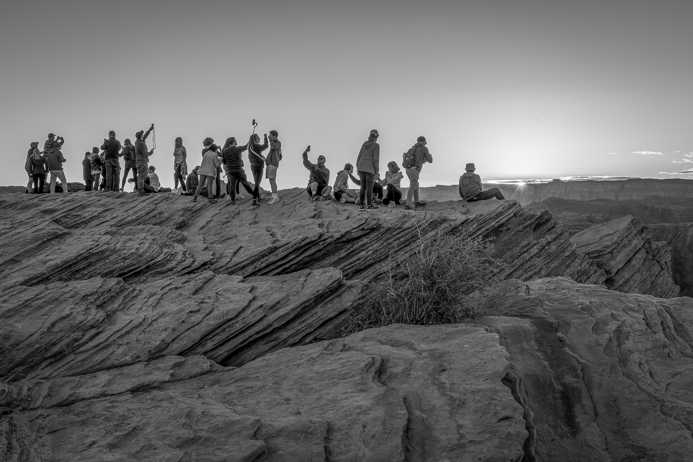
3rd Digital Mono Alice Seary
Loved the idea of people doing selfies at sunrise/sunset.
HM Digital Mono – Tom Johnson
Nice sun rays through clouds works good as a monochrome.
HM Digital Mono – Jim Spinoso
Nice telephoto of sun & clouds with sun not centered but would work better with sun on left third.
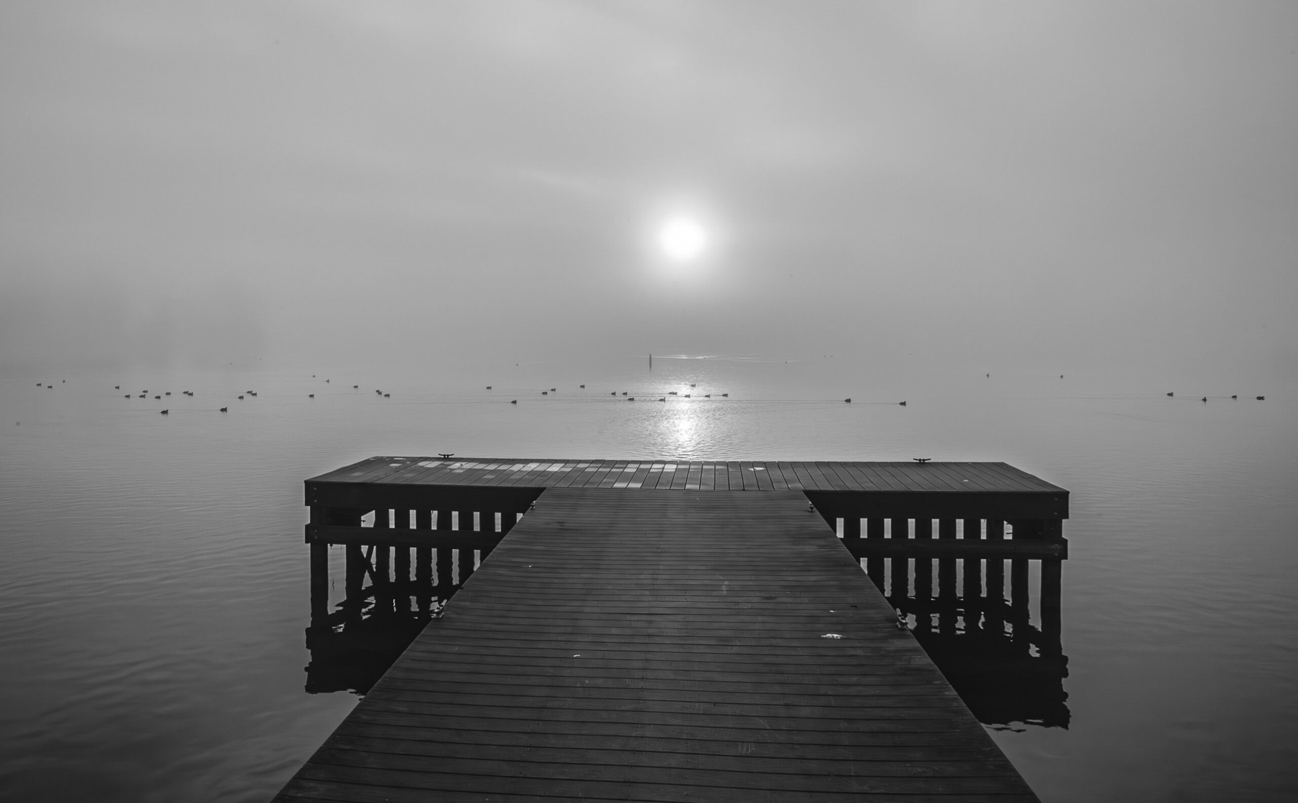
HM Digital Mono – Jim Spinoso
Glow of sun through fog and use of foreground but too centered.
HM Digital Mono Emily Saile
Nice use of foreground objects and sun not centered.
HM Digital Mono – Don Wolfe
Nice glow of sun thru clouds and use of foreground objects.
1st Mono Print – Doris Leveret
2nd Mono Print – Charles Leveret
3rd Mono Print – Philip Flowers
HM Mono Print – TBryant
HM Mono Print – P Hallmark
1st Color Print – Philip Flowers
2nd Color Print – Barbara Staggs
3rd Color Print – Joy Henderson

HM Color Print – Joy Henderson
HM Color Print – Doris Leverett
March – “Open”
Total Entries: 166 ; Color Digital: 63 ; Mono Digital: 53 ; Color Prints: 26 ; Mono Prints: 24 ; Judge: Herb Stokes
1st Digital Color – Tom Johnson
2nd Digital Color – Chris Baker

3rd Digital Color – Chris Baker

HM Digital Color – Trevor Hall
HM Digital Color – Tom Johnson
HM Digital Color – Riley Garrett

HM Digital Color – Casey Johnson

HM Digital Color – Brad Lackey
HM Digital Color – Alice Searcy
1st Digital Mono – Trevor Hall
2nd Digital Mono – Carol Eidson
3rd Digital Mono – Carolyn Spinoso

HM Digital Mono – William Farnsworth
HM Digital Mono – Philip Flowers
HM Digital Mono – Jack Eidson

HM Digital Mono – Chris Baker
HM Digital Mono – Chris Baker
1st Mono Print – Charles Leverett
2nd Mono Print – Doris Leverett
3rd Mono Print – Doris Leverett
HM Mono Print – Michael Cox

HM Mono Print – Joy Henderson
1st Color Print – John Dillingham

2nd Color Print – John Shriver
3rd Color Print – Henry Smith
HM Color Print – K Deal

HM Color Print – Emily Saile
HM Color Print Charles Leverett
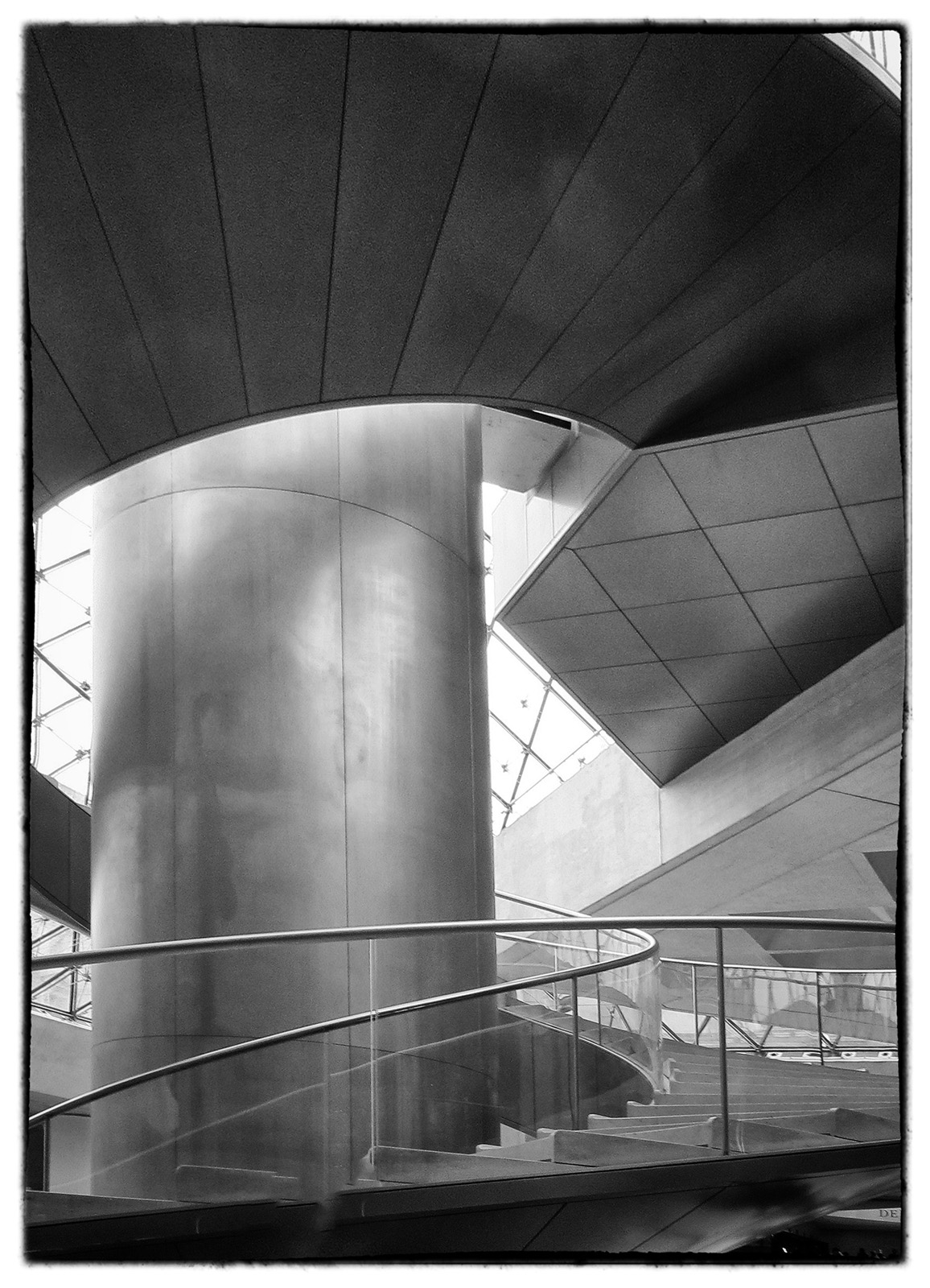
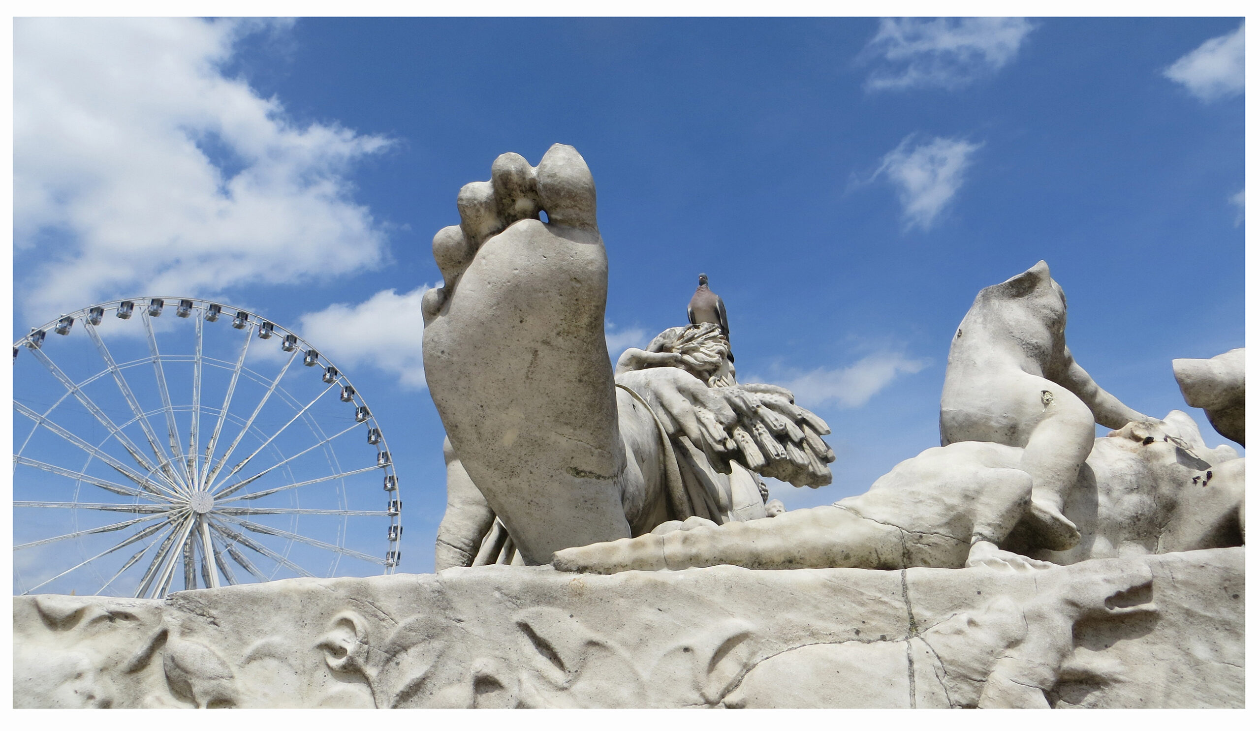
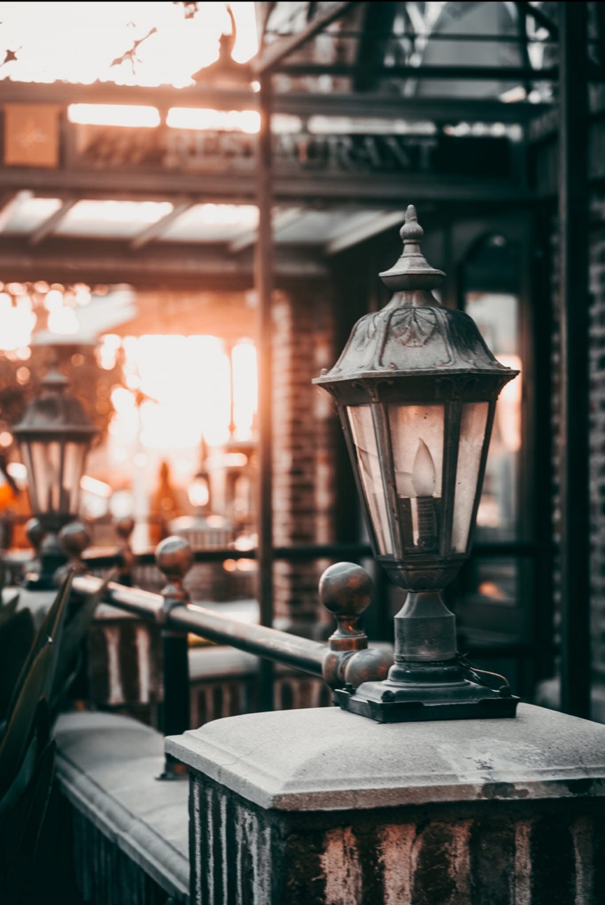
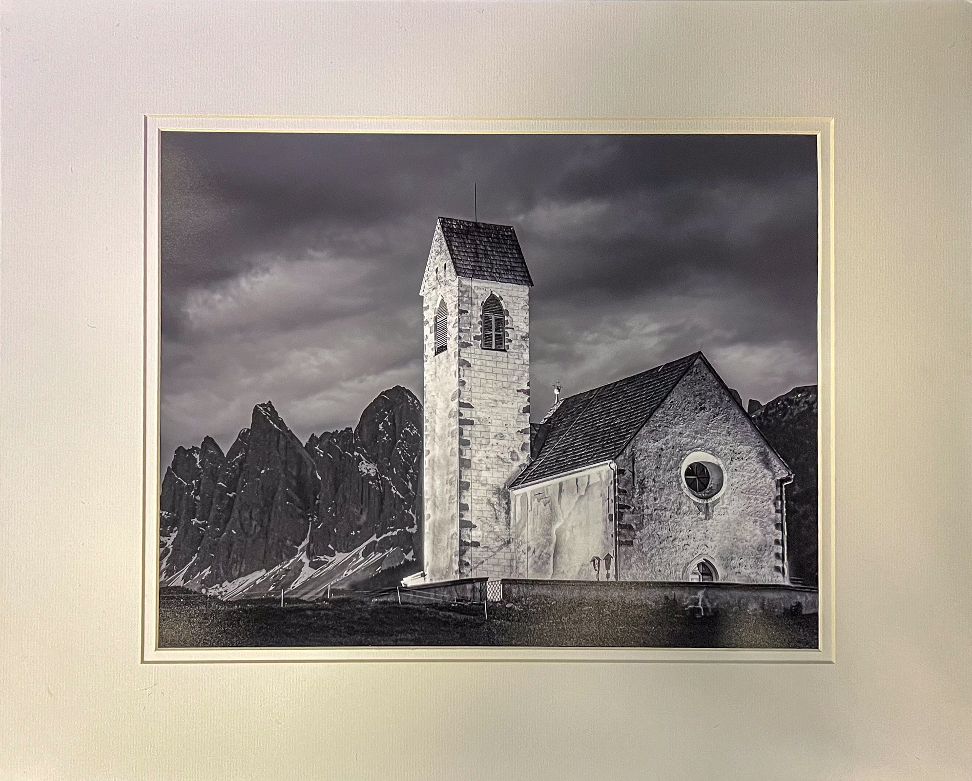
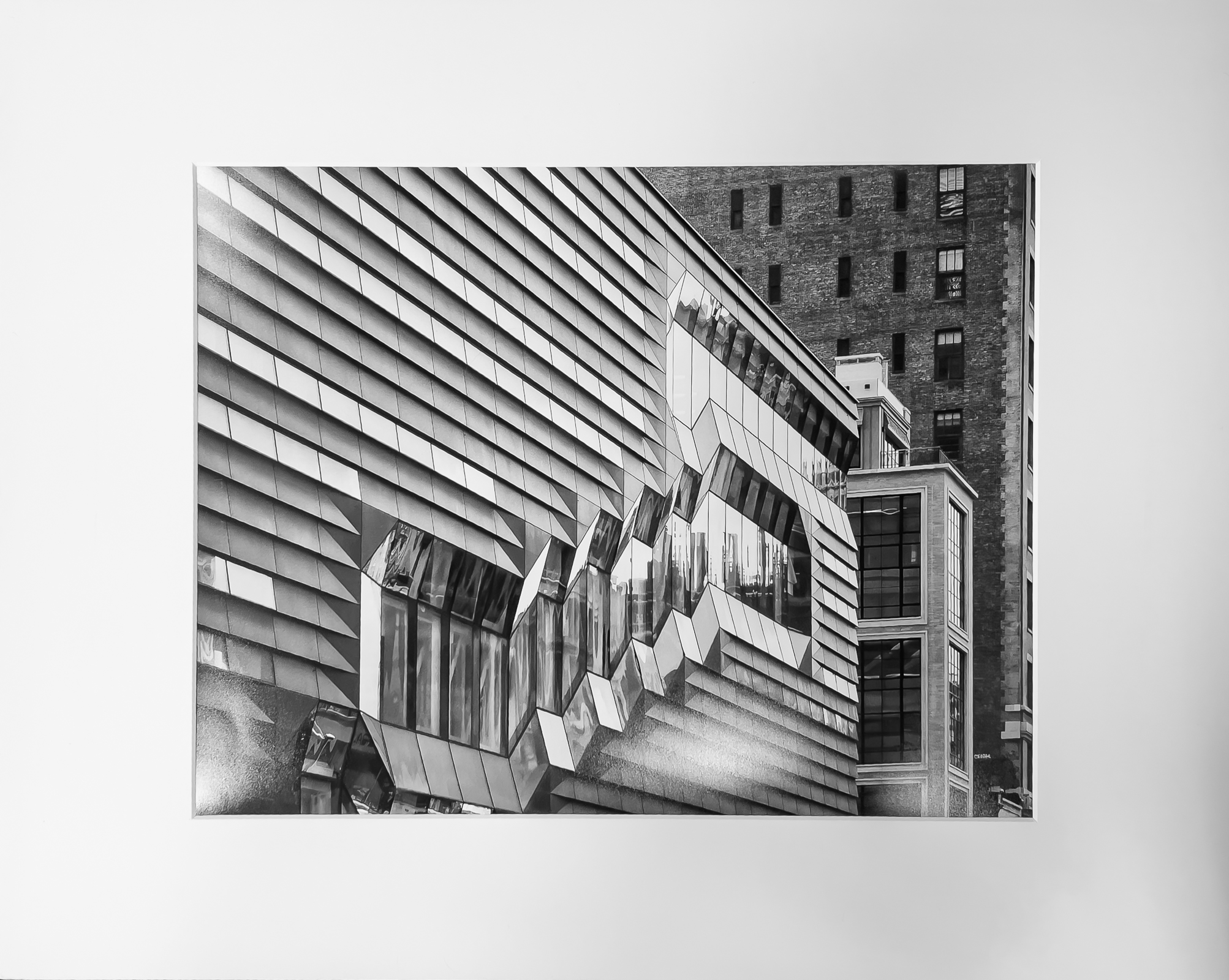
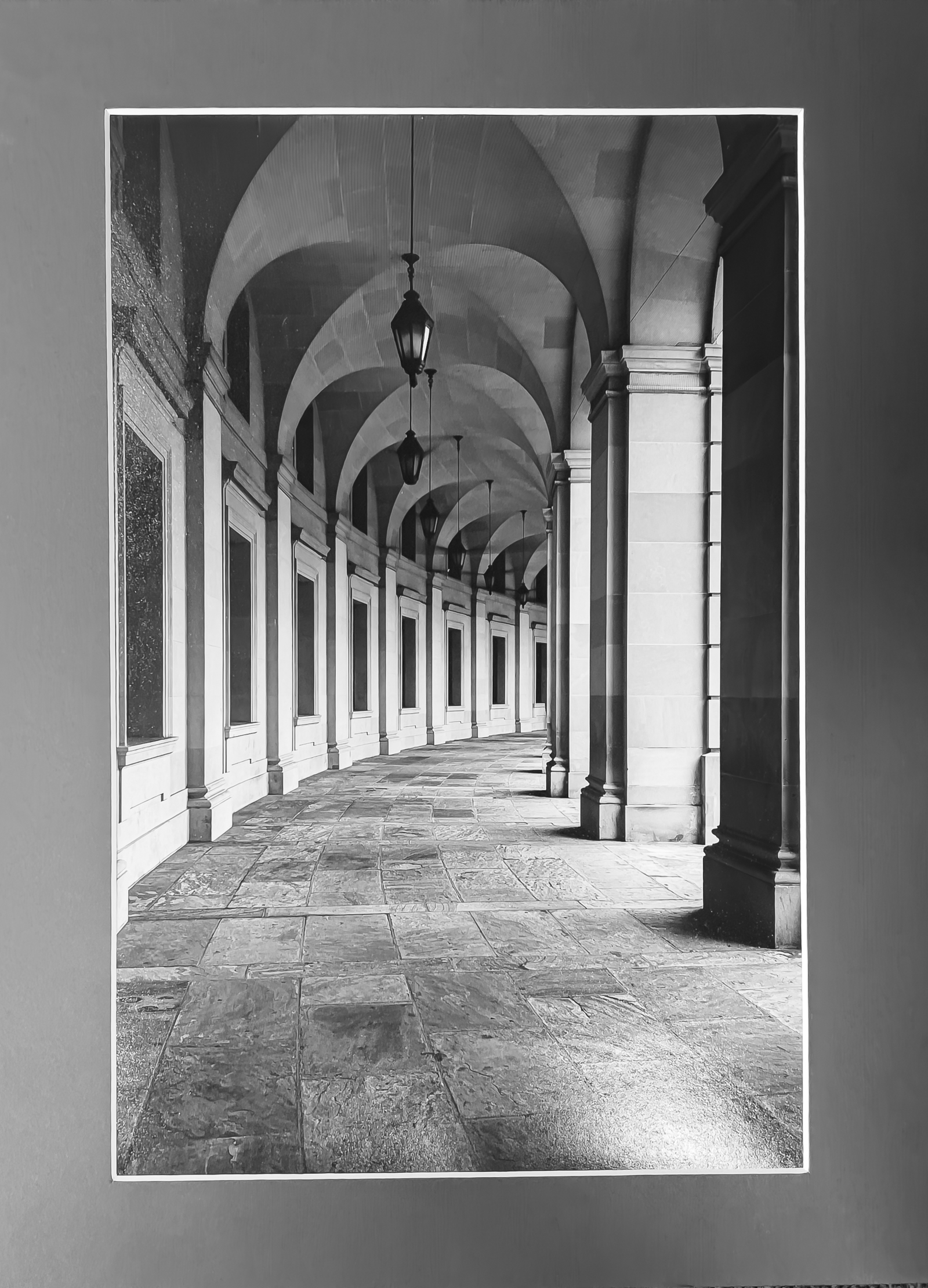
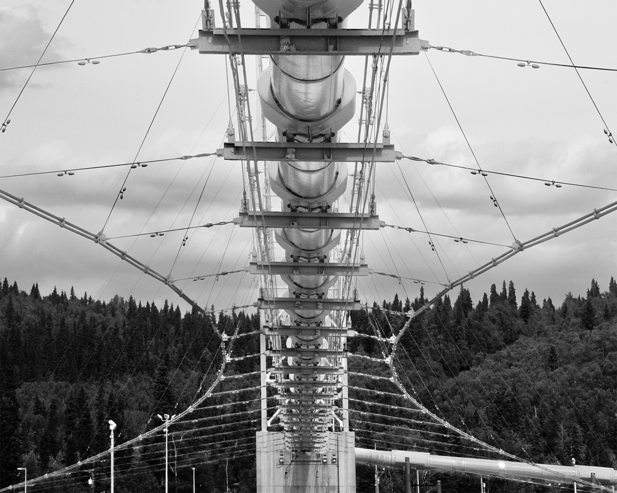
April – “Architectural”
Total Entries: 140 ; Color Digital: 49 ; Mono Digital: 51 ; Color Prints: 20 ; Mono Prints: 20 ; Judge: Cara Fuller
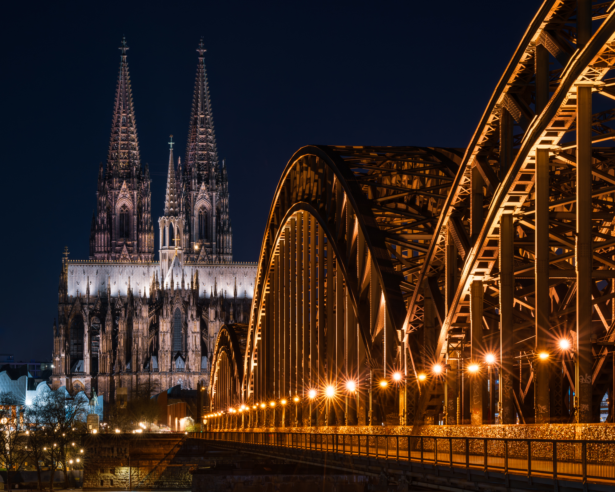
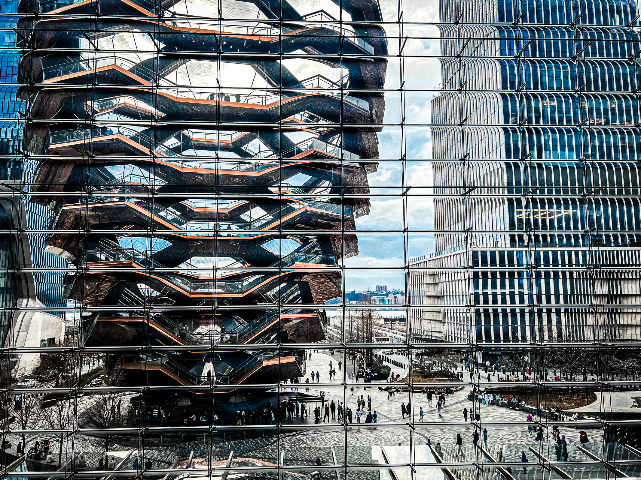
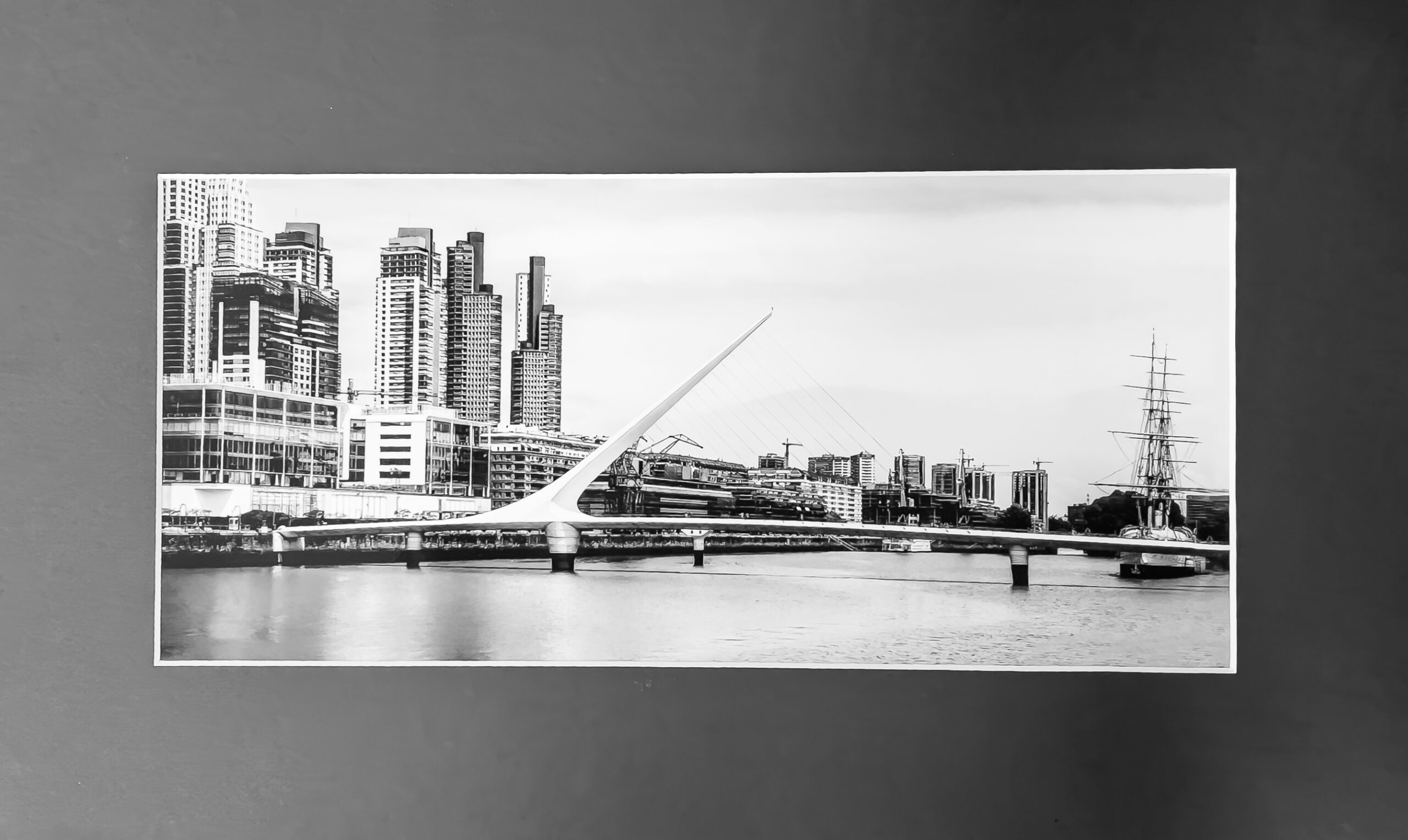
1st Digital Color – Chris Baker
It’s a great dynamic shot – the night contrast is interesting and the repeating lights create a leading line pulling you in. Plus l enjoy the juxtaposition of new bridge versus historic architecture

2nd Digital Color – Allen Gary
This hurt to look at – almost like a wounded animal. The agent of the building destruction being clearly apparent (No tornado happened) makes me think about how things once useful can be moved past so quickly
3rd Digital Color – Michael Cox
Very symmetrically laid out – super sharp – choosing to make the photo at night really popped the contrast and made it stand out/extra appealing.
HM Digital Color – Trevor Hall
I like being able to see the environment this element was attached too – I also like the juxtaposition of light to be used at night with the sun which negates the light fixtures use beaming in the background
HM Digital Color – Susan Poston
The whole scene is only seen through reflection on another building. What is in the scene is a “building” that appears made for art forms sake in that its function is not readily apparent.

HM Digital Color – Susan Chi
Very nicely laid out – repeating elements are nicely fit into the frame with the empty space on the right being used by the tower.
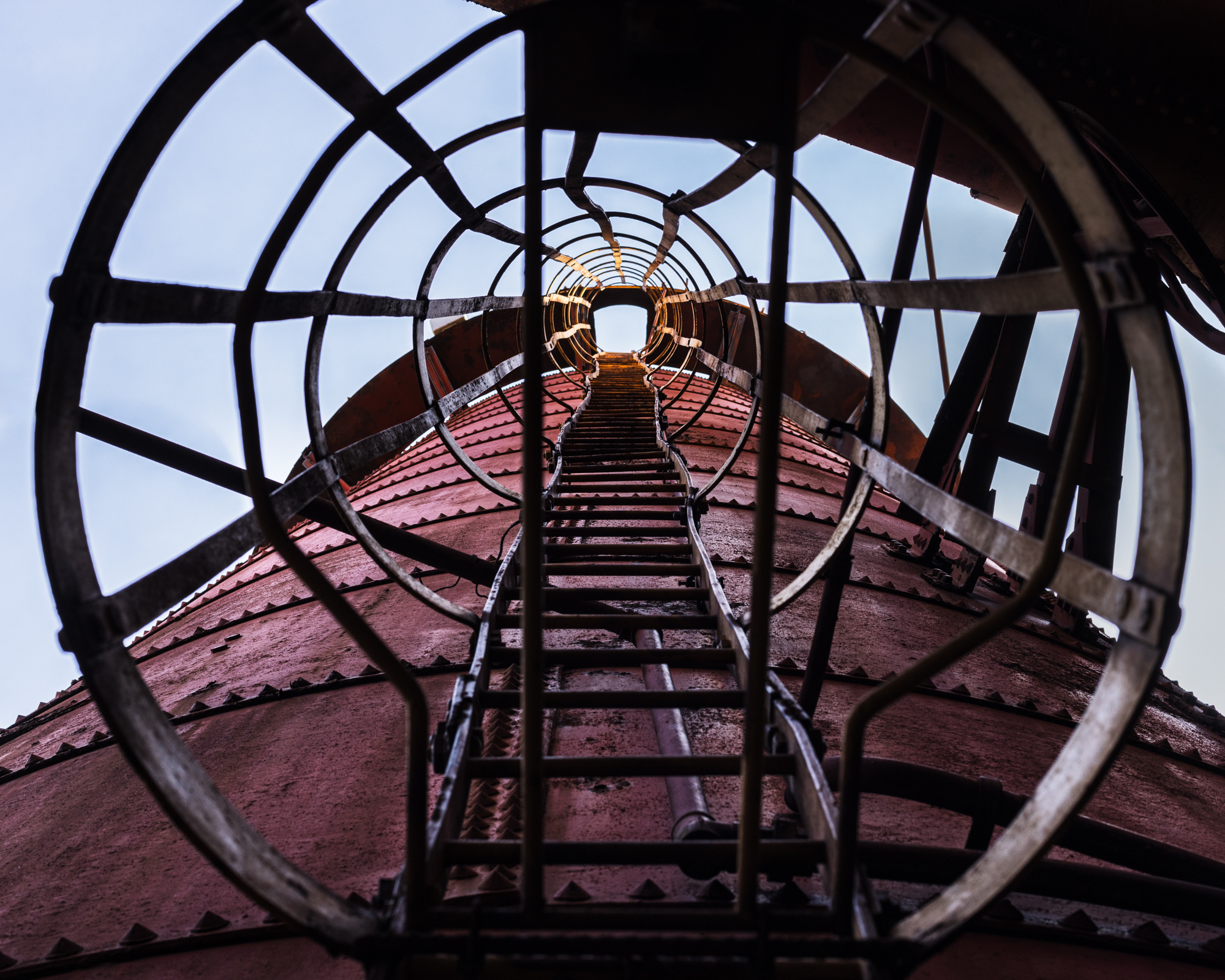
HM Digital Color – Mat Bevill
I really enjoy the wonky crooked ladder going up the side of the furnace. The safety precautions put in place by all the caging around it are almost made to feel pointless.
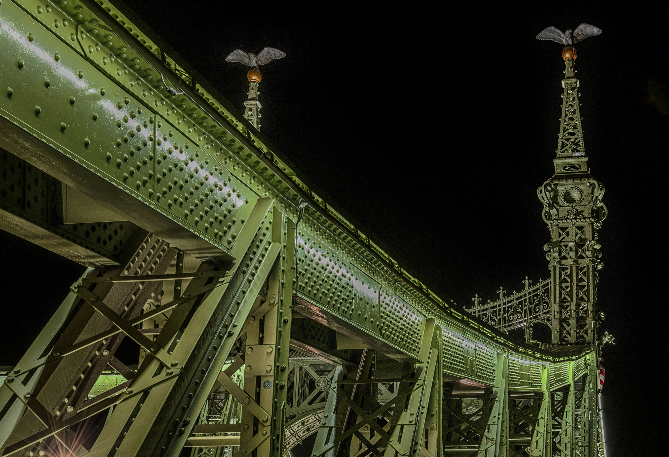
HM Digital Color – Jack Eidson
I really like the juxtaposition of new functional looking girders verses the historic decorative elements in the background. Plus the vivid green with the strong texture was very appealing
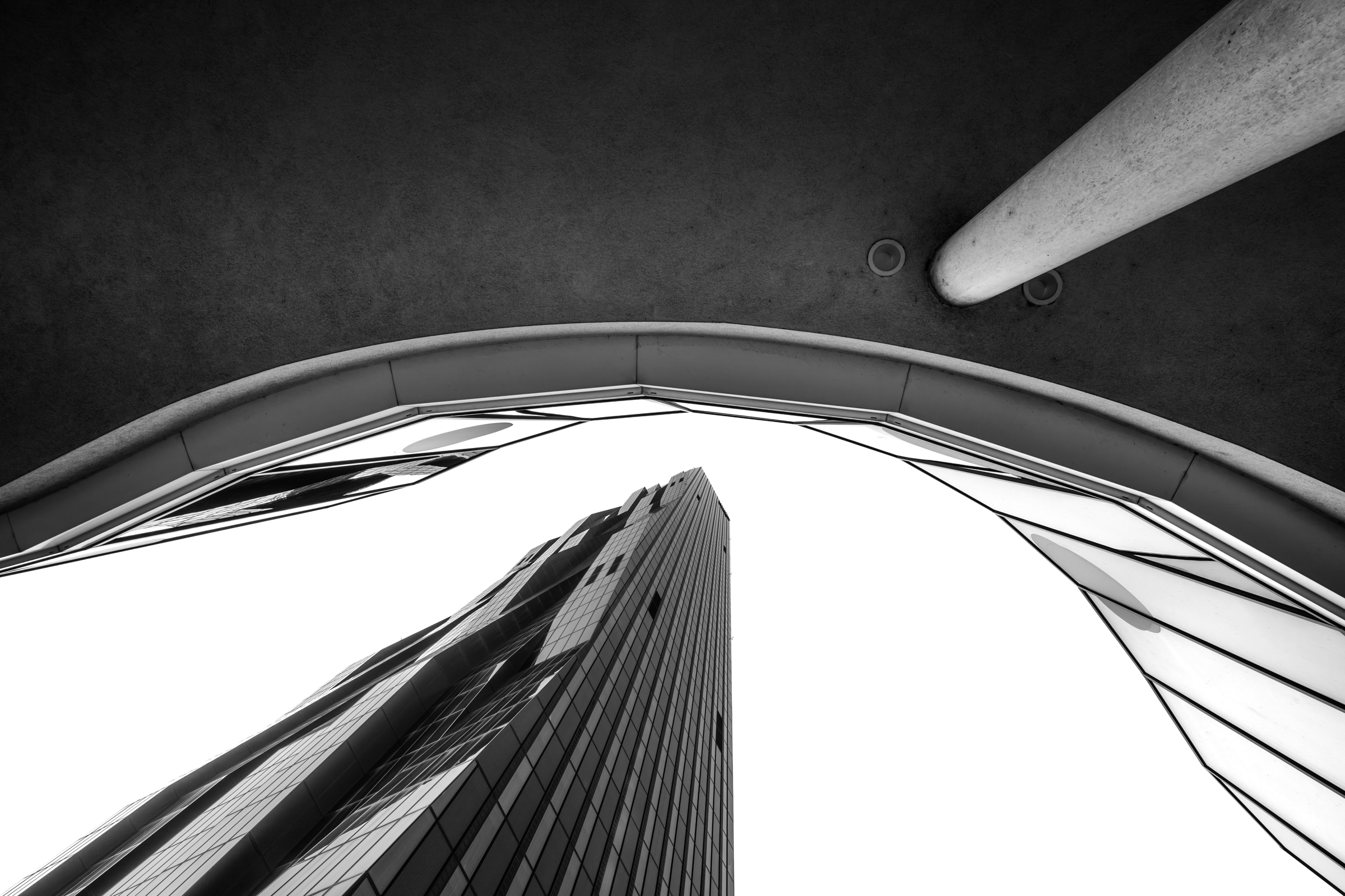
1st Digital Mono – Kate Deal
The convergence at the op makes this space really imposing – I almost image like a dreaded bording school. The railing bisecting the door doesn’t make it feel inviting either.
2nd Digital Mono – Mat Bevill
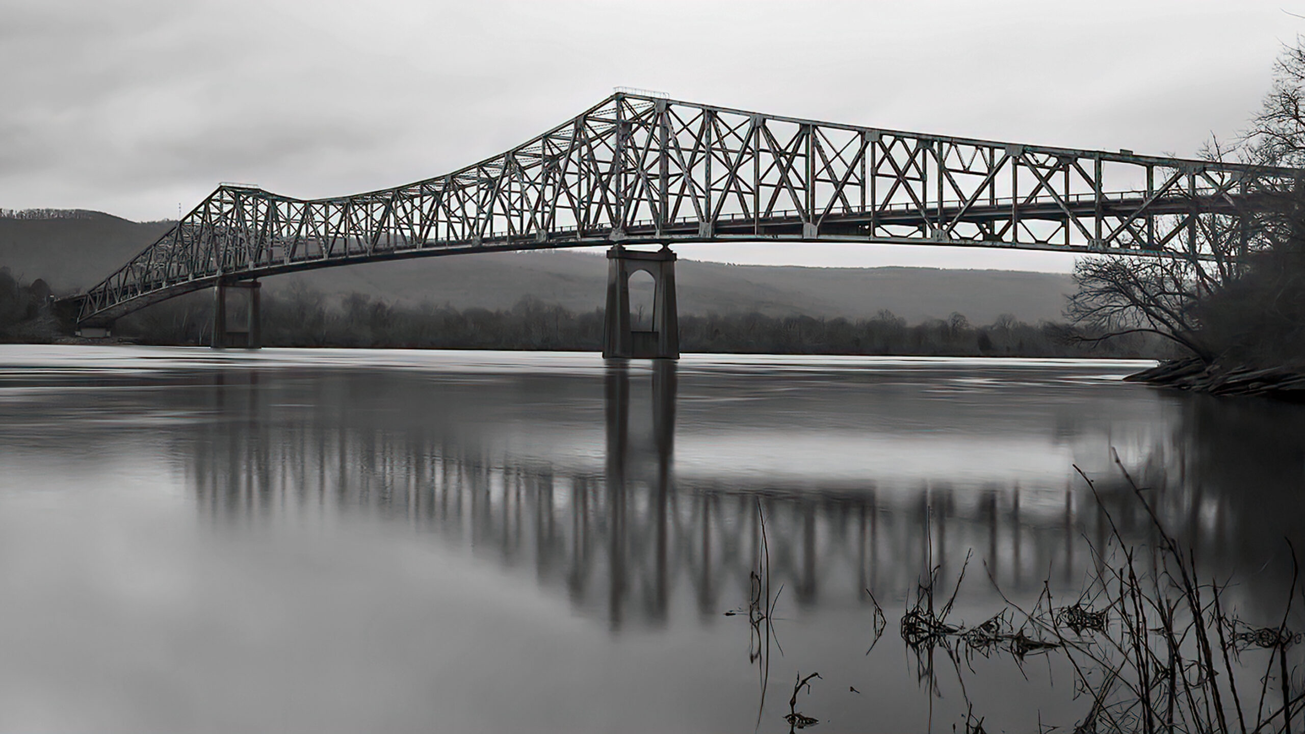
I appreciate the calmness of the water yet sharp architectural details of the bridge. Nice atmosphere as well.
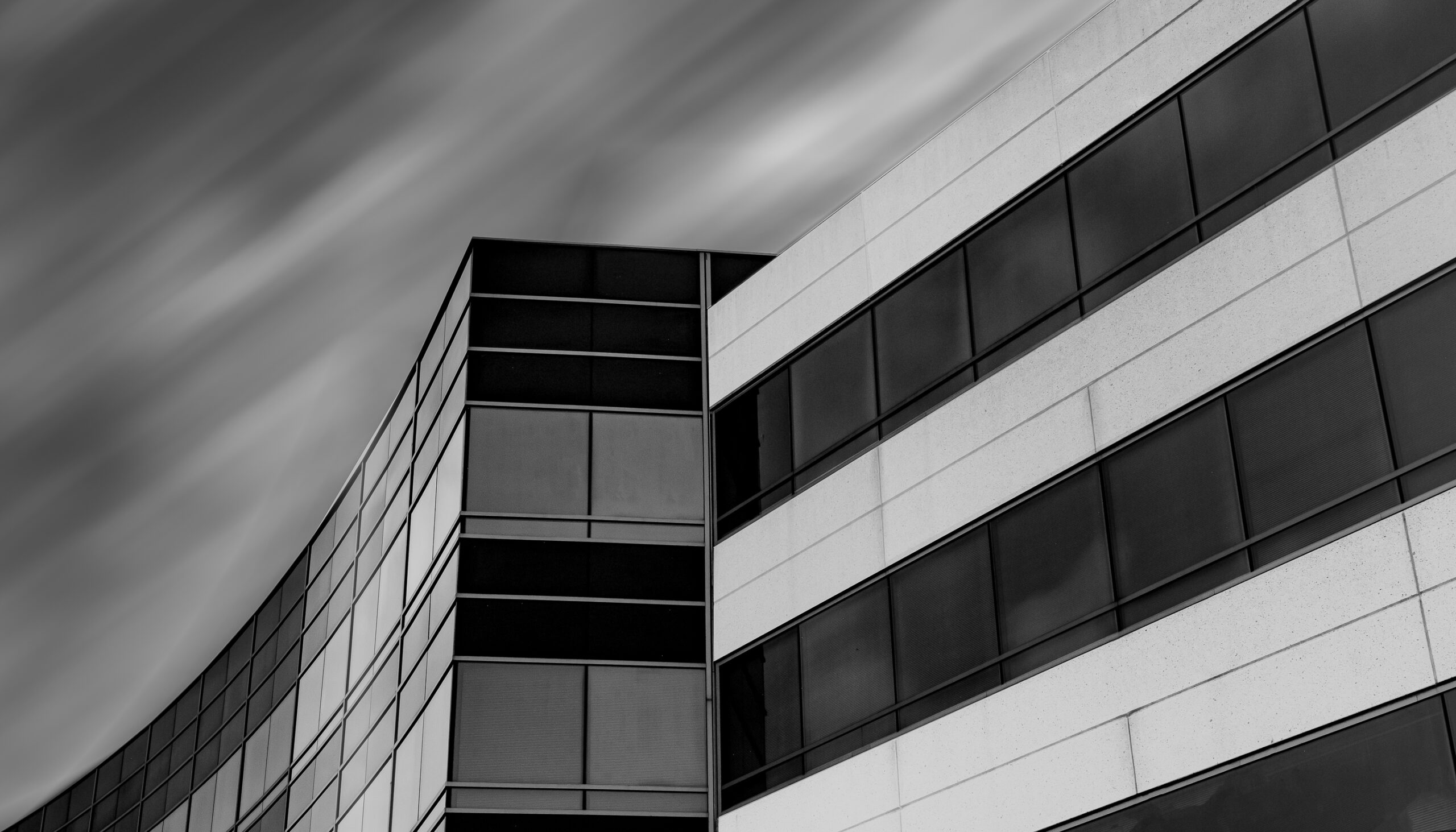
3rd Digital Mono – Susan Chi
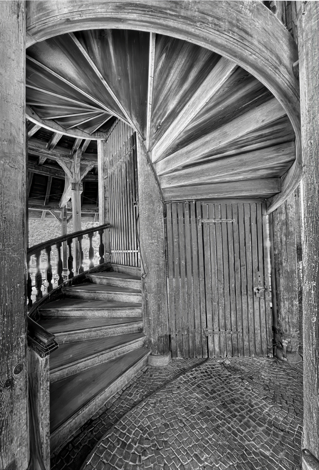
I enjoy the topsy-turvy – above and below scene combines with the textures of the bricks and the wood. Very nice even lighting too.
HM Digital Mono – Susan Poston
It’s so clean! the bright midtones helped this image pop.
HM DIgital Mono – Shannon Leszcynski
I love how such a strong contrast and monochrome presentation abstracts this architectural element so instead of looking at how it contributes to the whole we looks at its basic shapes.
HM Digital Mono – Chris Baker
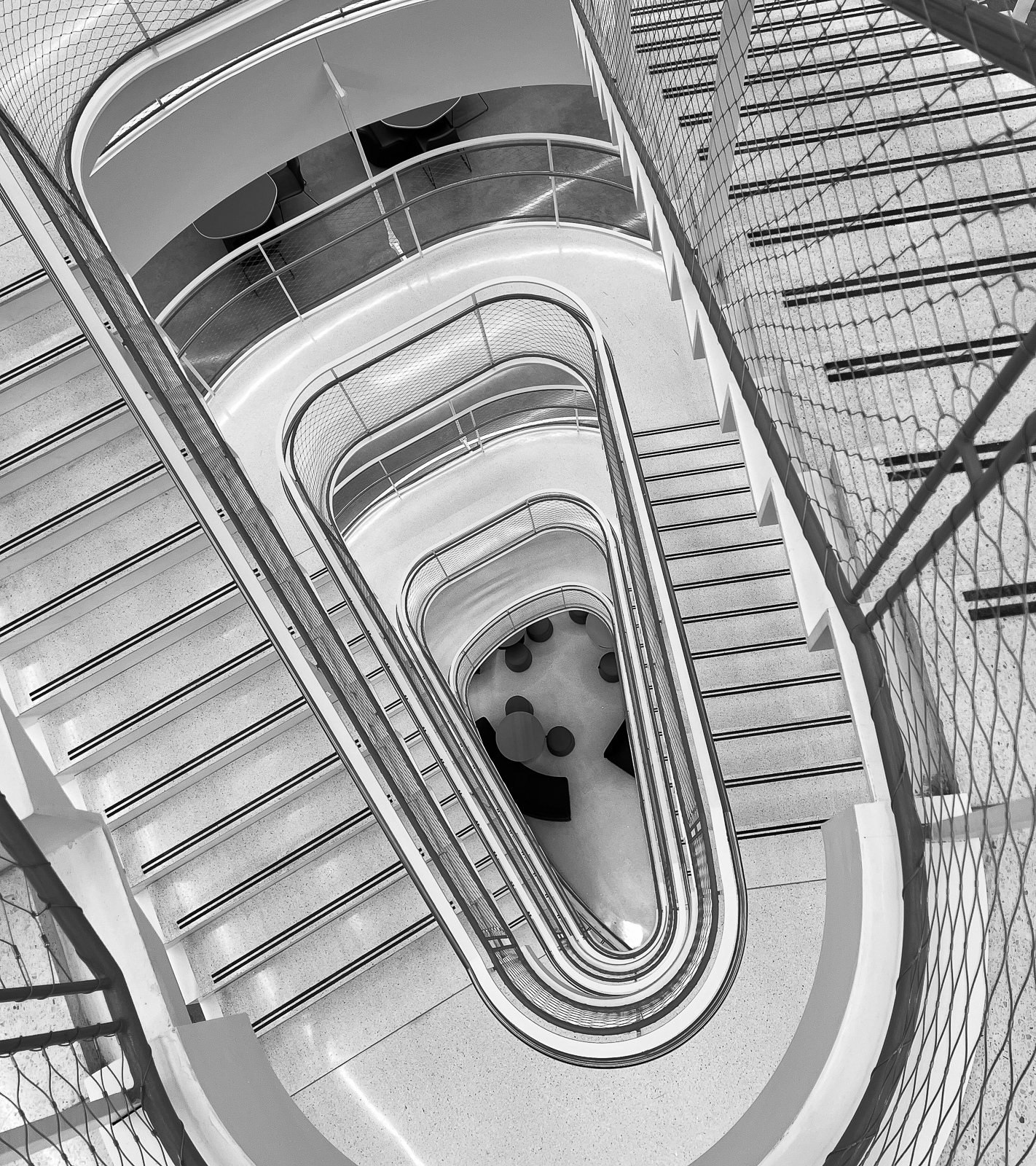
This one is topsy Turvey – am I looking up or down? I like that it engages my curiosity about its unique perspective.
HM Digital Mono – Casey Johnson
The motion of the clouds in the sky streaking past really add to the sense of motion in the architecture of the buildings. While they are (hopefully!) not going anywhere there shape feels like they are swooping along
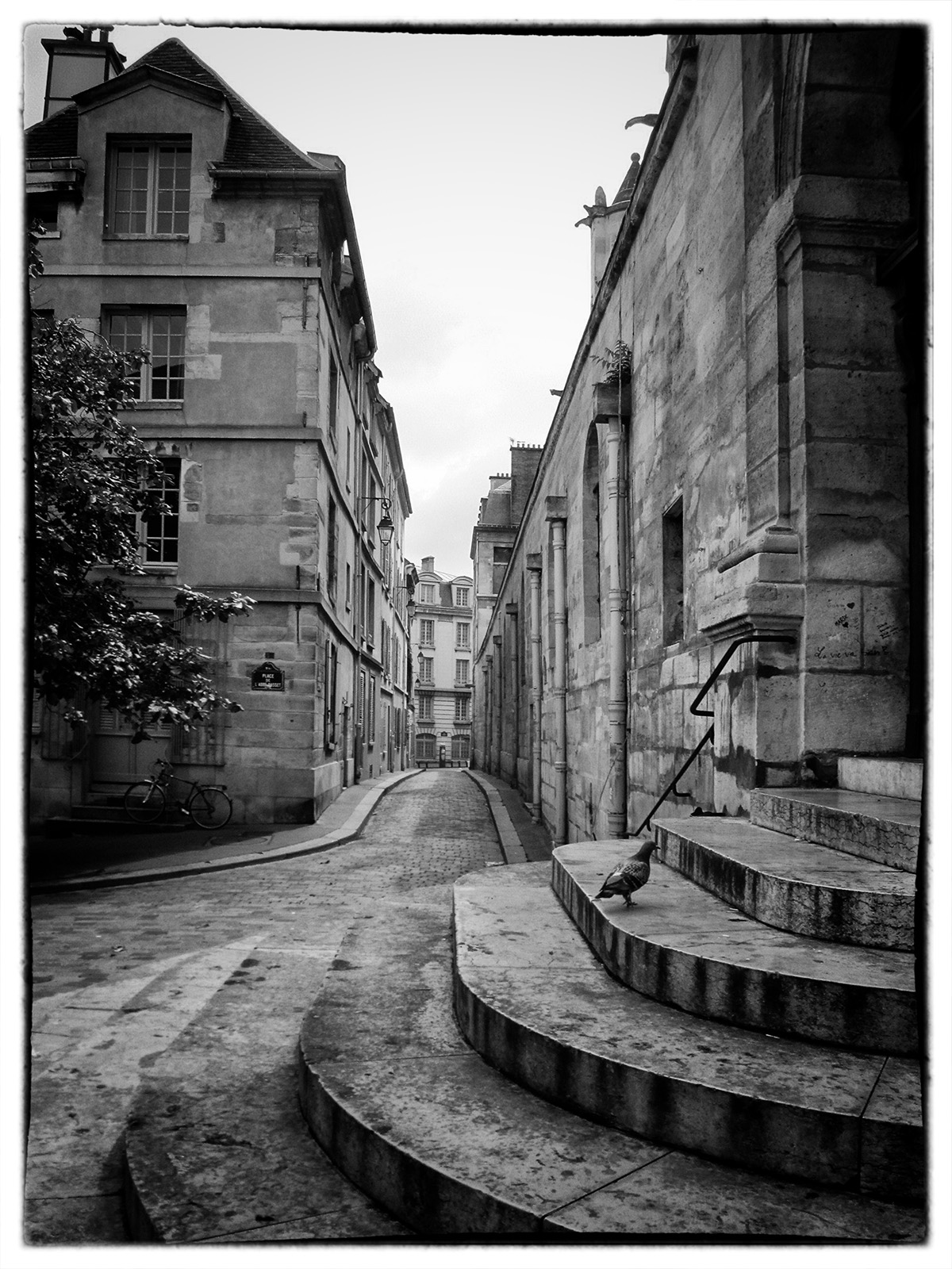
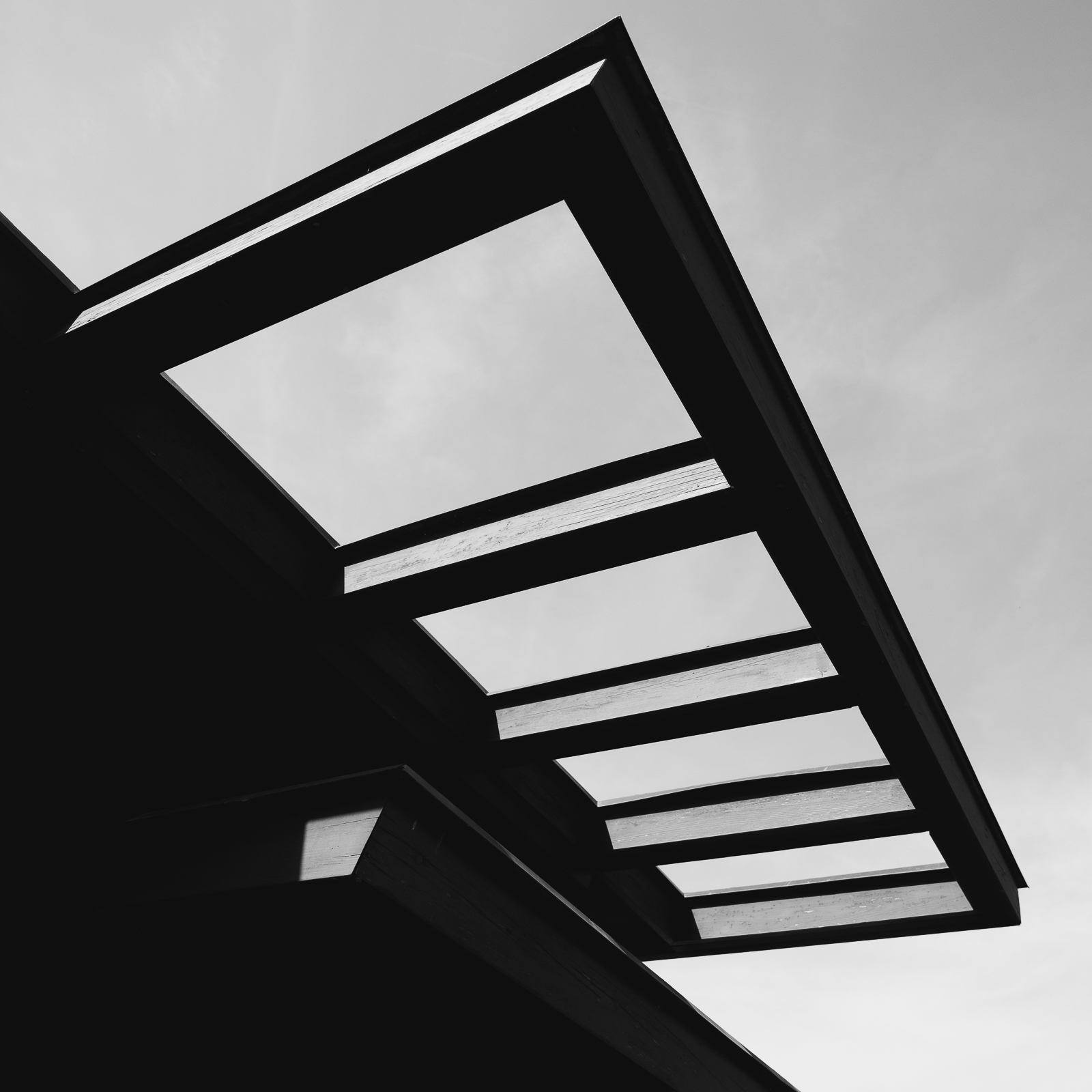
HM Digital Mono – Allen Gary
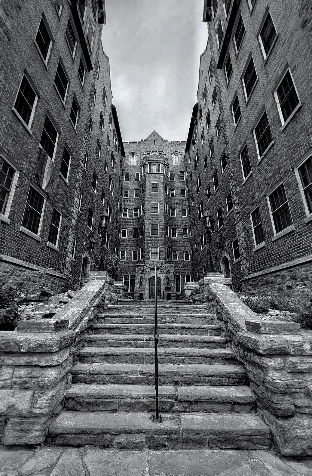
Great foreground-background relationships – Border fits vintage of buildings – leading lines of stair pulls you back the length of the alley which terminates in an interesting site. Bird adds life.
1st Mono Print – Barbara Staggs
2nd Mono Print – Joy Henderson
3rd Mono Print – Emily Saile
HM Mono Print – John Dillingham
HM Mono Print – Doris Leverett

1st Color Print – Henry Smith
2nd Color Print – Doris Leverett
3rd Color Print – Charles Leverett
HM Color Print – Emily Saile
HM Color Print – Barbara Staggs
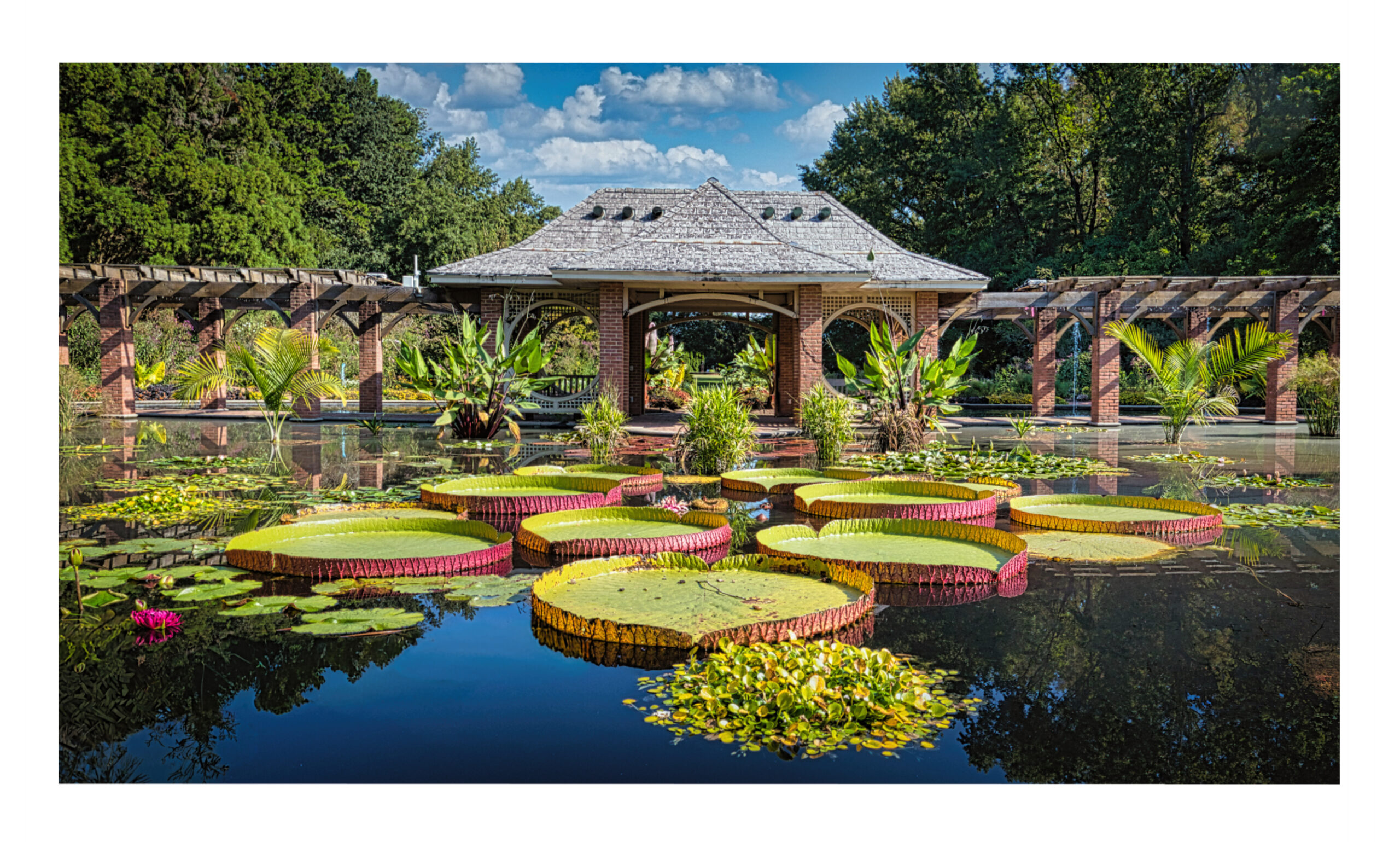
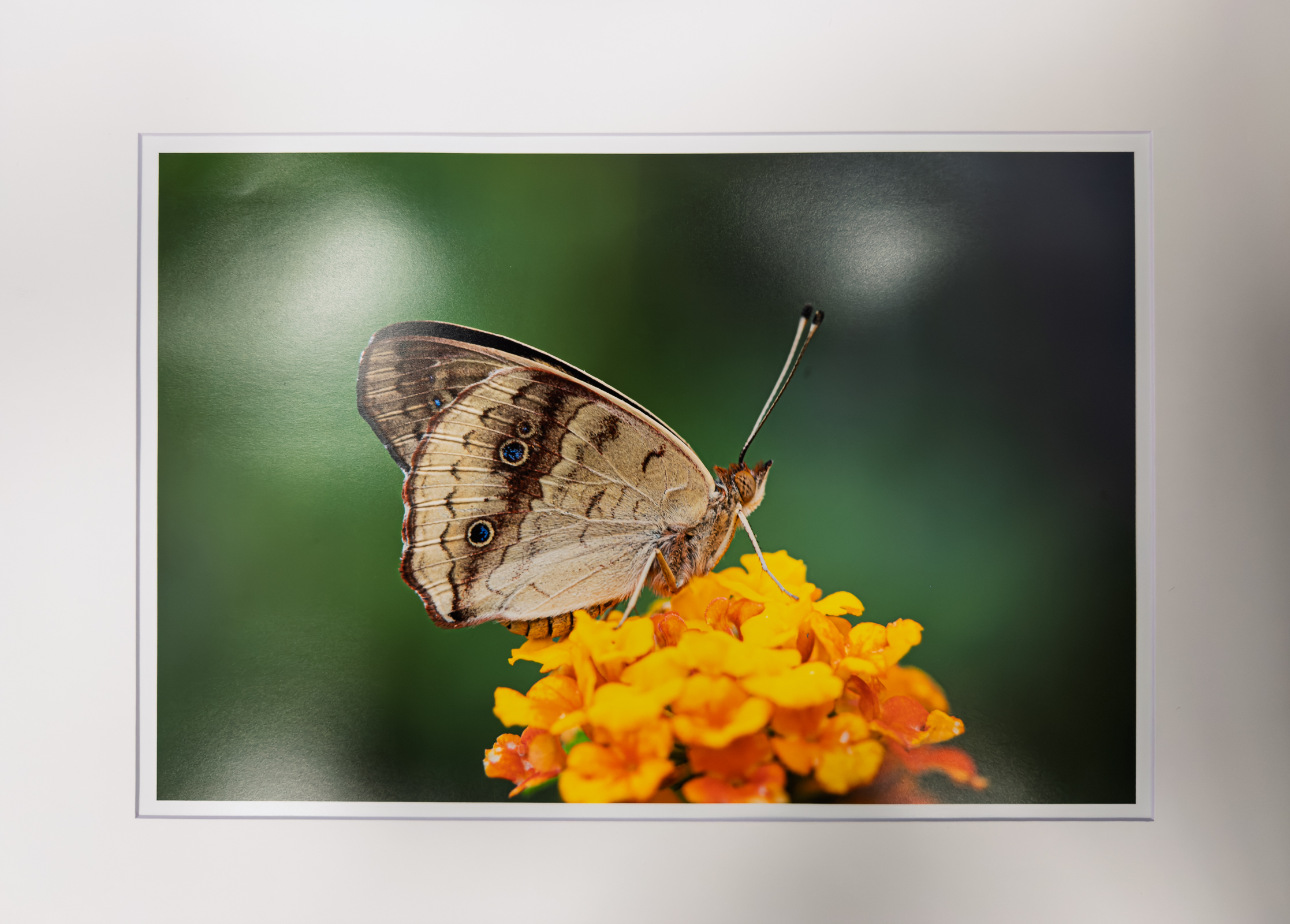
May – “Botanicals/Plants”
Total Entries: 169 ; Color Digital: 65 ; Mono Digital: 51 ; Color Prints: 28 ; Mono Prints: 25 ; Judge: Joe Matus
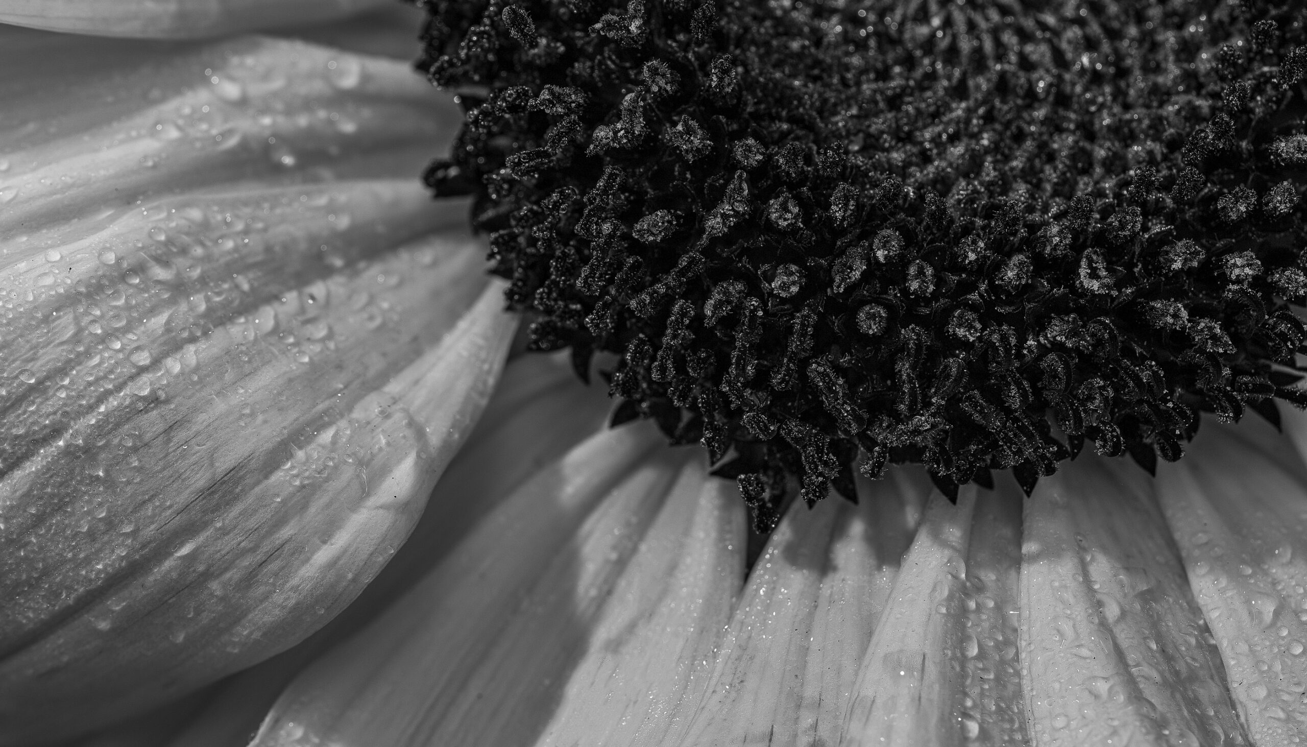
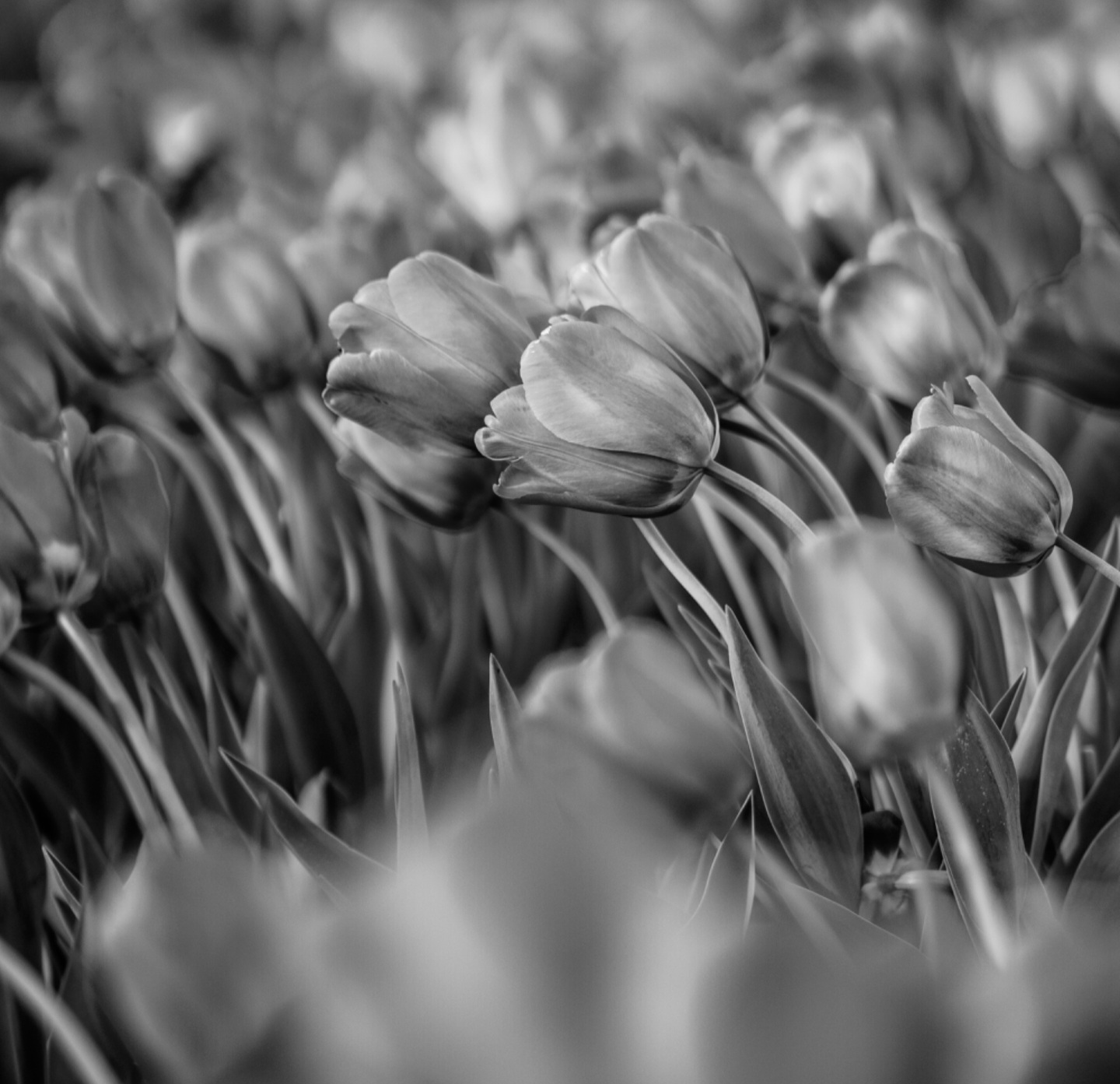
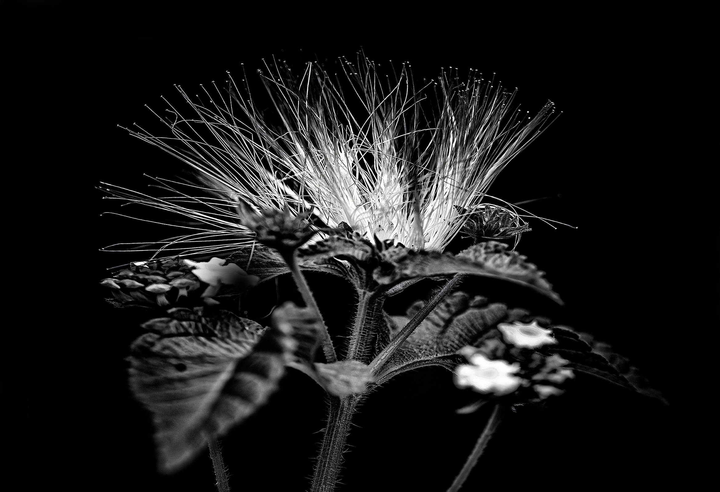
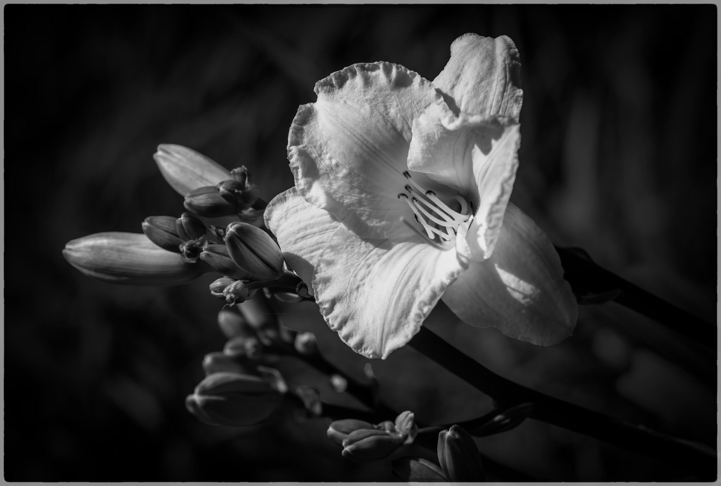
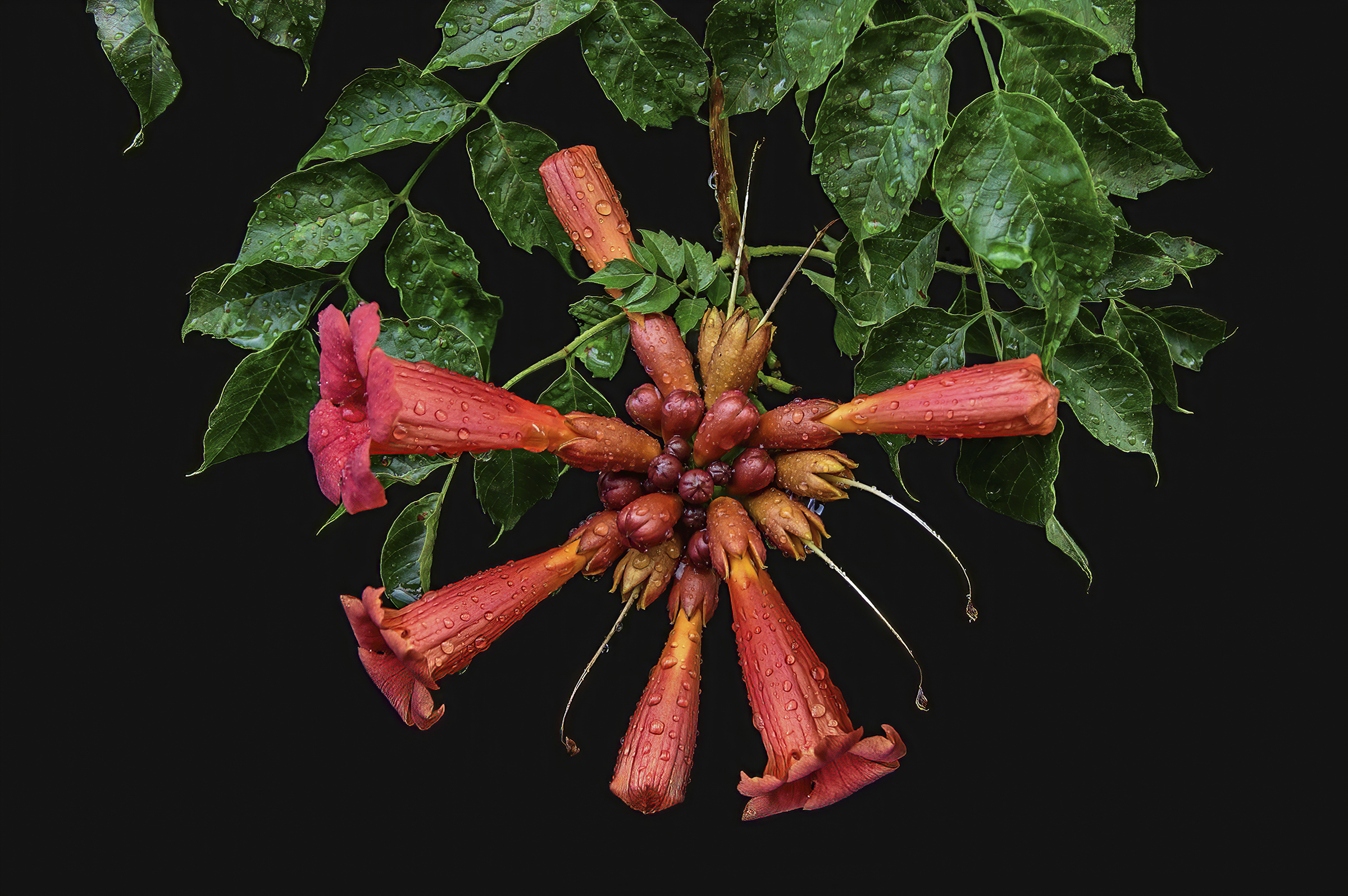
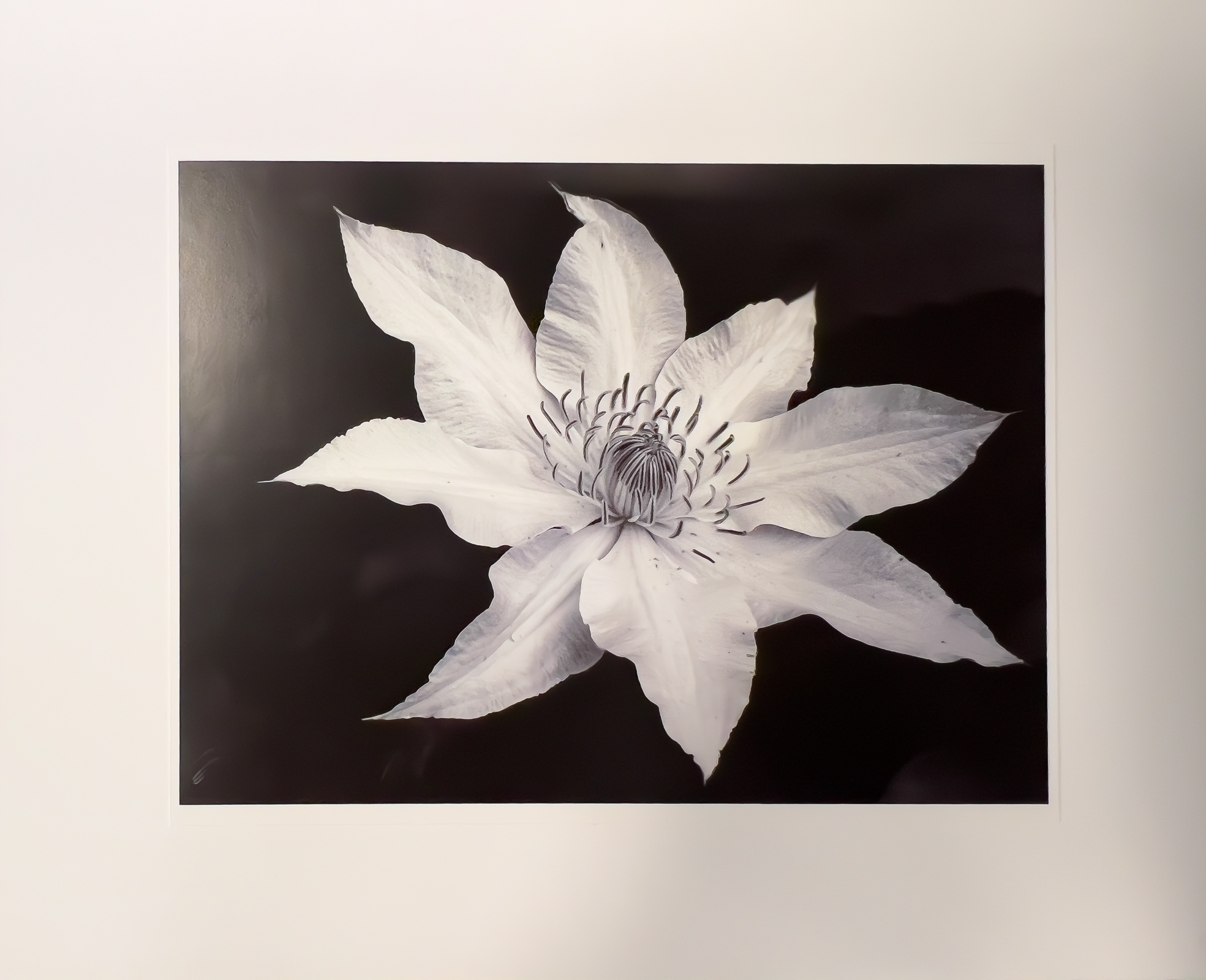
1st Digital Mono – Casey Johnson
Sharp focus and composition with good use of lights and darks to pull in the eye. Lighting is well balanced. Nicely captured fine details of the flower and water droplets help evoke a feeling of fascination and wonder.
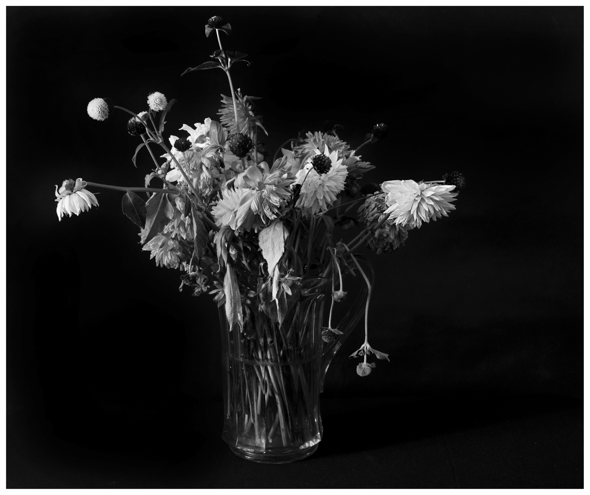
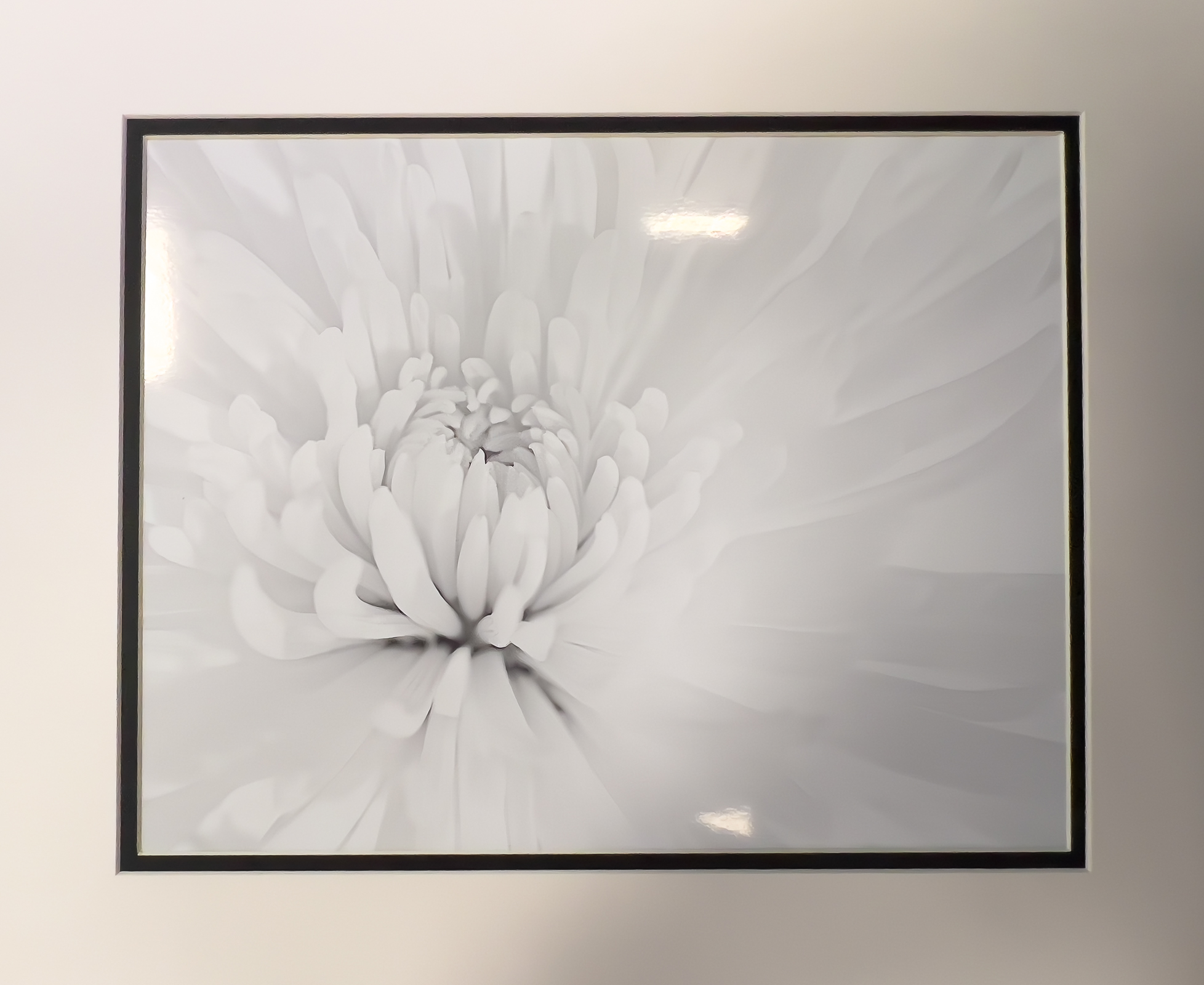
2nd Digital Mono – Julia Gary
An unusual portrait subject, emphasizing the end of life, and raising questions about the life previously lived. Well executed still life with a perfect blend of lighting, sharpness, and contrast to draw attention to fine details.
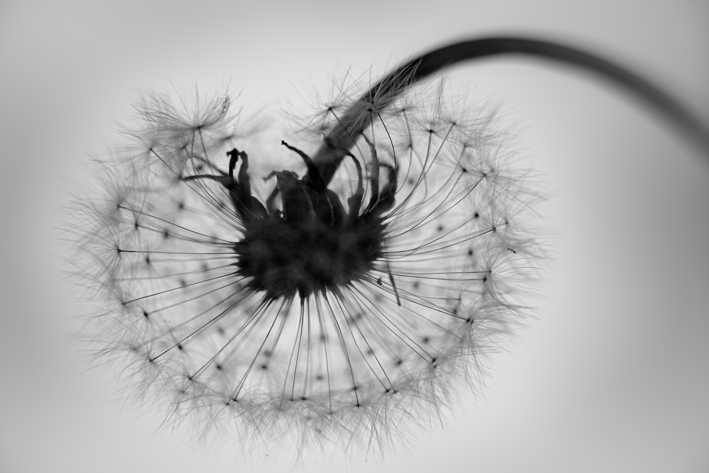
3rd Digital Mono – Kevin Burton
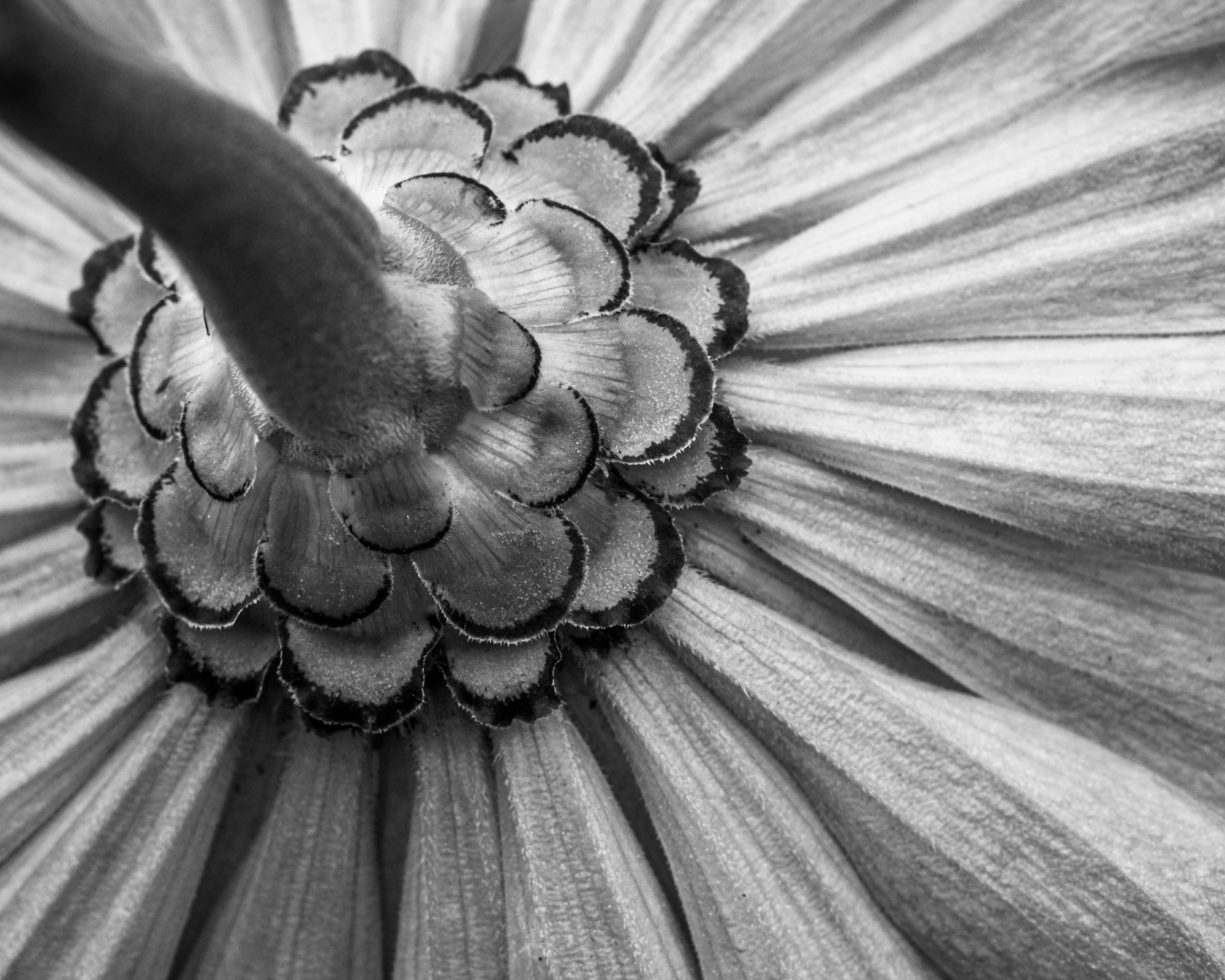
A unique perspective and the looping line of the stem quickly draws the eye’s attention. The sharply defined pappi contrast with the overall soft focus and highlight the fine, delicate details. Reminiscent of an advertising image.

HM Digital Mono – Susan Chi
The image evokes a vision of a heron about to take a drink. Excellent focus and composition with lots of visual interest. Highlights are not blown and darks are well detailed. Subject and it reflection are well balanced across the horizontal axis.
HM Digital Mono – Jim Spinoso
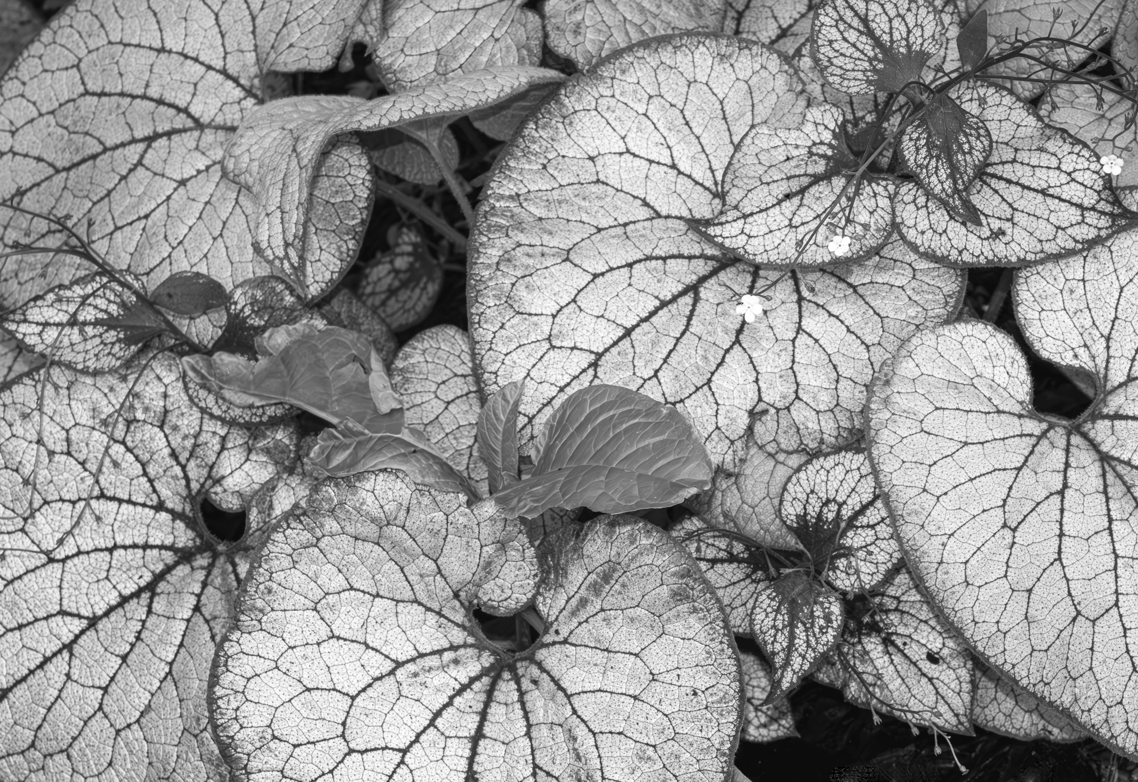
Well balanced lighting, with lots of attention grabbing pattern in the highlights contrasted against the dark leaf veins. Nice sharp focus. Small flowers are strategically placed to catch the attention. The scene has a calming effect.
HM Digital Mono – CT Chi
The highlights of the flower coupled with a dark background immediately draw the eye to the subject. The exposure is excellent, as is focus and image noise, and processing. Great portrait of a beautiful specimen.
HM Digital Mono – Chris Baker
Visually interesting look at an underappreciated side of flowers. Sharp focus, subject placement, leading lines, and light and dark patterning draw the eyes attention.
HM Digital Mono – Alice Searcy
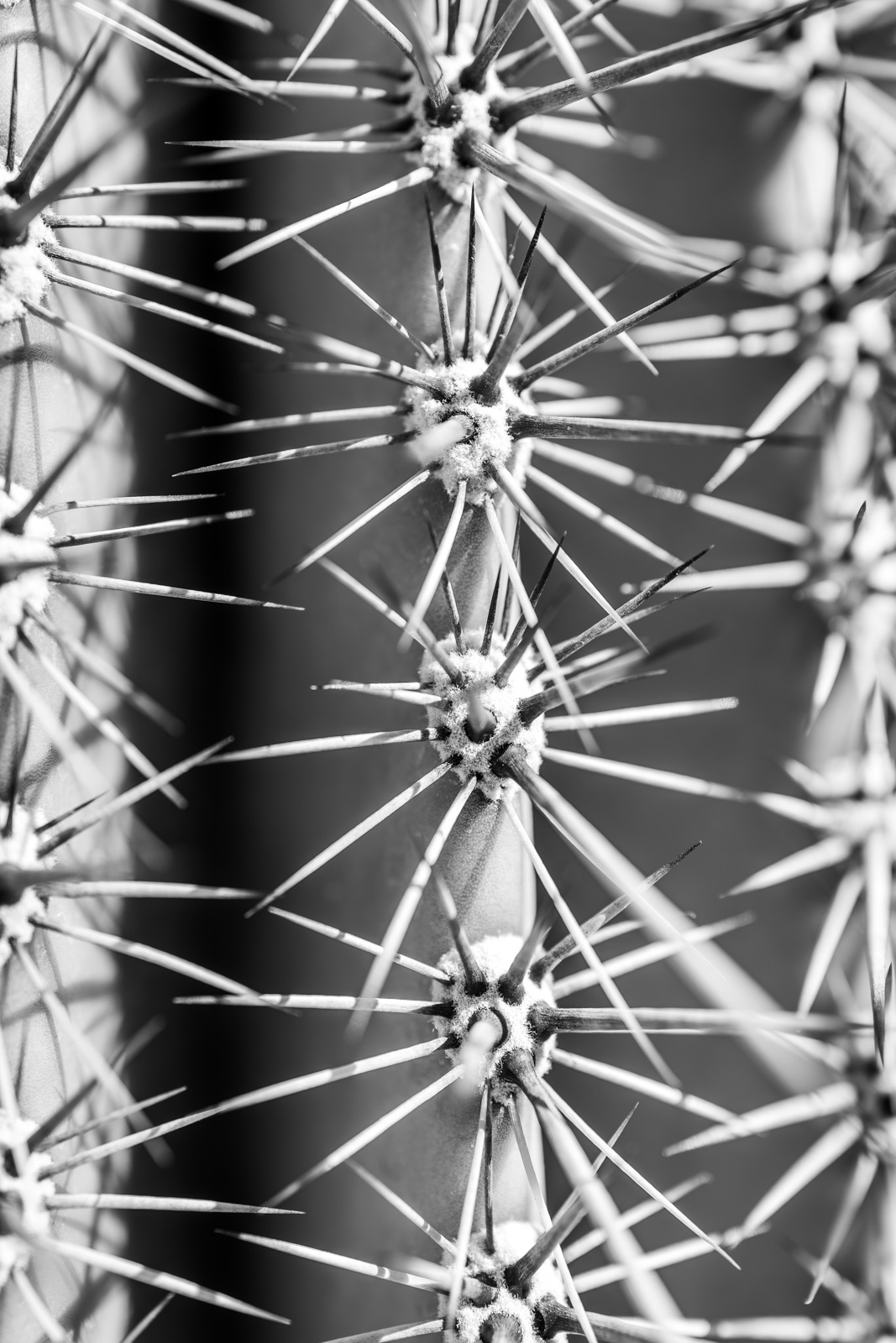
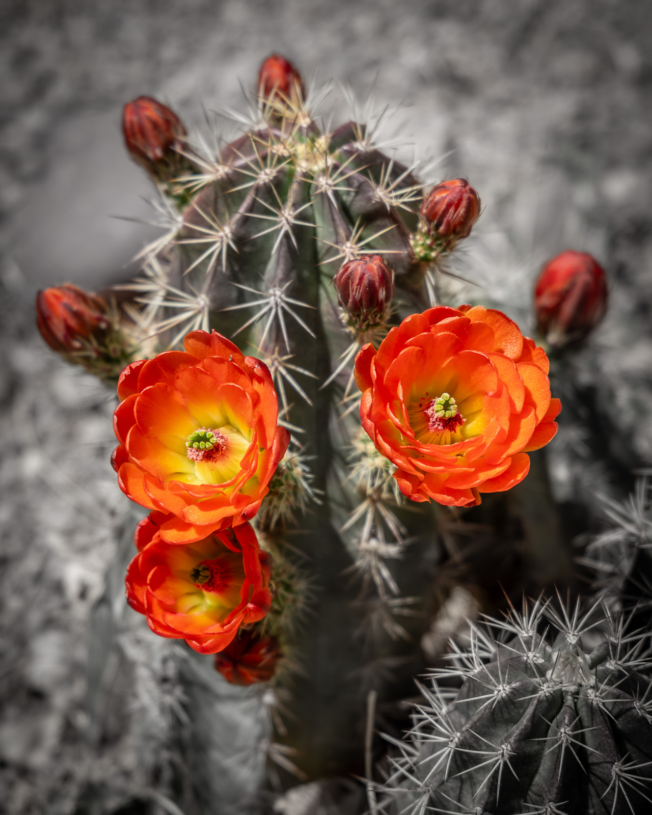
Good use of vertical lines and symmetry to highlight the beautiful, yet uninviting nature of a cactus. Nice focus, and good contrast emphasize the needles. The image would benefit from sharper detail on the right and less highlight on the left.

1st Digital Color – Jack Eidson
Great use of leading lines, subject placement, and lighting to direct the eye. Good use of dark background, free of distractions. The image tells the story of the simple, yet complex forms in nature.
2nd Digital Color – Carol Eidson
Great lighting, excellent sharp focus throughout the depth of field, and striking colors and textures. The leading lines of the flowers immediately draw in the eye. The colors and sharpness simultaneously evoke images of Christmas and summer.

3rd Digital Color – Susan Poston
Nice demonstration of the rule of thirds to highlight the resting dragonfly. The subject is in sharp focus, and the blue highlights contrast with the background to draw the eye. The image evokes the feeling of being in a forest on a summer day.
HM Digital Color – Tom Johnson
Nice capture showing the interplay between plant and insect. Good lighting and subject placement with use of a diagonal. Background blur helps isolate the subject but could be more blurred to the left of the flower.
HM Digital Color – Shannon Leszynski
Perfectly executed. Nice use of diagonal leading lines. Color tones and lighting are excellent, as is sharpness and overall processing.
HM Digital Color – Michael Cox
The image evokes a feeling of tranquility. Good use of a horizontal division of the frame to highlight the flowers and their reflection. The background has some distractions that could be darkened or cloned out to strengthen the subject.

HM Digital Color – Chris Baker
Interesting visual perspective using a bright highlight (sun star) to pull the eye into the scene. Lovely colors and textures. The viewer feels part of the scene. The image might be stronger if rotated slightly clockwise for more vertical stems.

HM Digital Color – Chris Baker
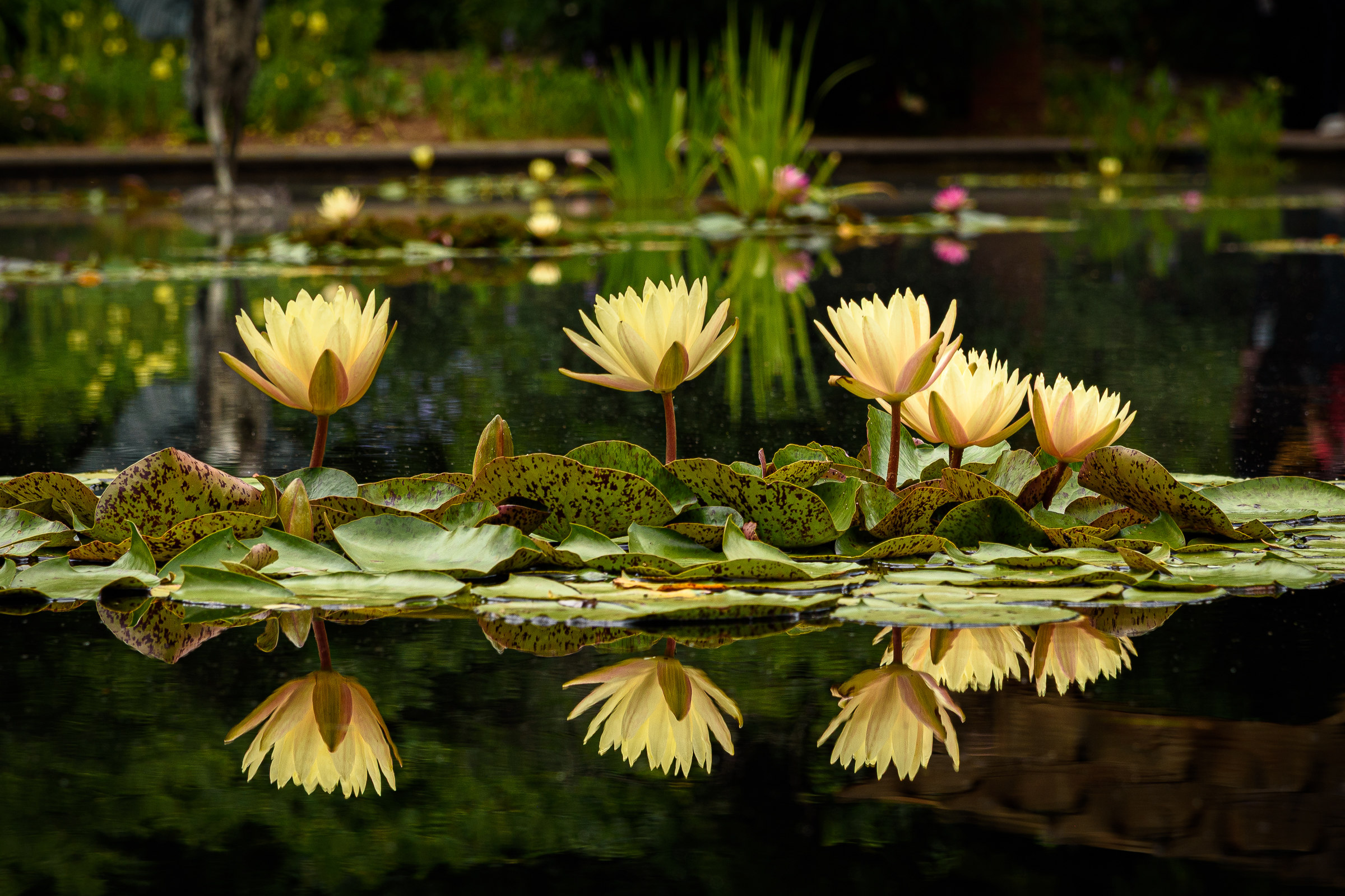
Very well executed.Good use of lighting and exposure to create a well balanced portrait. The subject and reflection neatly split the image in half, highlighting the beauty of this flower from both above and below. The image evokes a feeling of calm.

HM Digital Color – Casey Johnson
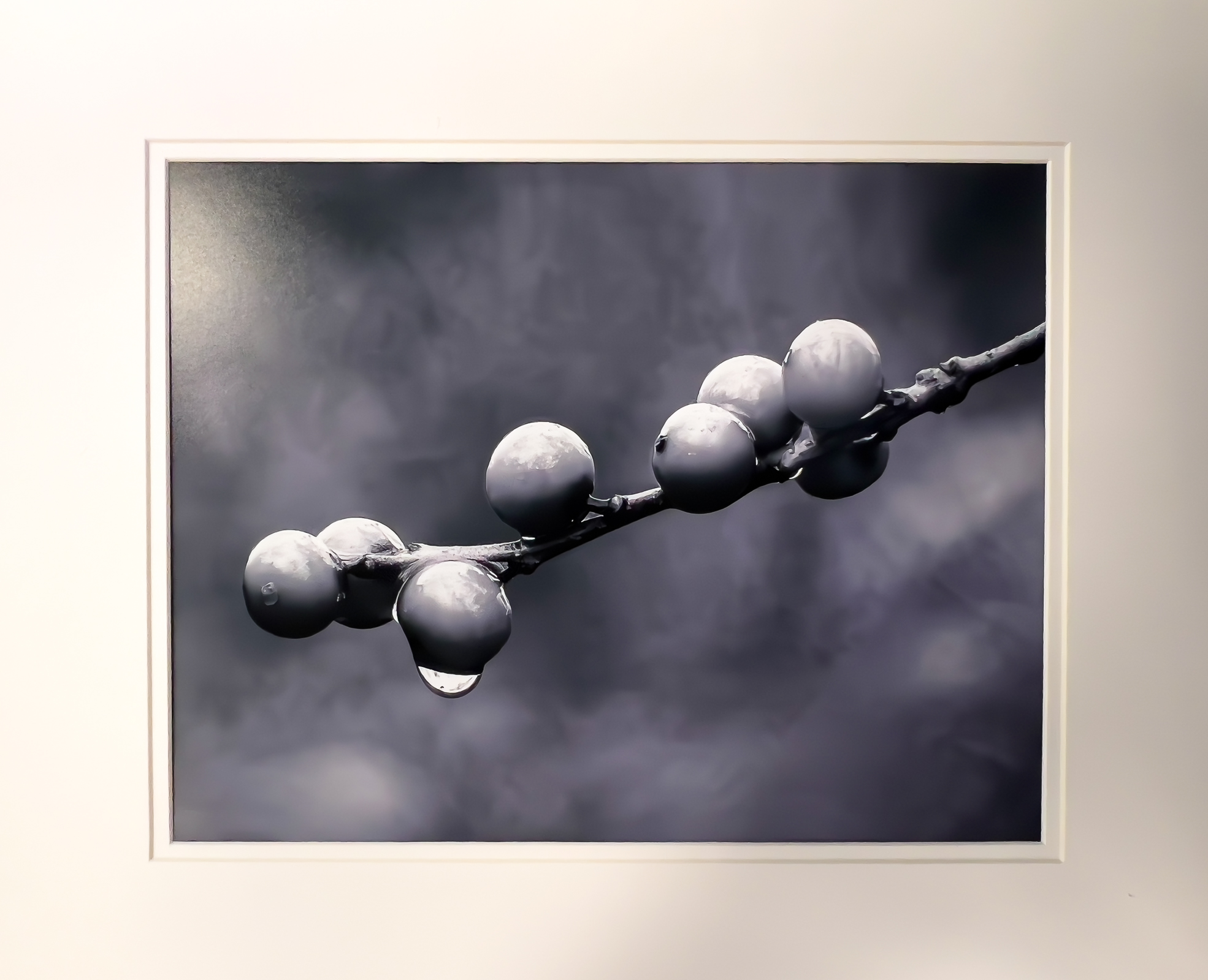
Striking closeup with excellent details of the water droplets. The image evokes a feeling of a cool dewy morning in the garden. Some darkening of the background highlights would help better emphasize the bud.
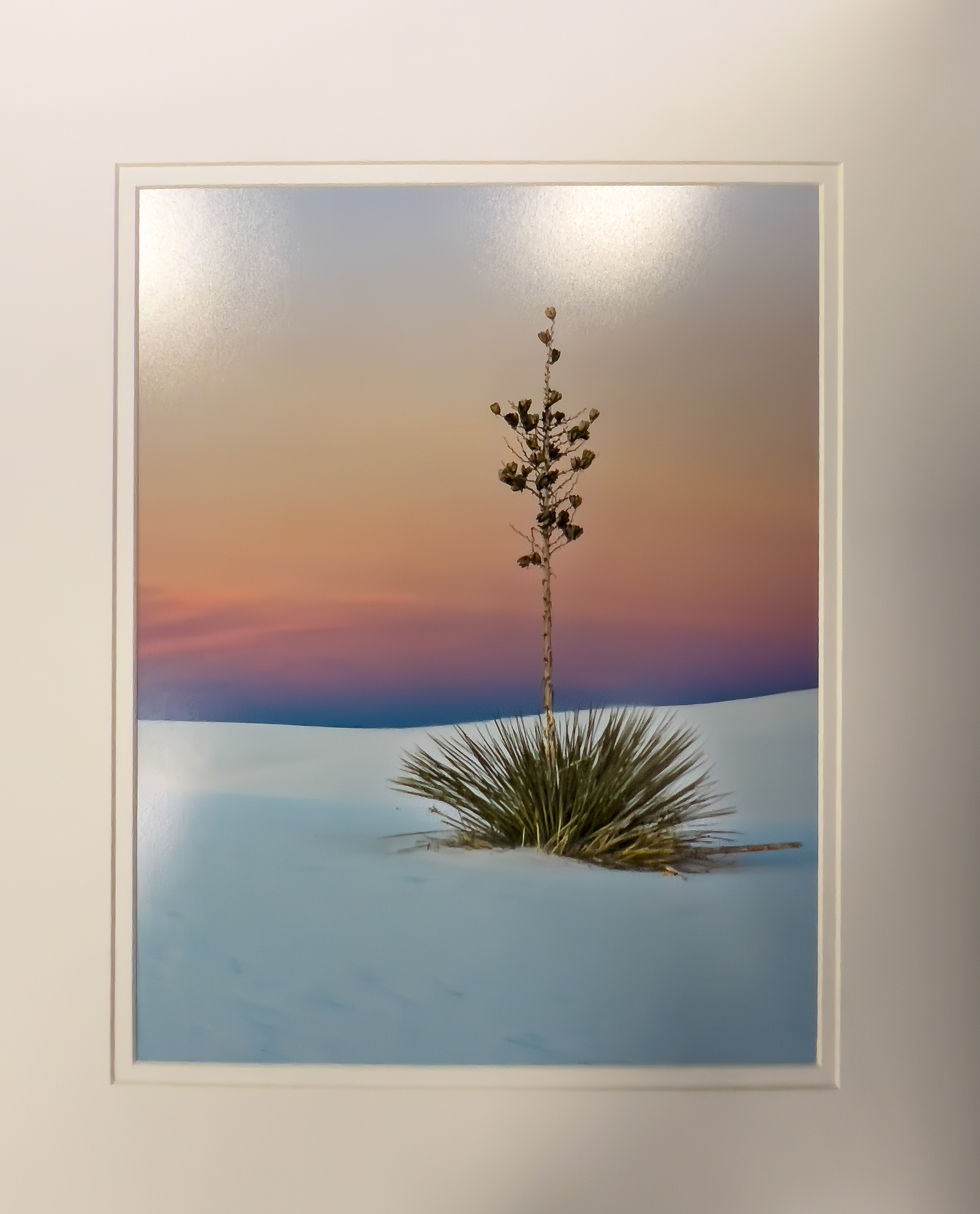
HM Digital Color – Alice Searcy
Interesting use of de-saturation of the background to emphasize the flowers to say “here we are”! The cactus feels like it leans slightly left. A small rotation would strengthen the image, as may a vignette or some darkening of the background.
1st Mono Print – Doris Leverett
2nd Mono Print – Doros Leverett
3rd Mono Print – Mike Cook
HM Mono Print – Ricky Pounders
HM Mono Print – Joy Henderson
HM Mono Print – Barbara Staggs
1st Color Print – Joy Henderson

2nd Color Print – Emily Saile
2rd Color Print – Mike Cook
HM Color Print – Kate Deal
HM Color Print – Eddie Sewall
HM Color Print – Bob Gathany
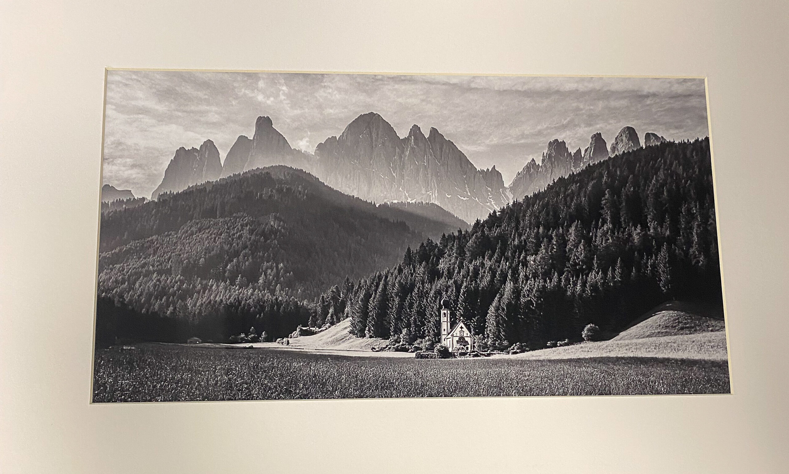
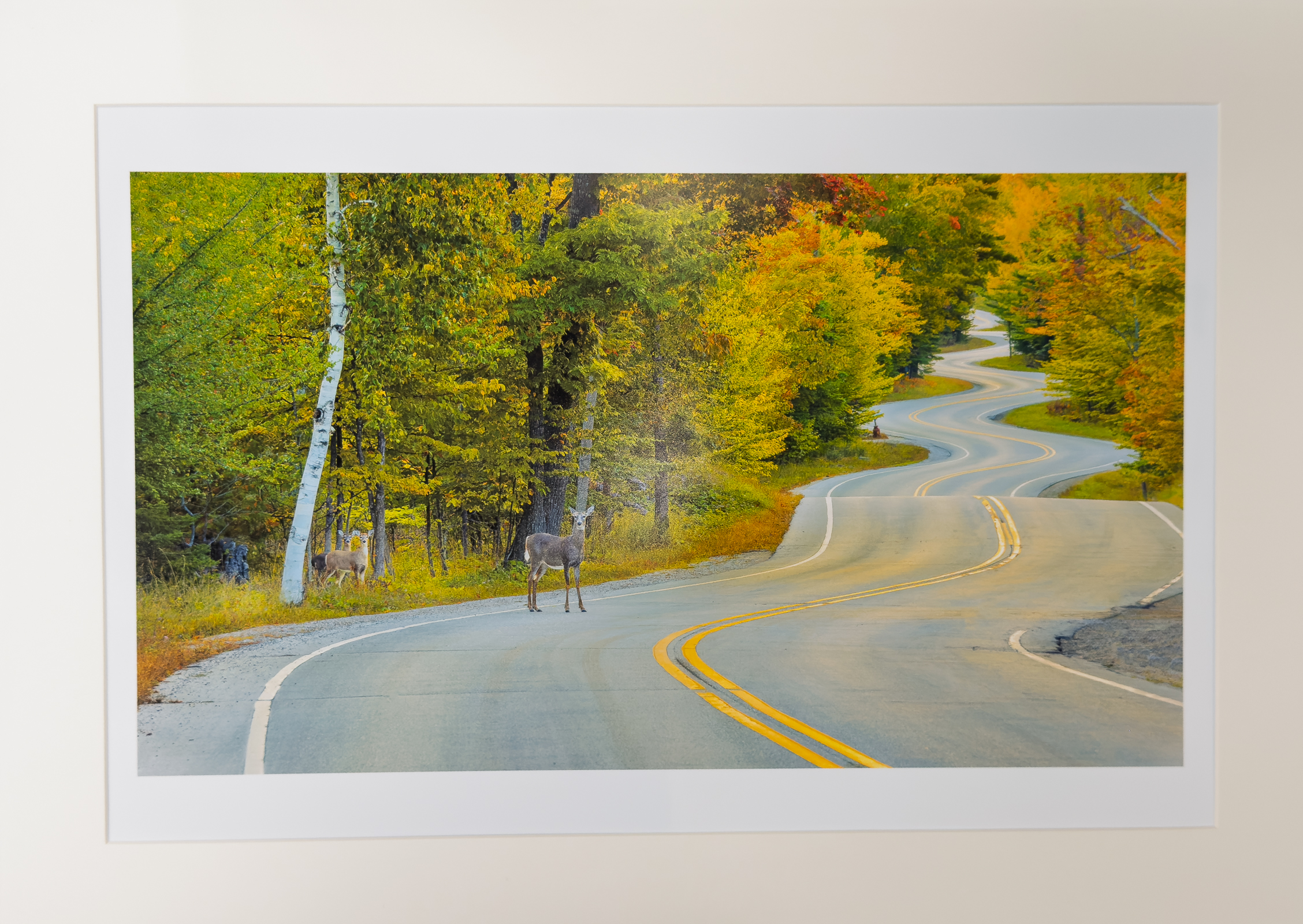
June – “No. Alabama / So. Tennessee”
Total Entries: 114 ; Color Digital: 43 ; Mono Digital: 33 ; Color Prints: 21 ; Mono Prints: 17 ; Judge: Mary Beth Johns
1st Mono Print – Doris Leverett
2nd Mono Print – Tom Bryant
3rd Mono Print – Emily Saile
HM Mono Print – Barbara Staggs
HM Mono Print – Barbara Staggs
1st Color Print – John Dillingham
2nd Color Print – Joy Henderson
3rd Color Print – Casey Johnson
HM Color Print – Tom Bryant
HM Color Print – Barbara Staggs
1st Digital Mono – Allen Gary
2nd Digital Mono – Allen Gary
3rd Digital Mono – Mat Bevill
HM Digital Mono – William Farnsworth
HM Digital Mono – Carol Eidson
HM Digital Mono – Alice Searcy

1st Digital Color – Michael Cox

2nd Digital Color – Carolyn Spinoso
3rd Digital Color – Casey Johnson
HM Digital Color – Susan Chi

HM Digital Color – Jim Spinoso
HM Digitsl Color – Julia Gary
HM Digital Color – Jack Eidson
July – “Open”
Total Entries: 151 ; Color Digital: 57 ; Mono Digital: 52 ; Color Prints: 22 ; Mono Prints: 20 ; Judge: Patrick Oden

1st Digital Color – CT Chi
2nd Digital Color – Jim Spinoso

3rd Digital Color – Susan Poston
HM Digital Color – Mike Cook
HM Digital Color – Tom Johnson
HM Digital Color – Susan Chi
HM Digital Color – Philip Hallmark
HM Digital Color – Emily Saile
HM Digital Color – Allen Gary

1st Digital Mono – Jane Reneau
2nd Digital Mono – Allen Gary
3rd Digital Mono – Mike Cook
HM Digitla Mono – Chris Baker
HM Digital Mono – William Farnsworth
HM Digital Mono – Virginia Gilbert

HM Digital Mono – Jack Eidson
HM Digital Mono – Allen Gary
HM Mono Print – Emily Saile
1st Mono Print – Joy Henderson
2nd Mono Print – Joy Henderson
3rd Mono Print – Doris Leverett
HM Mono Print – Charles Leverett
1st Color Print – Barbara Staggs
2nd Color Print – Joy Henderson
3rd Color Print – Casey Johnson
HM Color Print – Doris Leverett
HM Color Print – C Ashby
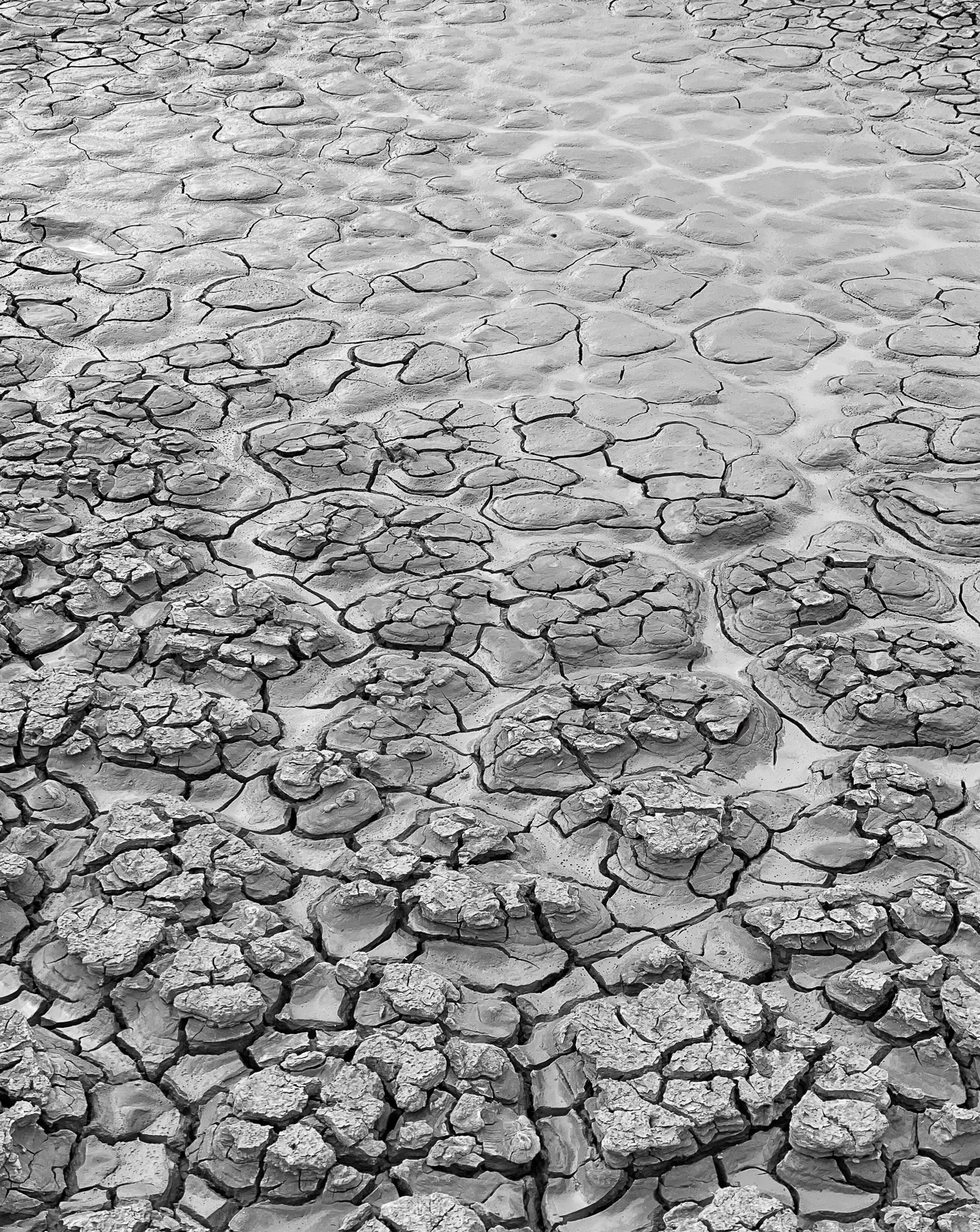
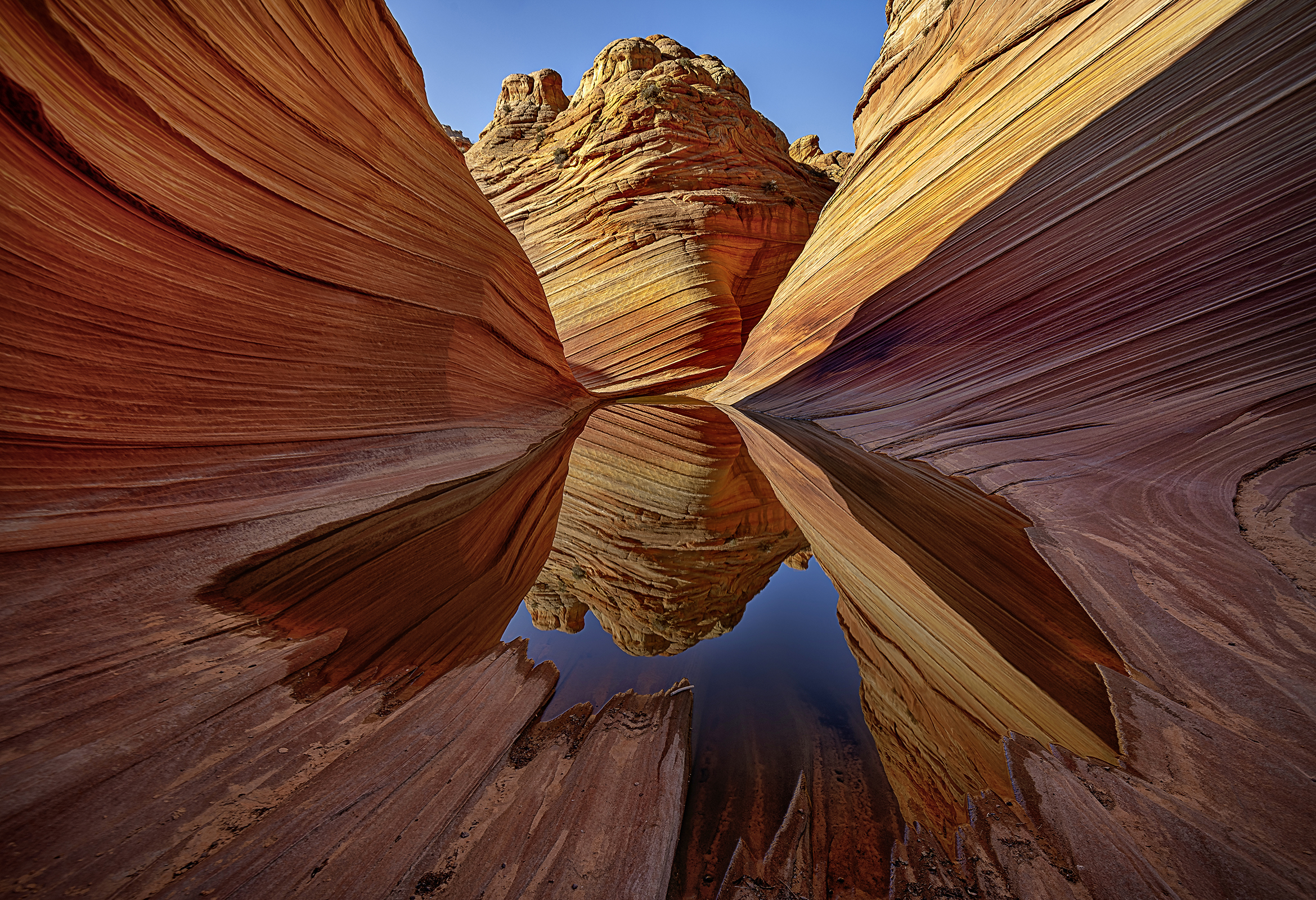
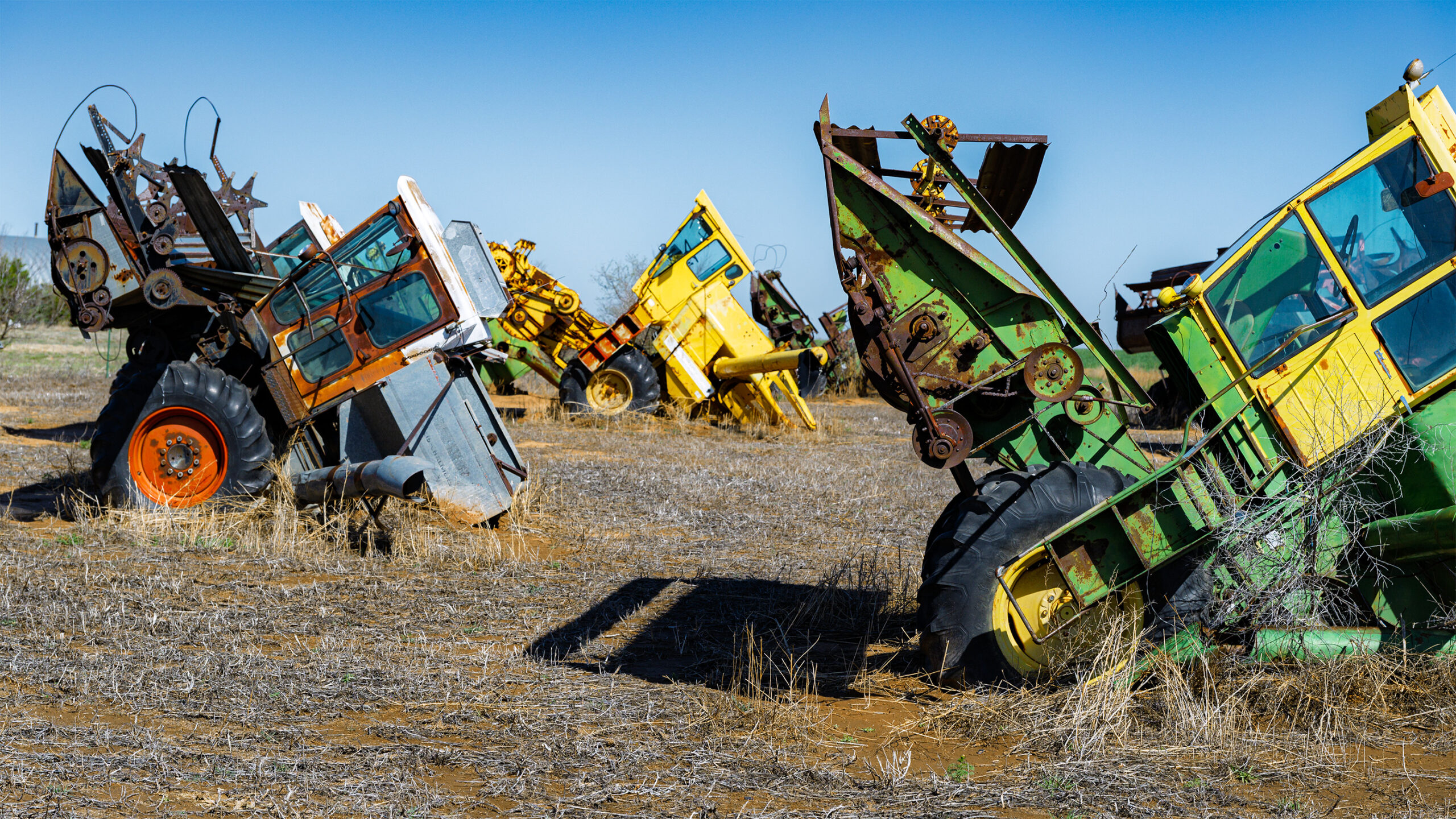
August – “Formations”
Total Entries: 142 ; Color Digital: 54 ; Mono Digital: 47 ; Color Prints: 21 ; Mono Prints: 20 ; Judge: Muril Robertson
1st Digital Color – Susan Chi
2nd Digital Color – Casey Johnson
3rd Digital Color – John Shriver
HM Digital Color – Casey Johnson
HM Digital Color – Mike Cook
HM Digital Color – Eric Deylius

HM Digital Color – CT Chi
HM Digital Color – Susan Poston
1st Digital Mono – Mat Bevill
2nd Digital Mono – Chris Baker
3rd Digital Mono – Emily Saile
HM Digital Mono – Tyrell Jemison
HM Digital Mono – Susan Poston

HM Digital Mono – Jack Eidson
HM Digital Mono – CT Chi
HM Digital Mono – Allen Gary
1st Mono Print – Charles Leverett
2nd Mono Print – Casey Johnson
3rd Mono Print – L Deal
HM Mono Print – Joy Henderson

HM Mono Print – Doris Leverett
1st Color Print – Eric Deylius
2nd Color Print – Emily Saile
3rd Color Print – Henry Smith
HM Color Print – Tom Bryant
HM Color Print – Charles Leverett
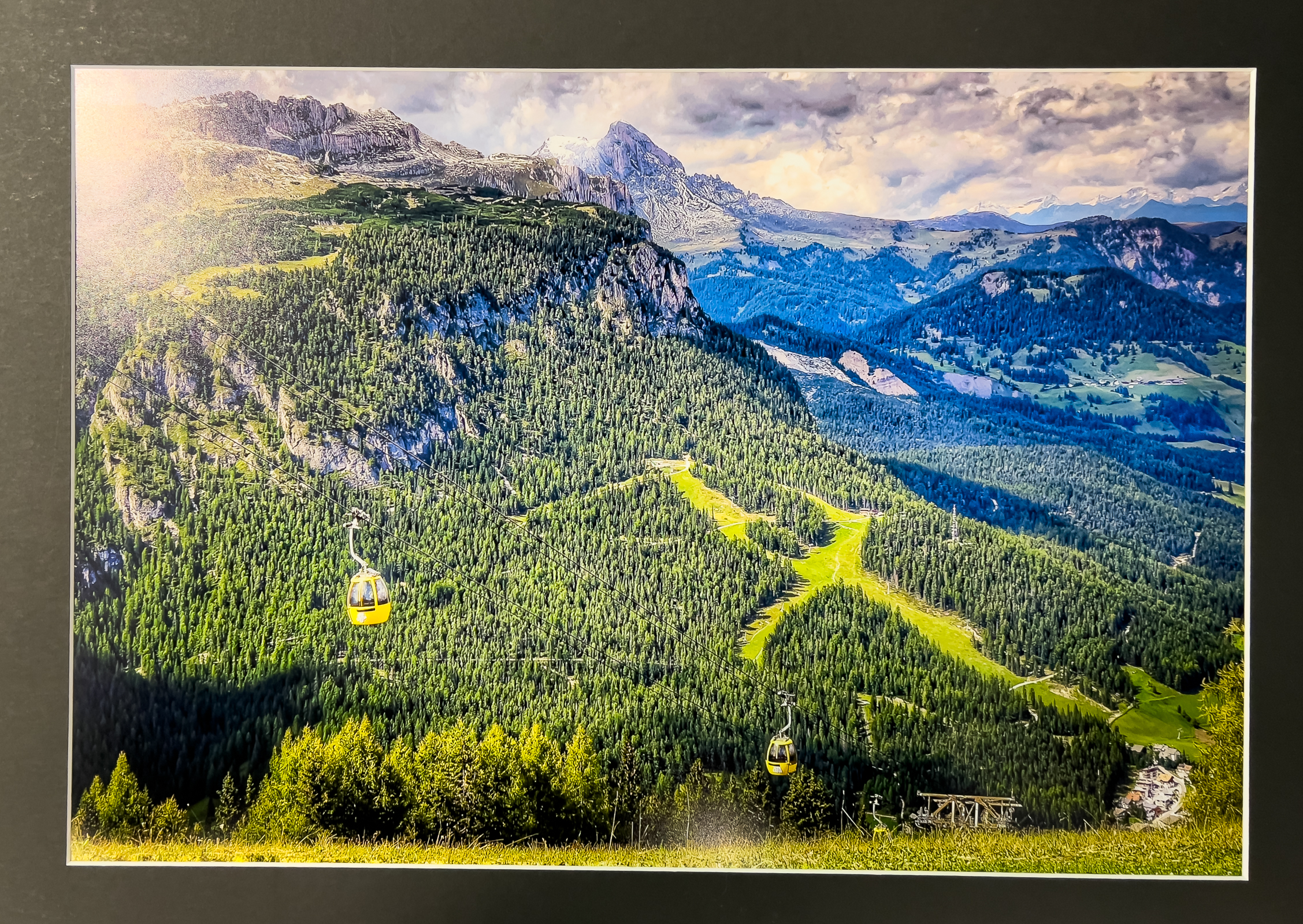
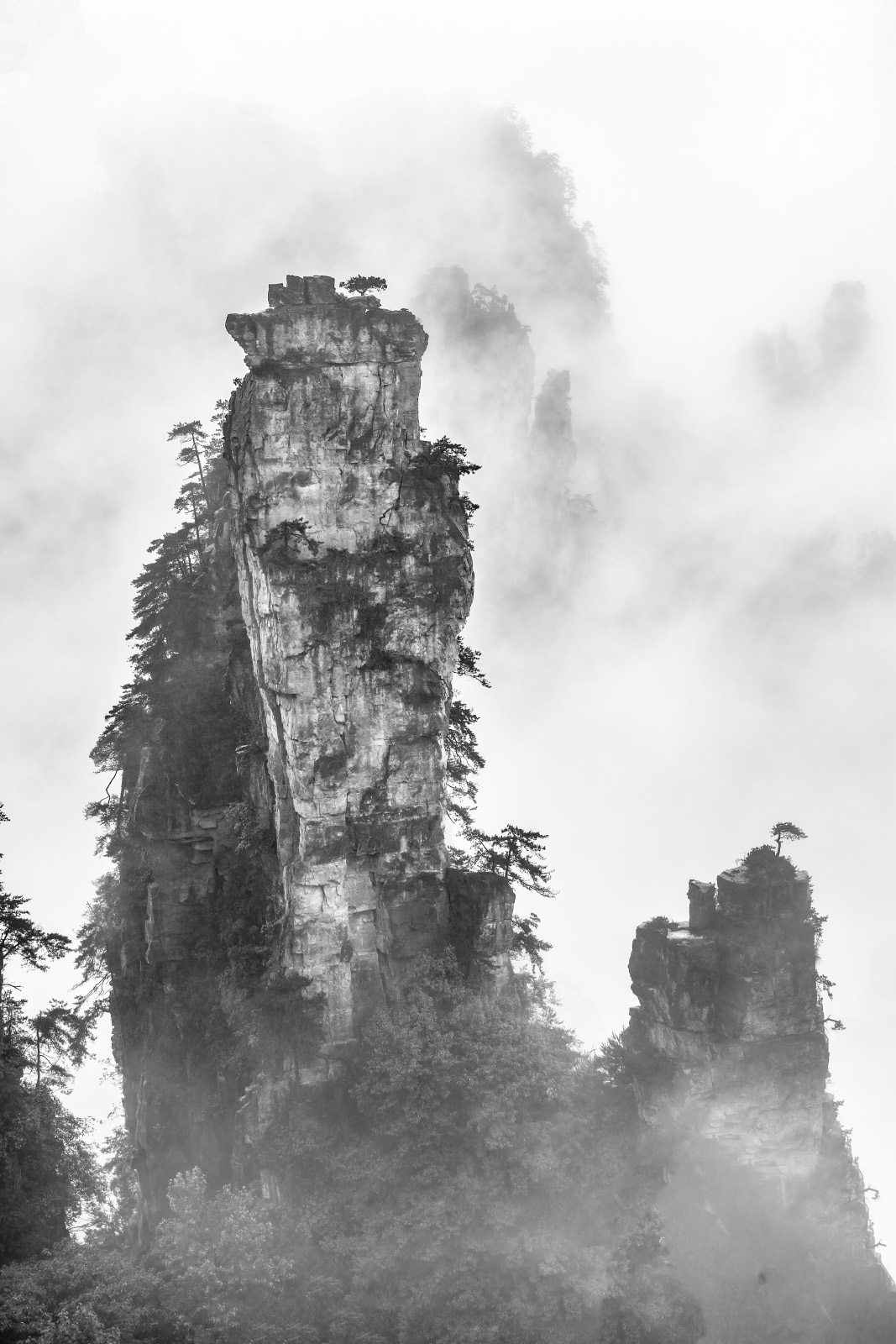
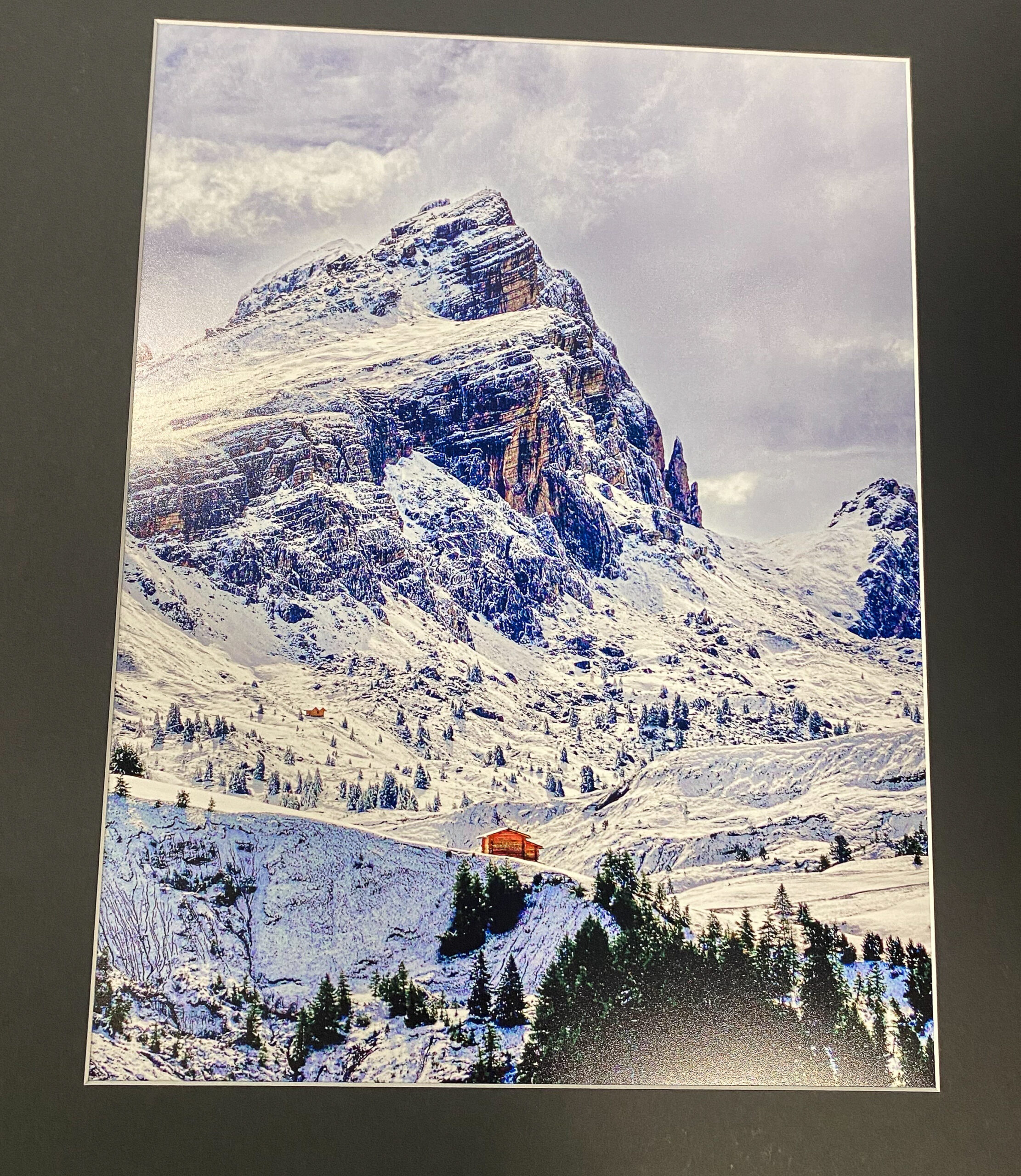
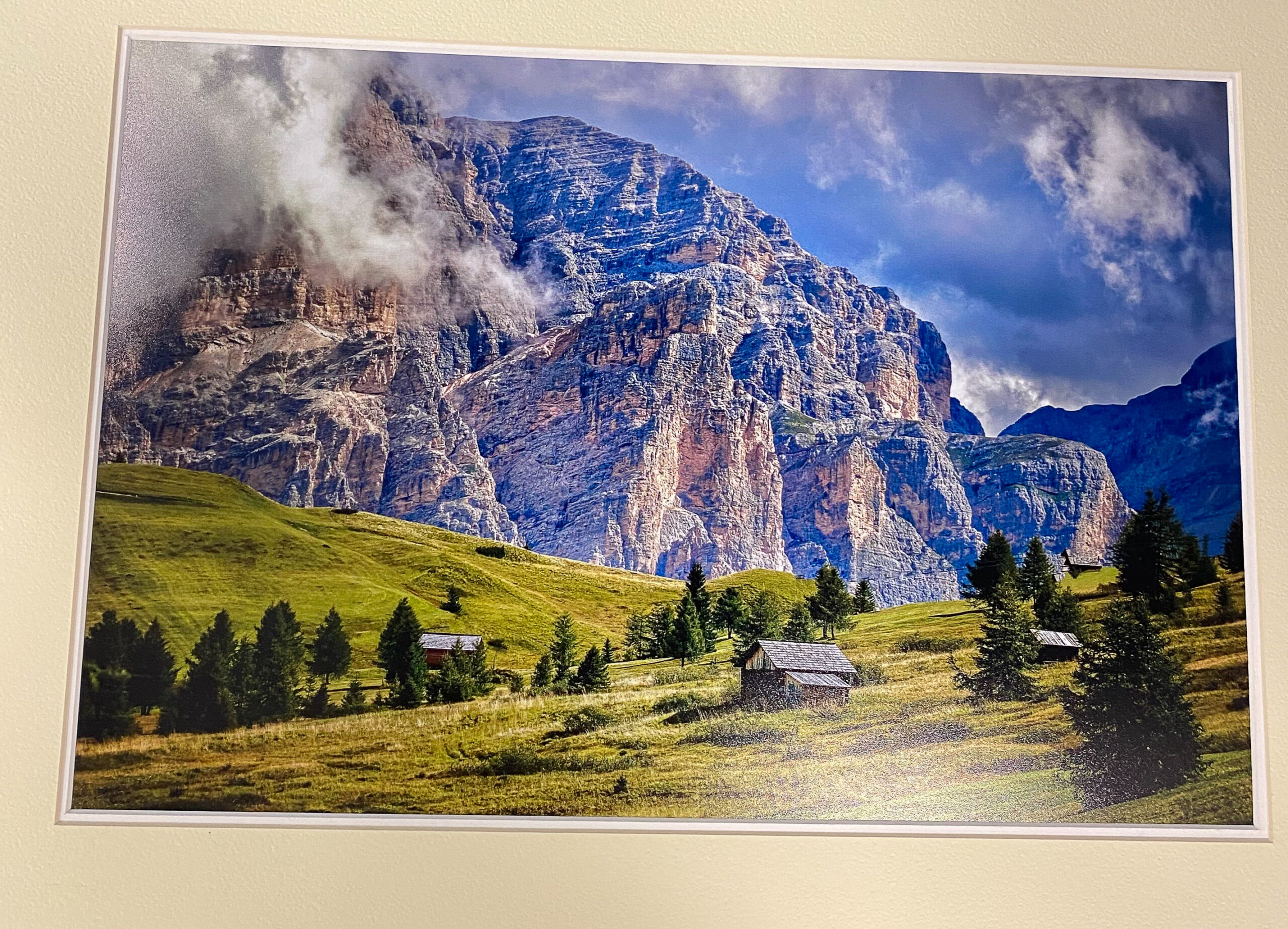
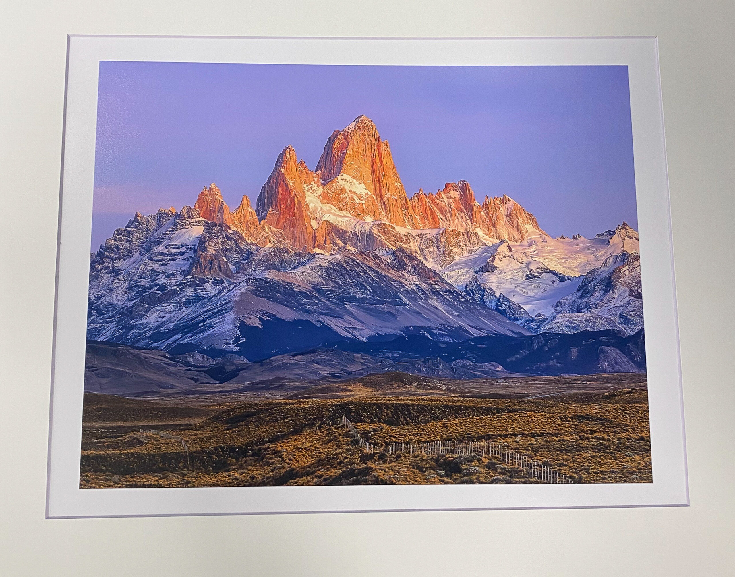
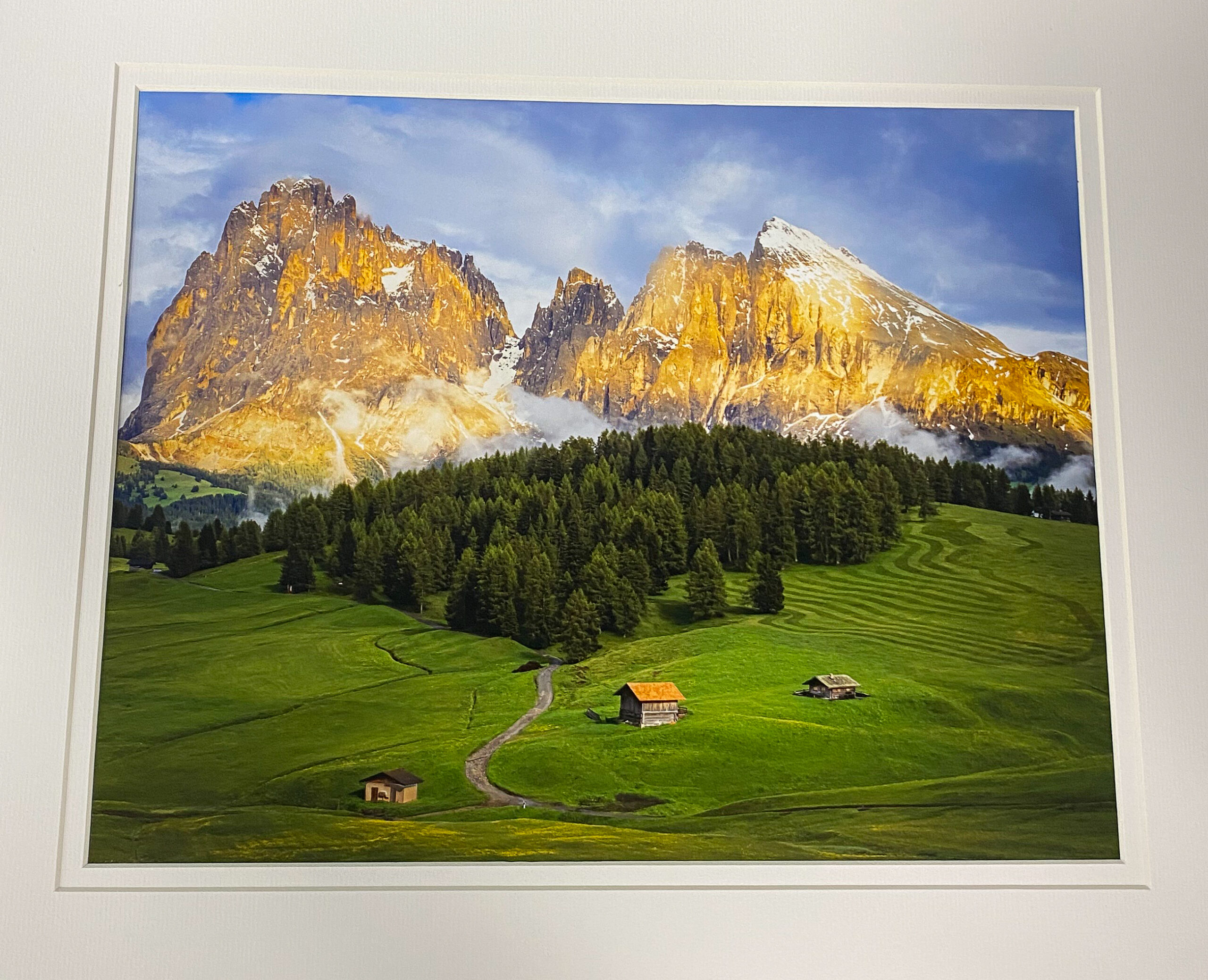
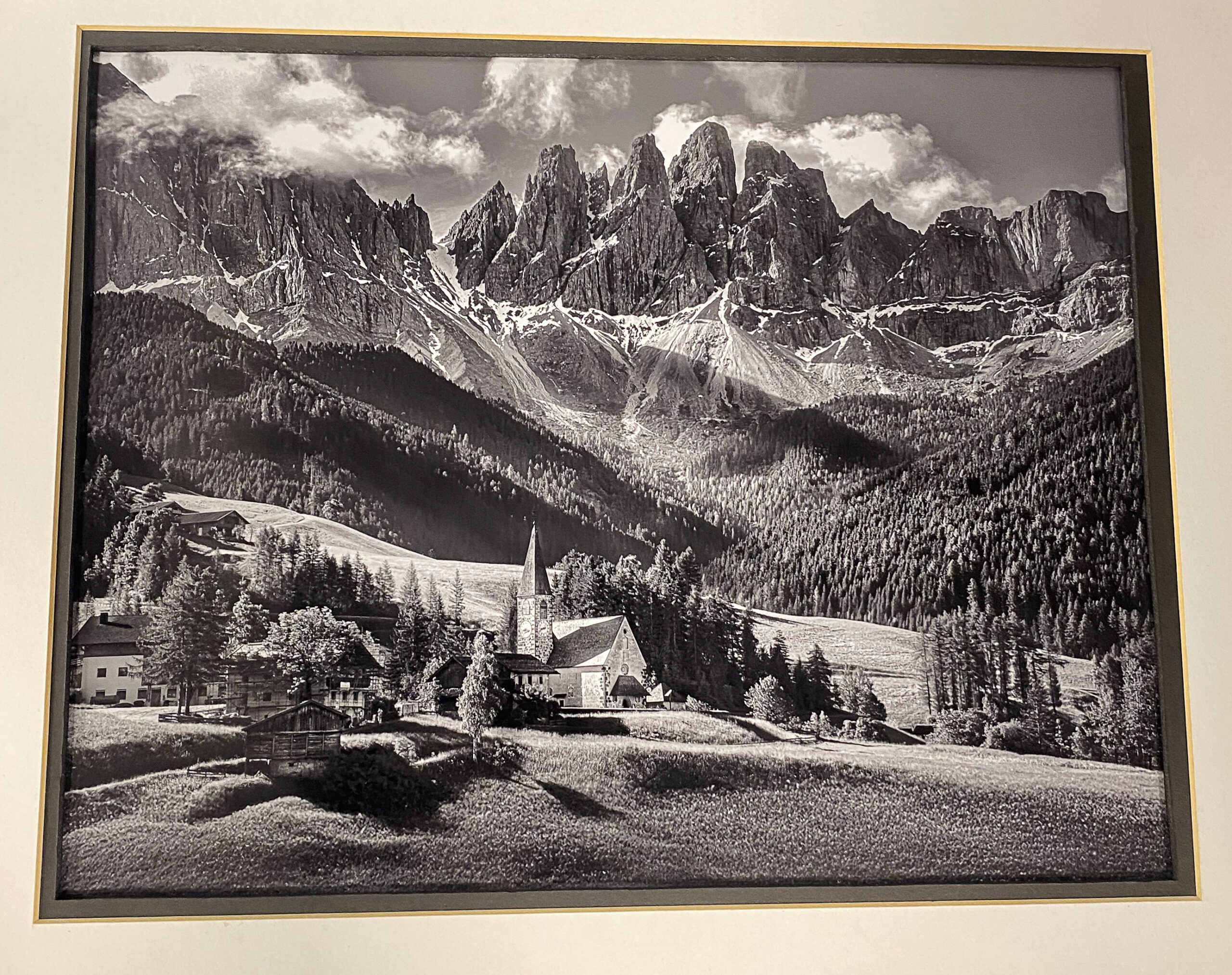
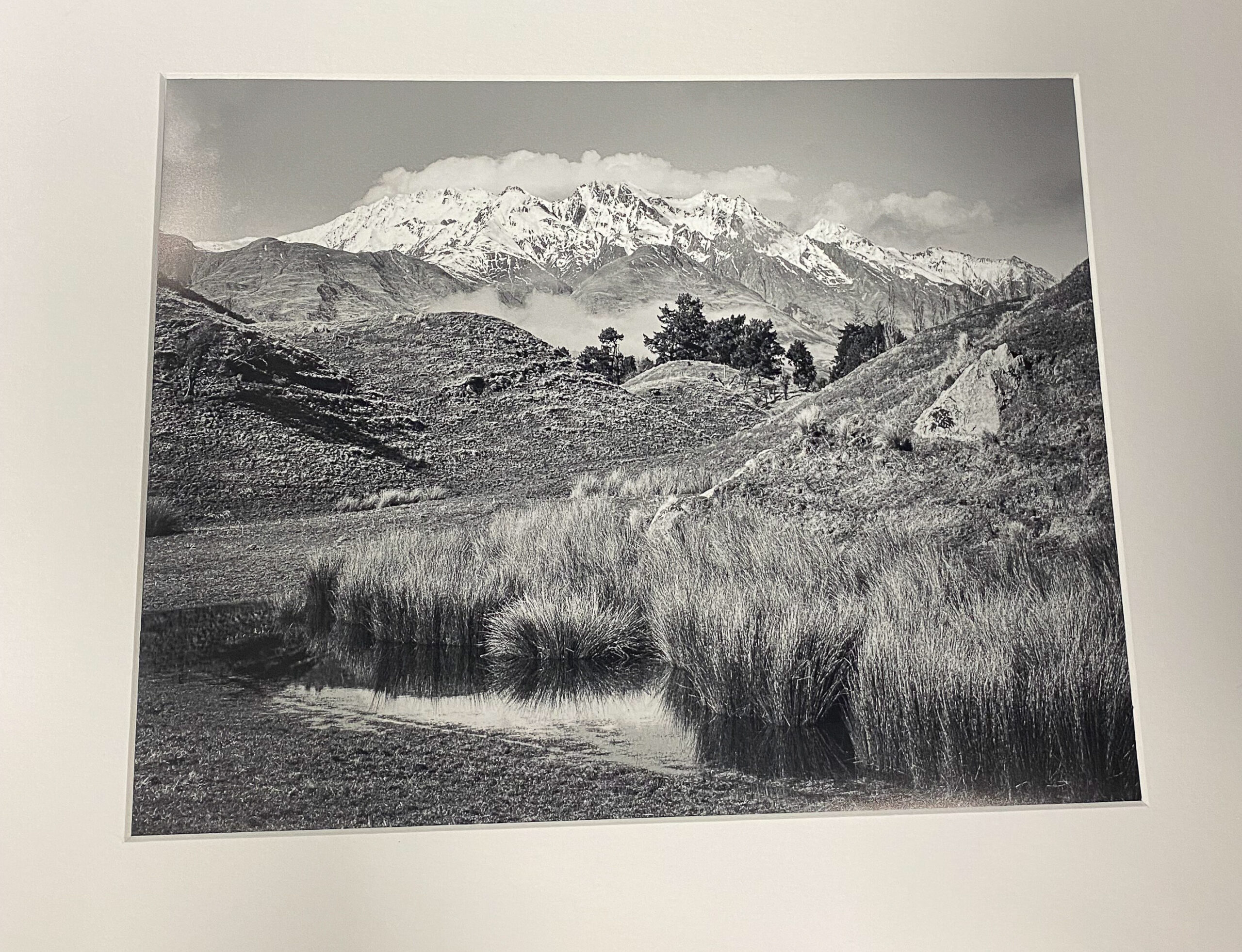
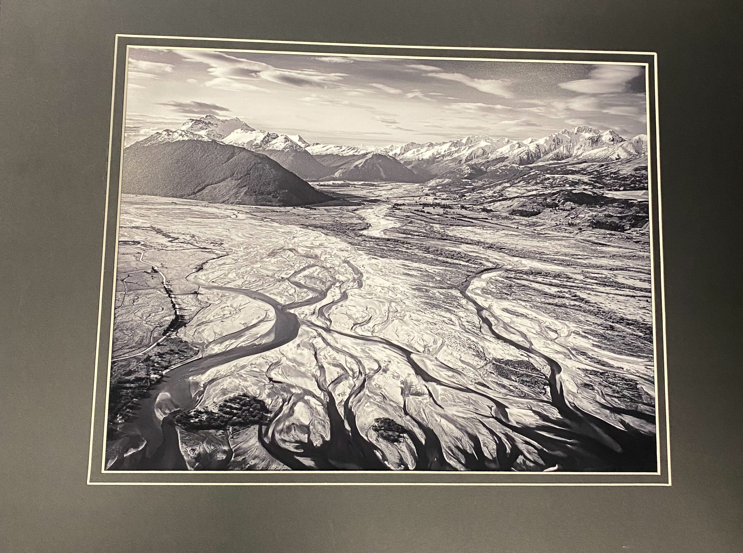
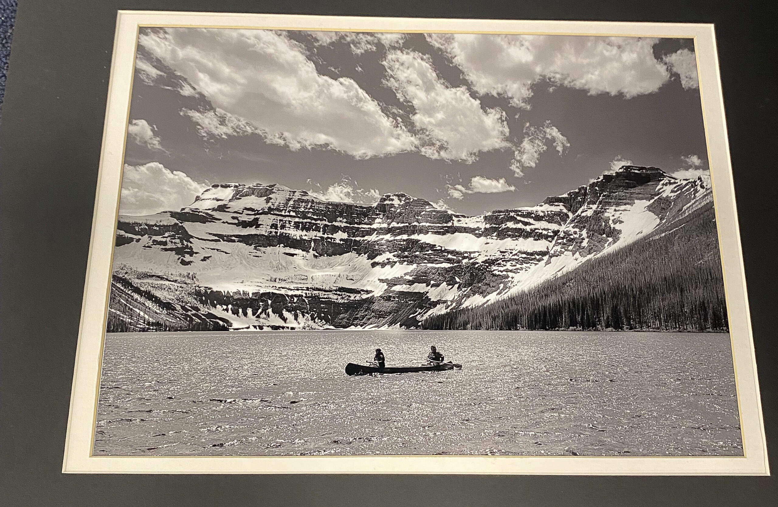
September – “Mountains and Valleys”
Total Entries: 123 ; Color Digital: 46 ; Mono Digital: 36 ; Color Prints: 21 ; Mono Prints: 20 ; Judge: Joe Fikes
1st Digital Mono – Jack Eidson
2nd Digital Mono – CT Chi
3rd Digital Mono – Susan Poston
HM Digital Mono – William Farnsworth
HM Digital Mono – Susan Chi
HM Digital Mono – Ricky Pounders
HM Digital Mono – Jack Eidson
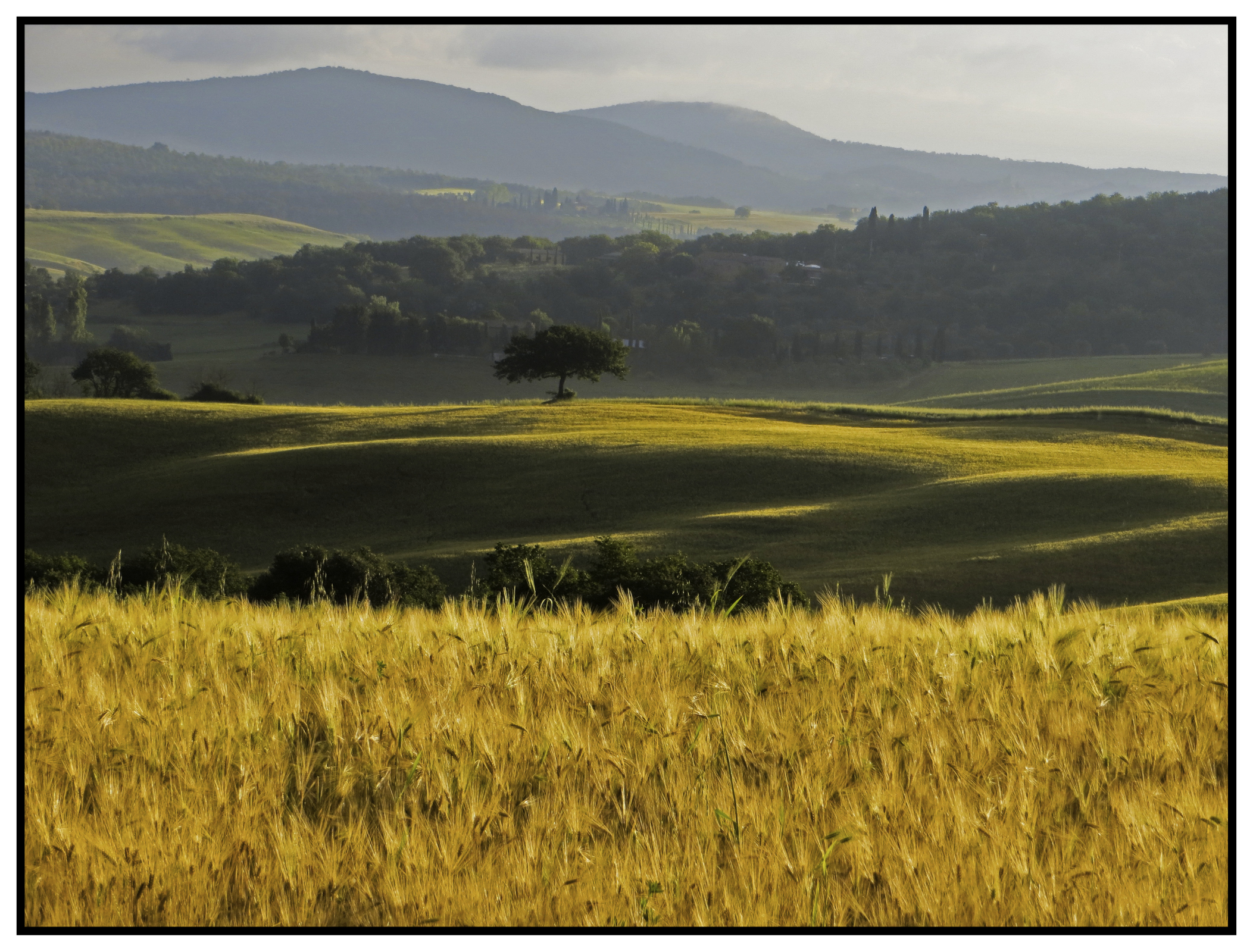
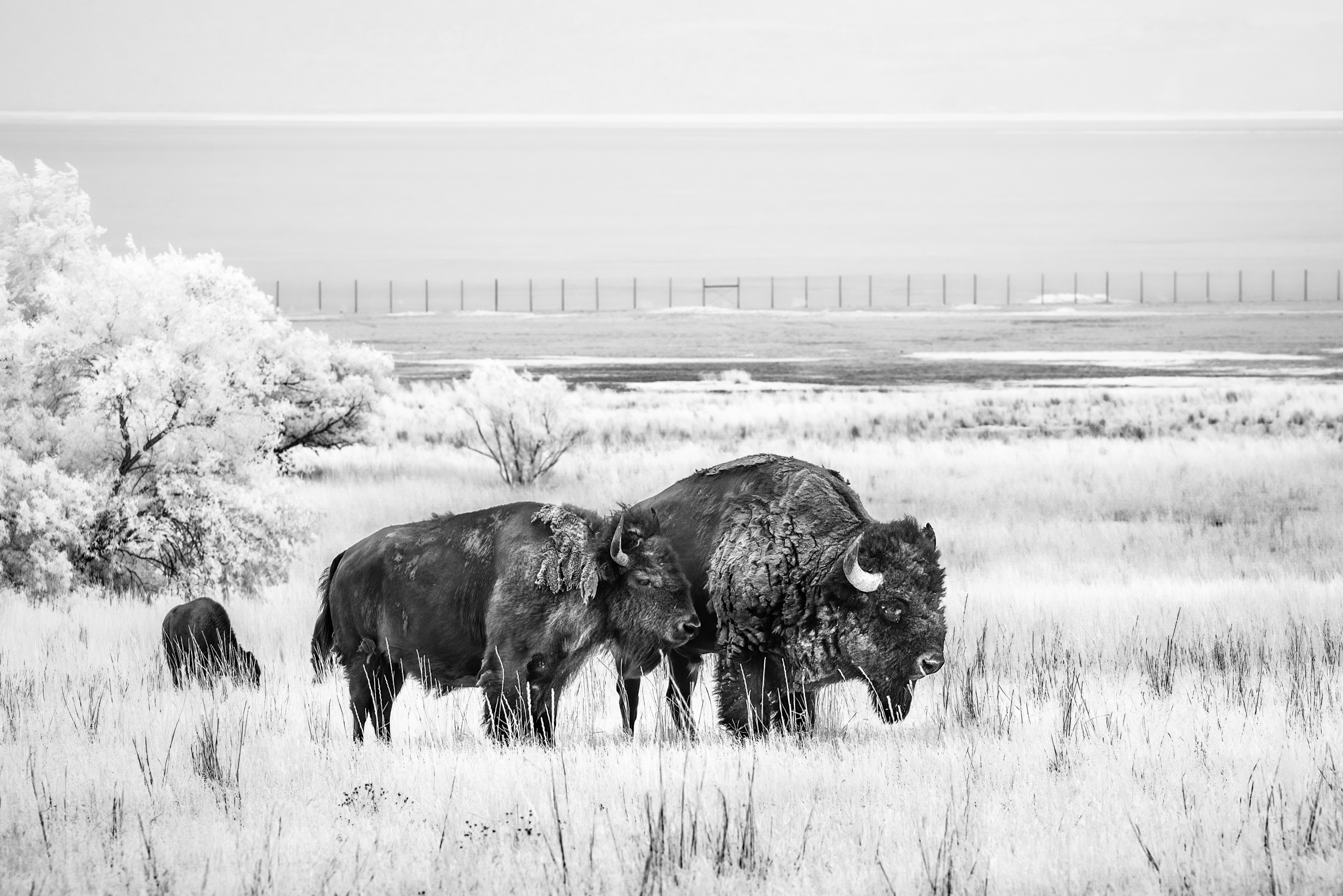
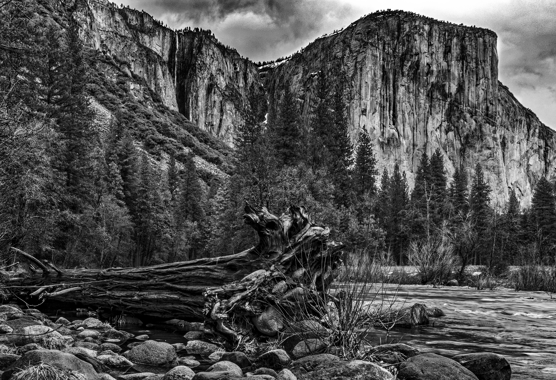
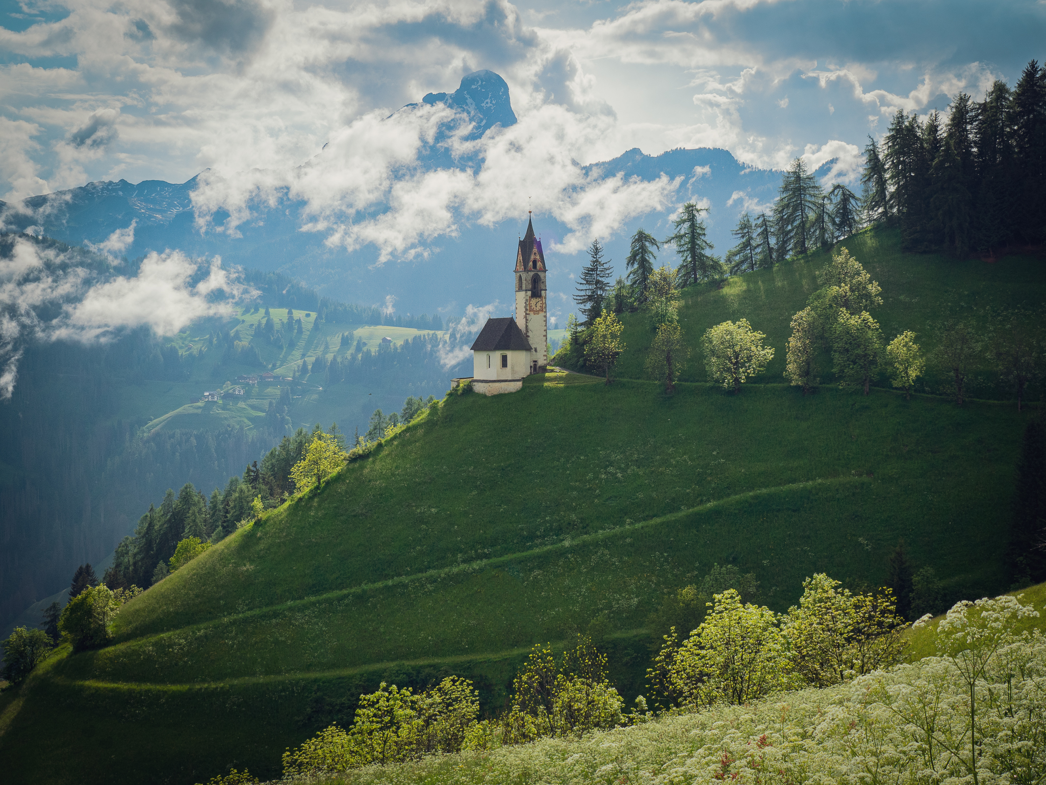
1st Digital Color Allen Gary
I hate it when the first image out of the barrel wins first prize! It was just grand. I love the sharpness and texture of the wheat in the foreground. I think the black and white surround adds to the image as a mat would.
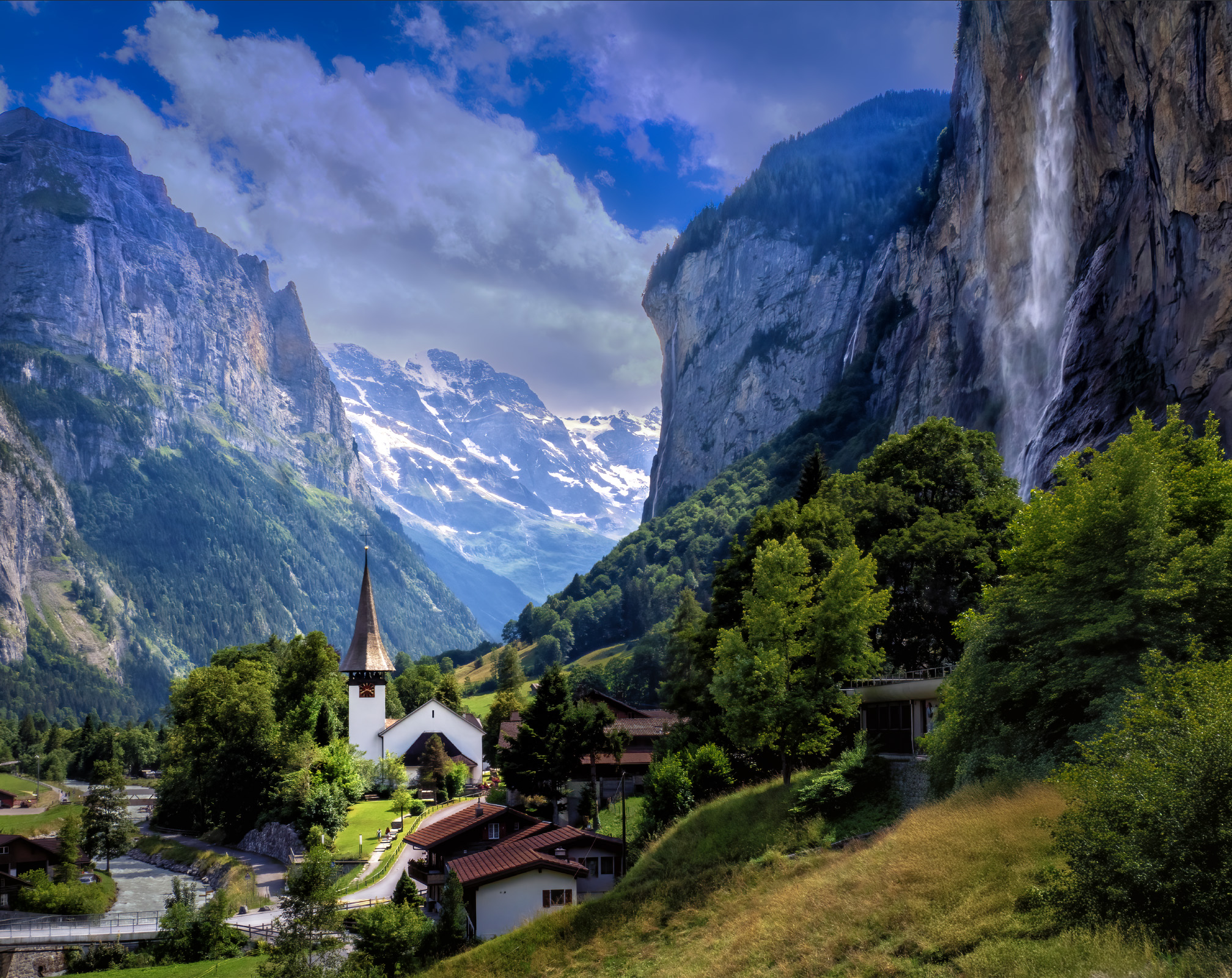
2nd Digital Color – CT Chi
Simply splendid. I love the vertical lines formed by the waterfalls and the church steeple. Nice and crisp. Perfectly exposed.

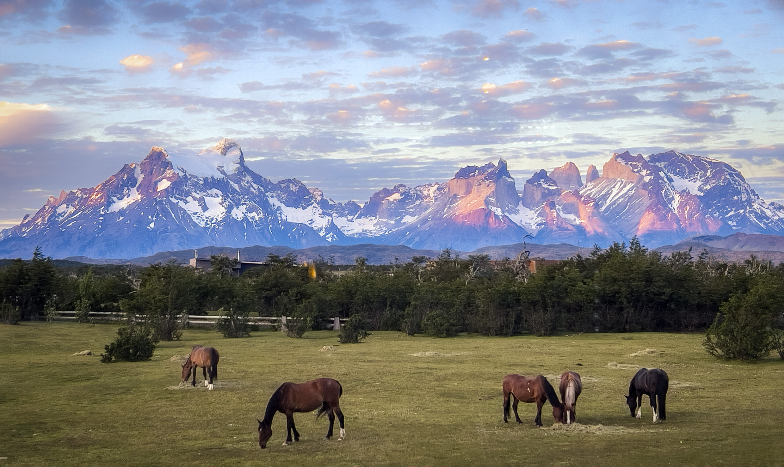
3rd Digital Color – Susan Poston
Beautiful color. The strong side lighting accentuates the trees. Very nice!
HM Digital Color – Susan Chi
This is a matter of taste, but… I would have eliminated the buildings behind the trees with Photoshop. It would have to be carefully done and it would be very tedious. But I think it would greatly improve the image.
HM Digital Color – Chris Baker
What a glorious contrast between the cold/hard ice and rock and the warm yellow grass! Nice and sharp all the way from the front to the back. On a different night you might have taken one of the ribbons.
HM Digital Color – Casey Johnson
Some people might question why this one got honorable mention and others didn’t. I just liked the subtle fall colors of the trees in the middle and the warmth of the fell above. The old stone barn tucked away into the trees made the image to me.
HM Digital Color – Carolyn Spinoso
HM Digital Color – Susan Poston
I would have liked it better if the church hadn’t been smack in the middle. Still, it’s a nice image.
1st Color Print – Charles Leverett
2nd Color Print – Charles Leverett
3rd Color Print – Casey Johnson

HM Color Print – Doris Leverett
HM Color Print – Barbara Staggs
1st Mono Print – Charles Leverett
2nd Mono Print – Emily Saile
3rd Mono Print – Barbara Staggs
HM Mono Print -Lara Deal
HM Mono Print – Charles Leverett
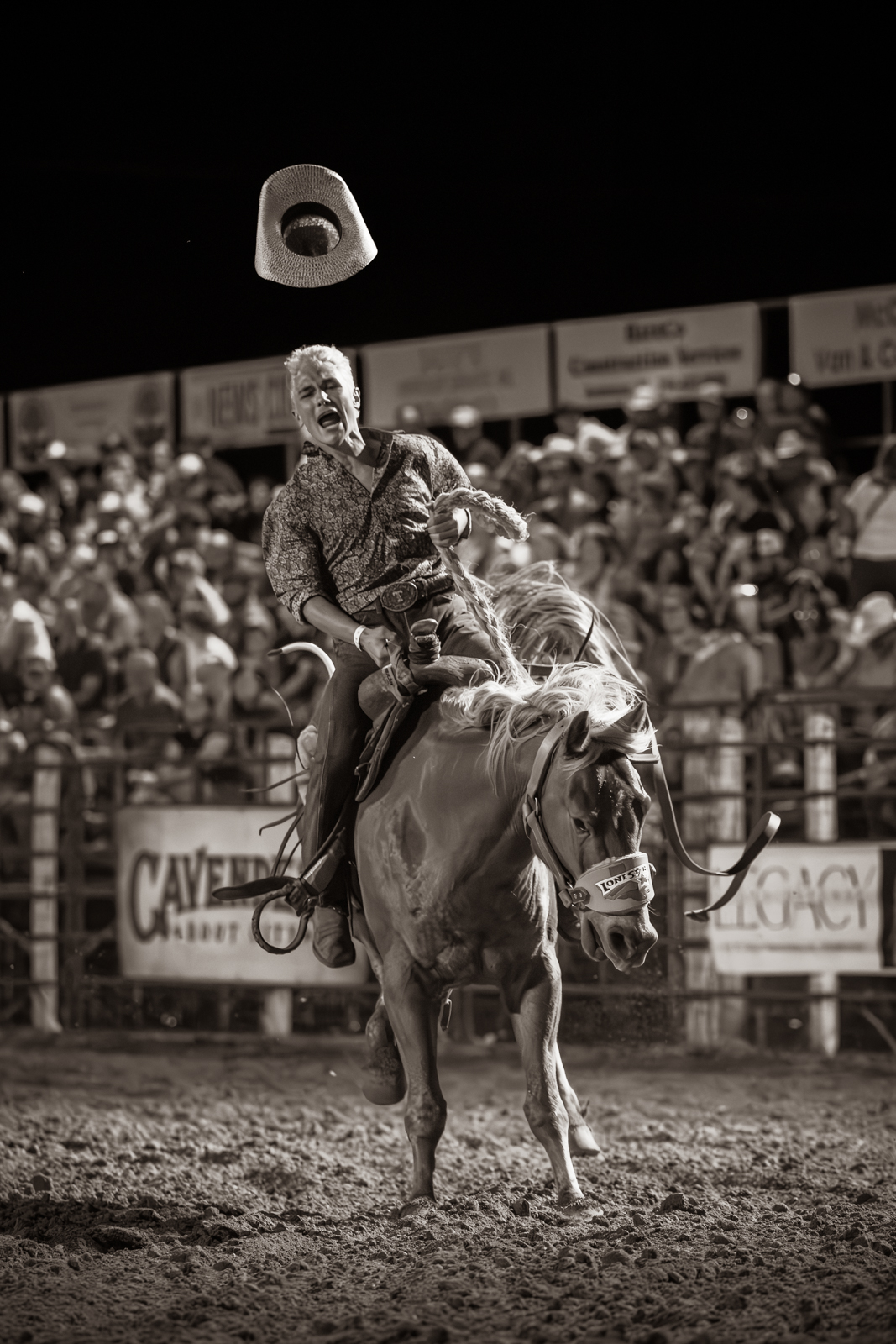
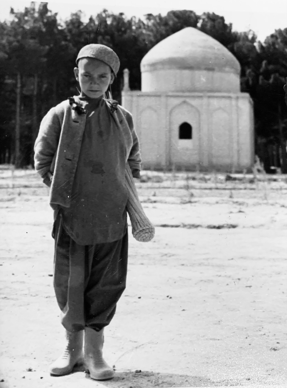
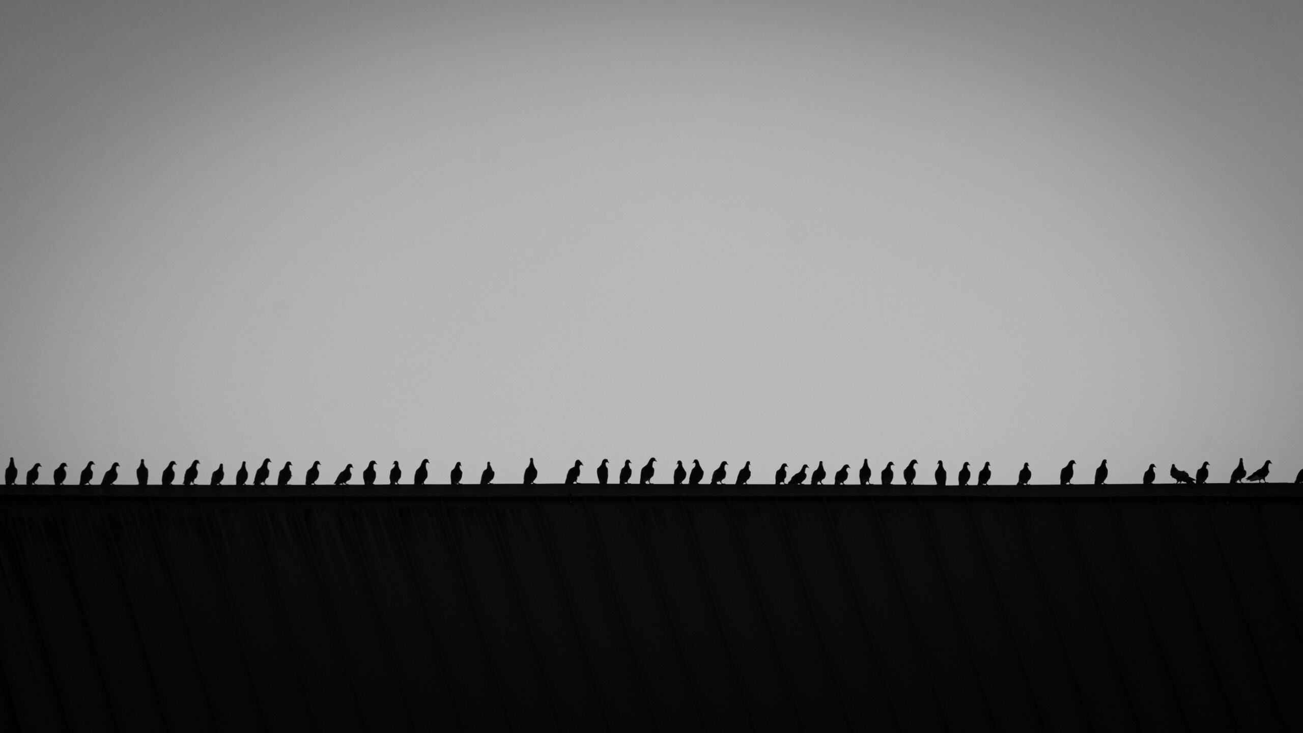
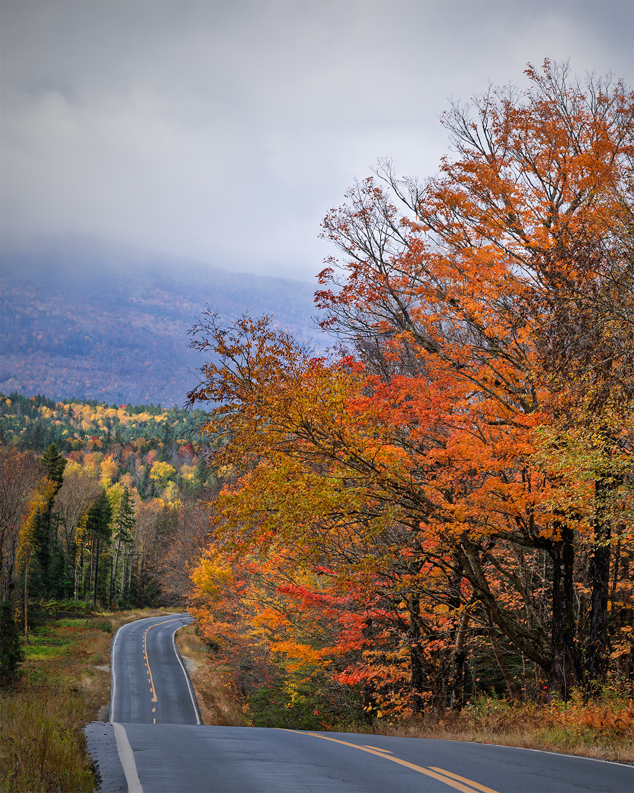
October – “Open”
Total Entries: 115 ; Color Digital: 37 ; Mono Digital: 36 ; Color Prints: 24 ; Mono Prints: 18 ; Judge: Cecil Holmes

1st Digital Color – Chris Baker
This is a great wildlife interaction image that was timed perfectly! I love that it was taken at the right time of day for the golden light and the fact that the eye is tack sharp!

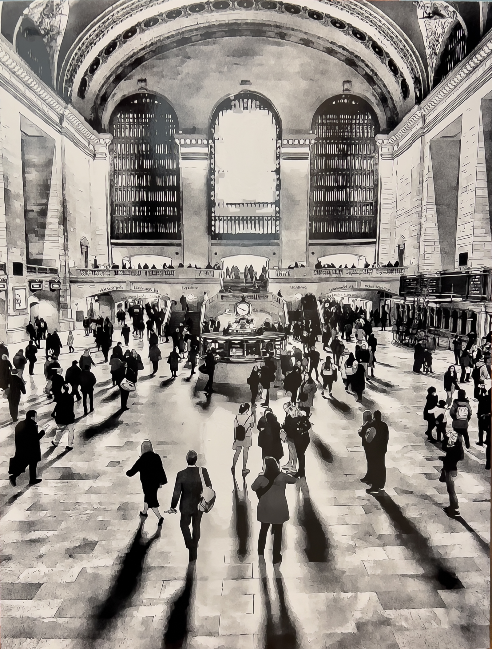
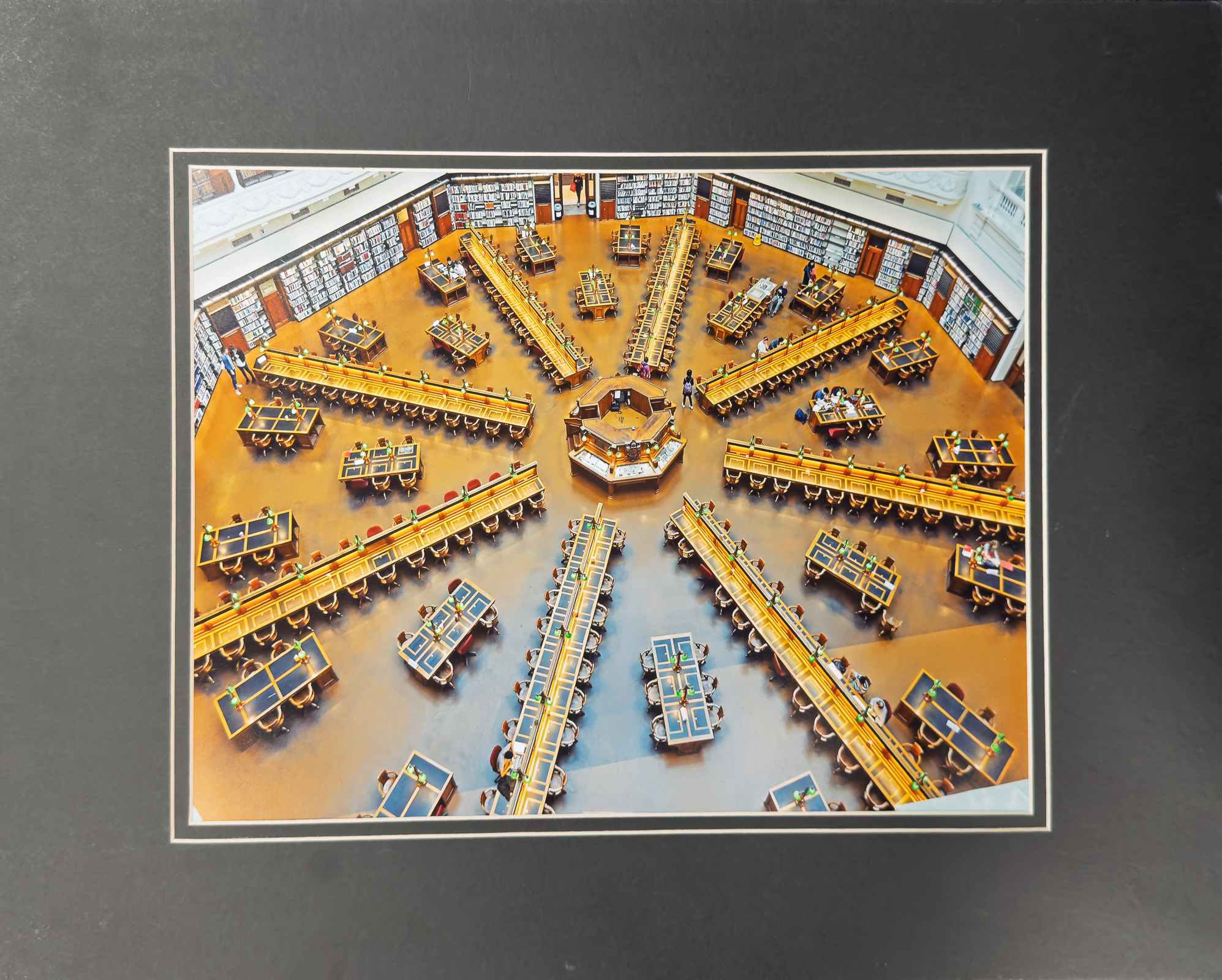
2nd Digital Color – Jane Reneau
I LOVE the perspective on this one! A very unusual angle that works really well. I like how you have “framed” your subject with the stacks of books. Also, the “background” or floor is very clean and non-distracting!
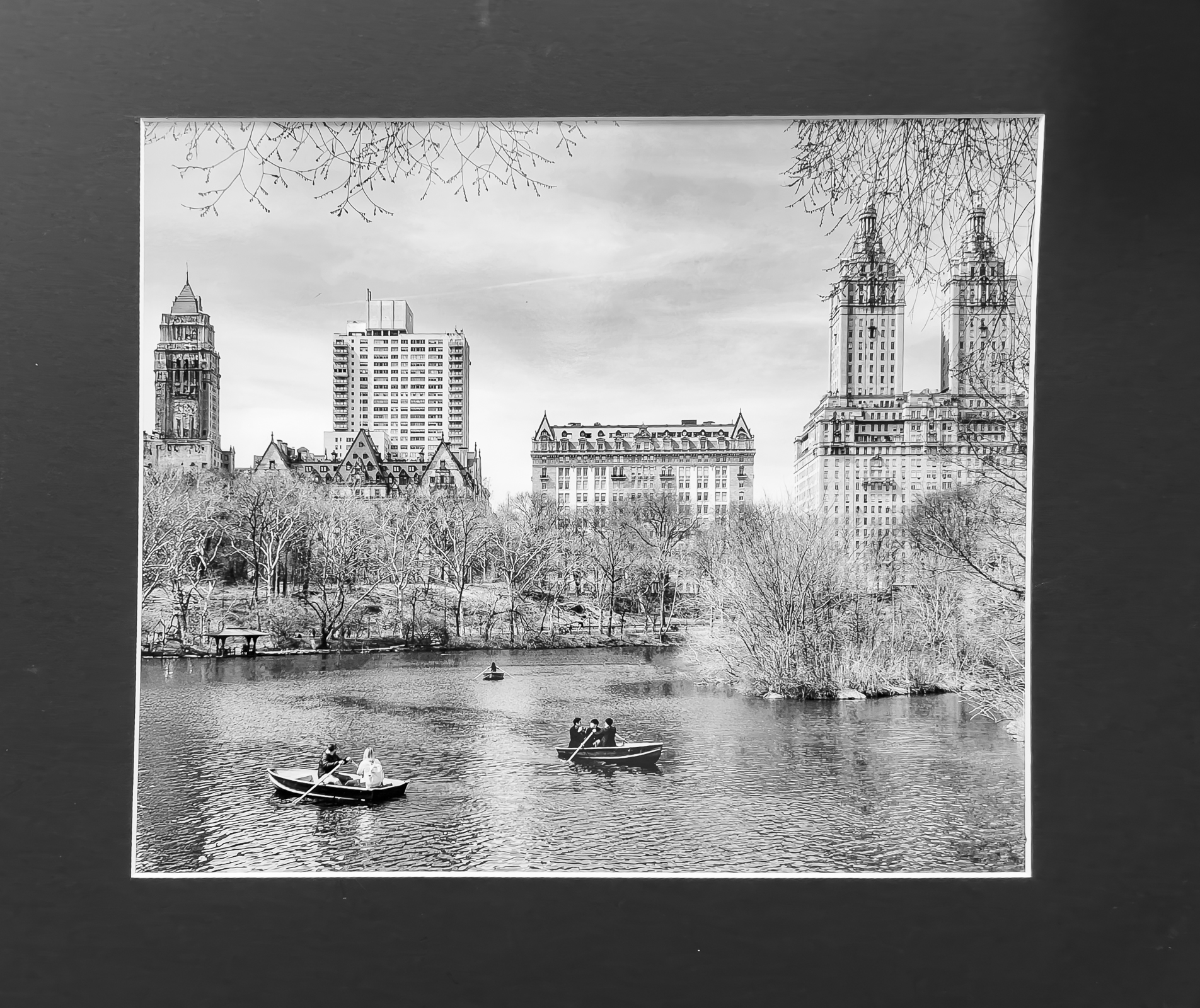
3rd Digital Color – Jack Eidson
I love the colors and leading lines on this one! The reflection is the star of the show, but all the lines lead you to the center of that reflection. Great use of lines!
HM Digital Color – William Farnsworth
This is a great leading line example. The road takes me through the entire image. The fall colors are great, also!
HM Digital Color – Tom Johnson
I think this is a very strong composition. The placement of the lilies and vegetation in the foreground really anchor it. The blue sky with puffy white clouds help, too.
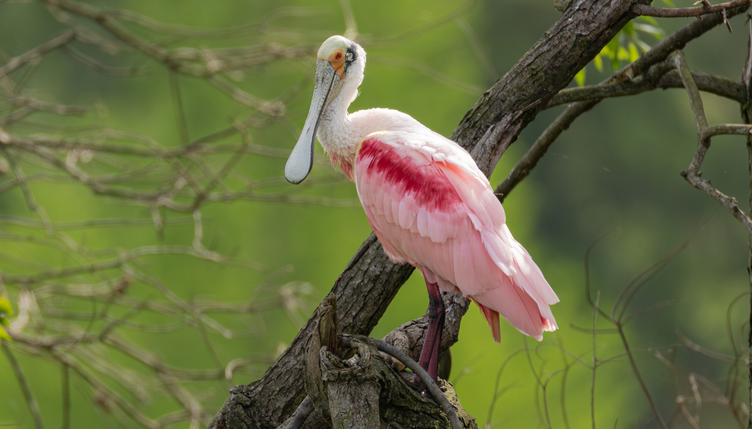
HM Digital Color – Picky Pounders
I think this image has a great DOF. The spoonbill is in nice, sharp focus with great color. The background falls off quickly and just enough.

HM Digital Color – Julia Gary
I think this is a great showcase of how something simple can be made into a great image. Not only that, but I like the curve of the structure, creating a perfect golden ratio. The three statues are perfectly spaced.
HM Digital Color – Julia Gary
I love all the color in this image! It also tells a story and has me wanting to know more of the story.
HM Digital Color – Carol Eidson
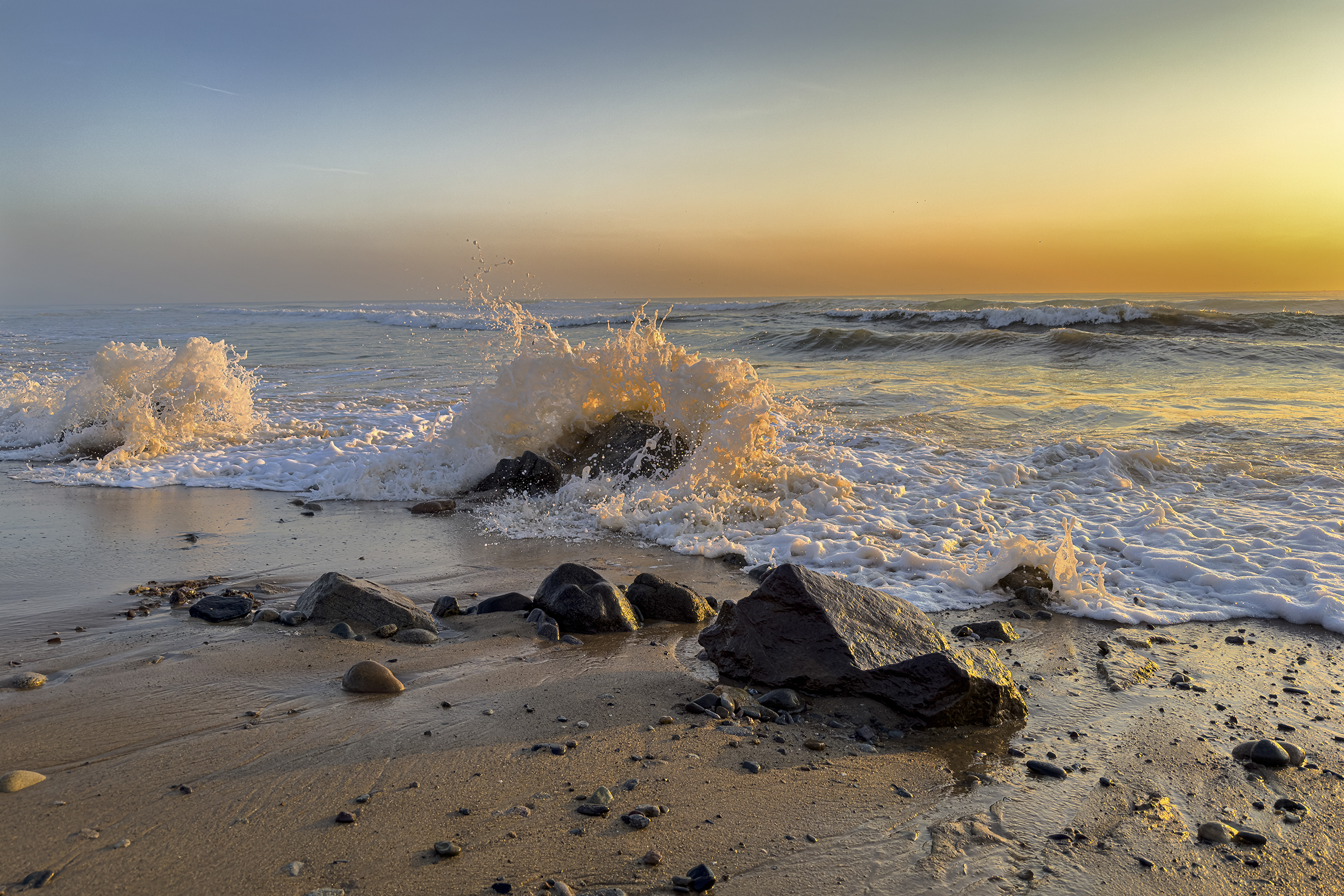
I love this golden hour seascape! I like that you went with a faster shutter speed here to “freeze” the water. The sun backlighting those waves really looks neat!
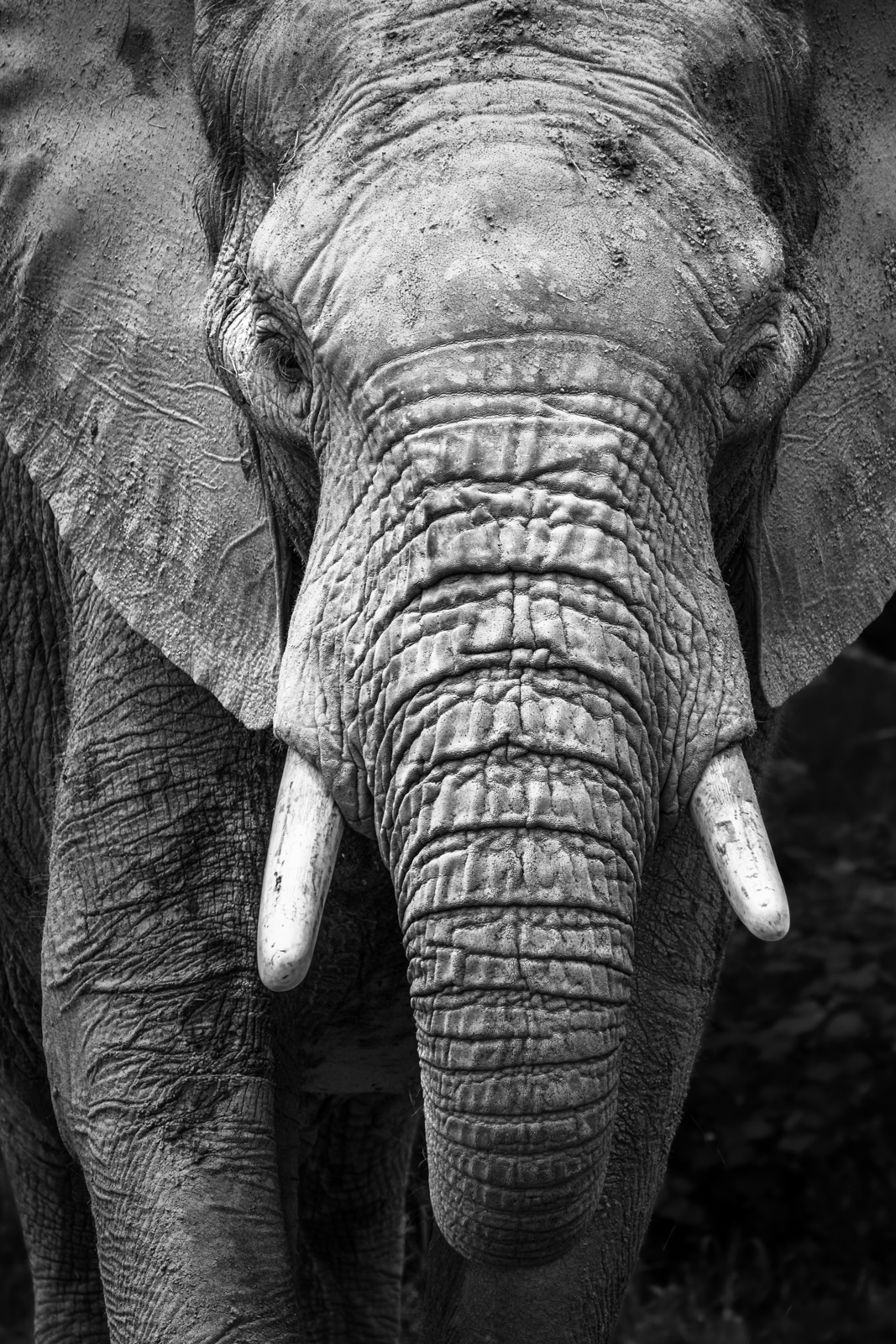
1st Digital Mono – Chris Baker
I love the detail in this elephant portrait! Black & White was the right choice here! The brightest part of the image is the face, exactly where it needs to be!
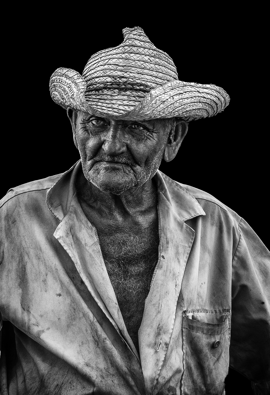
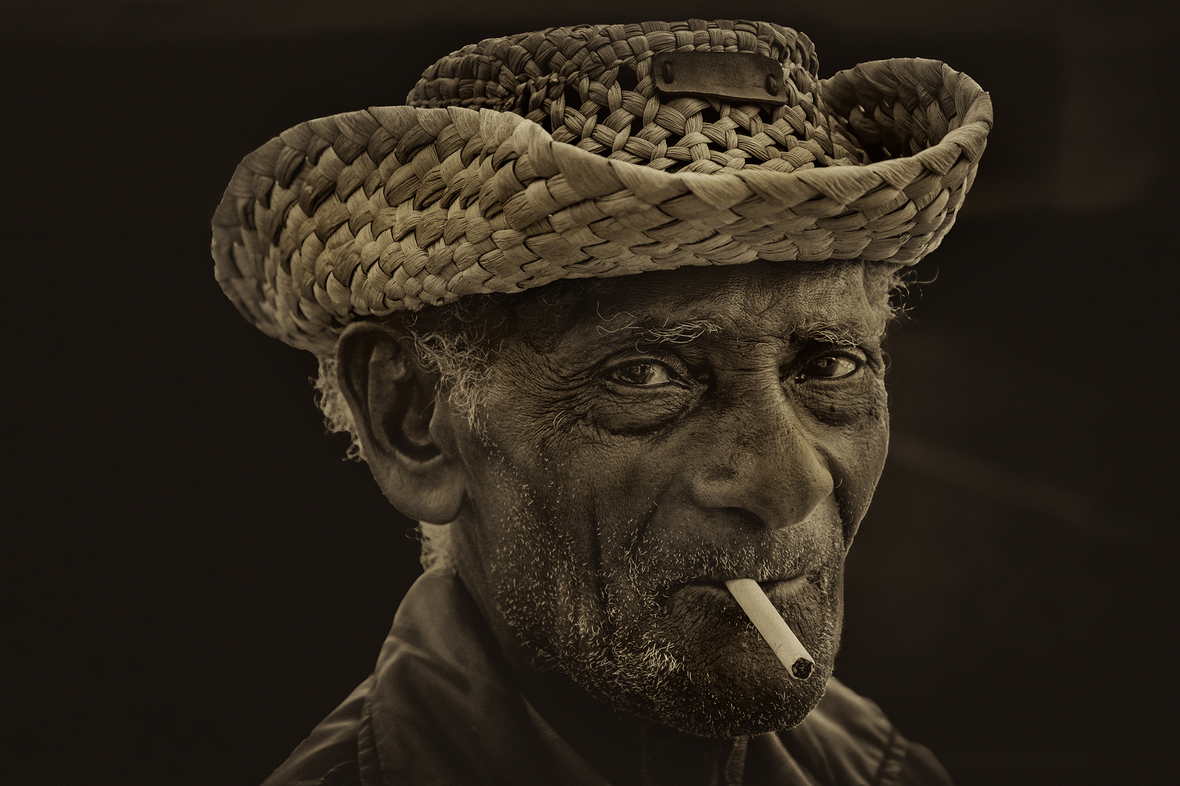
2nd Digital Mono – Jack Eidson
Great, great black & white portrait! The lighting is wonderful and I love all the detail in everything from the hat to the face to the shirt. Nice clean background, also!
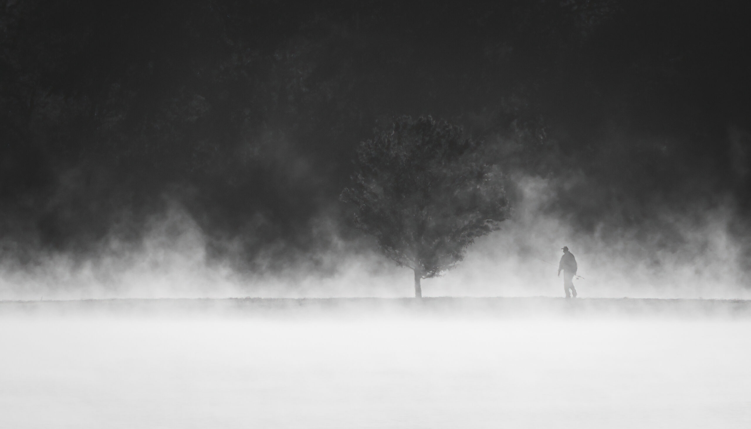
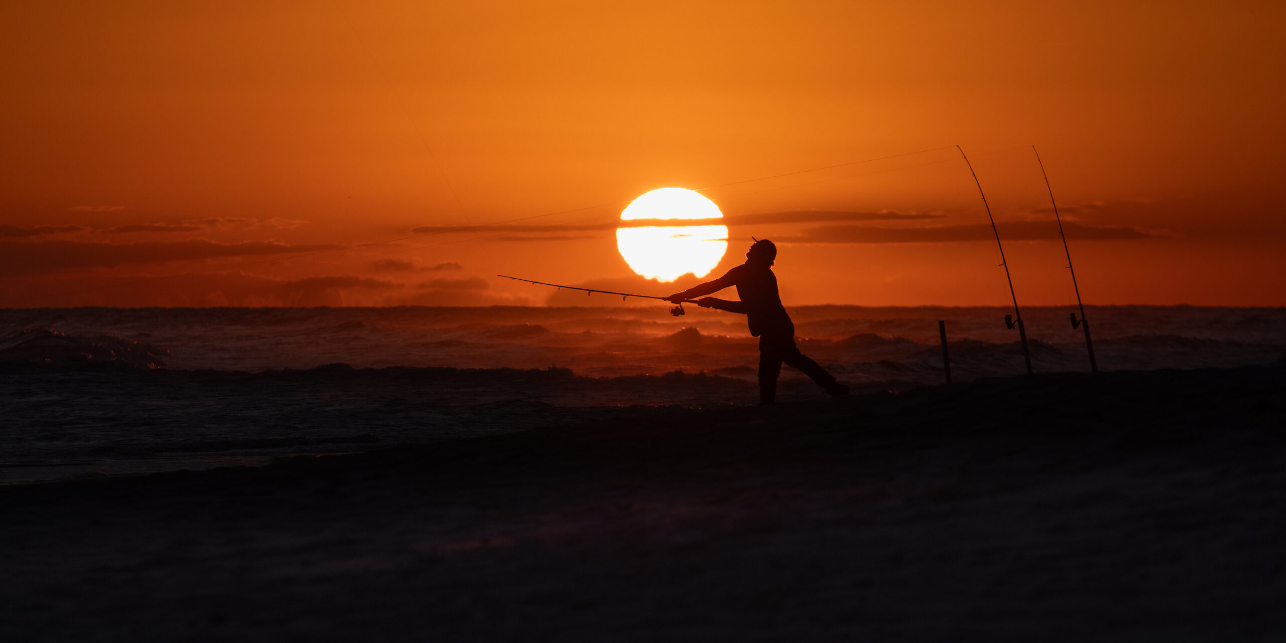
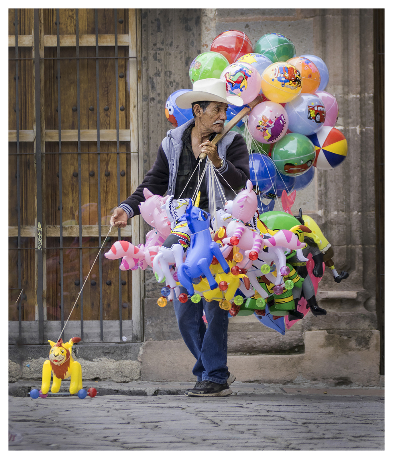
3rd Digital Mono – Mat Bevill
I love the atmosphere in this one! I also love the composition. The placement of the fisherman in the frame allows him to walk “into” the frame. Great Scene!
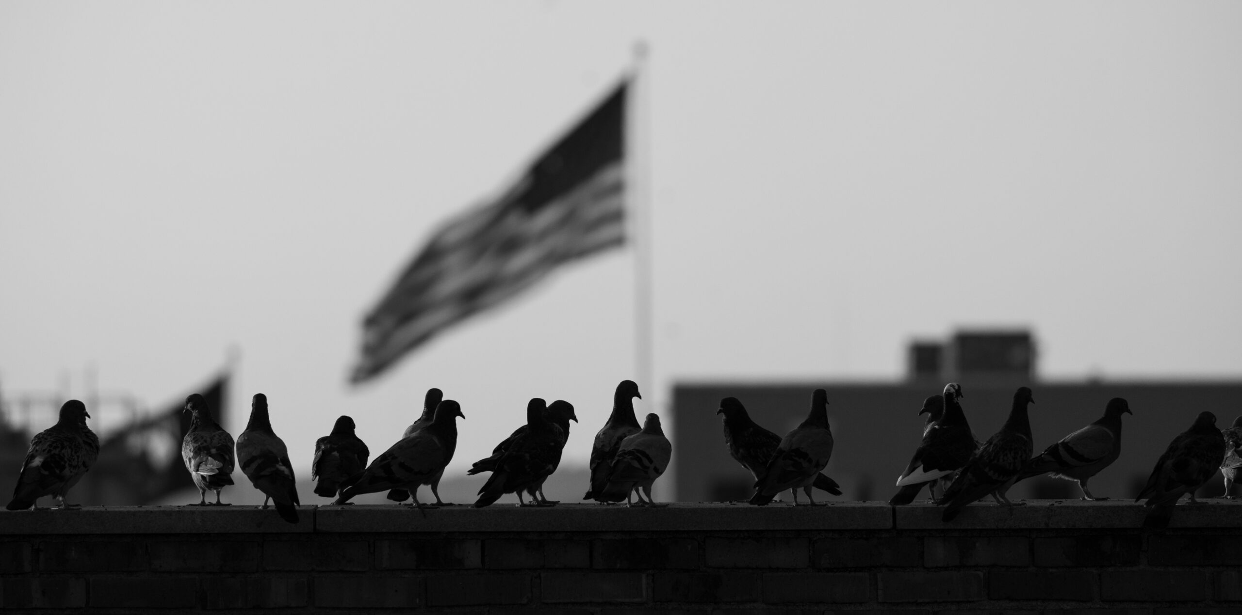
HM Digital Mono – Tyrell Jemison
I love the DOF here. The silhouette pigeons make a great foreground. The DOF is enough that I know there is a US Flag back there, but just enough to put the viewers focus onto the pigeons. This makes me feel as if I am sitting at a suburban park.
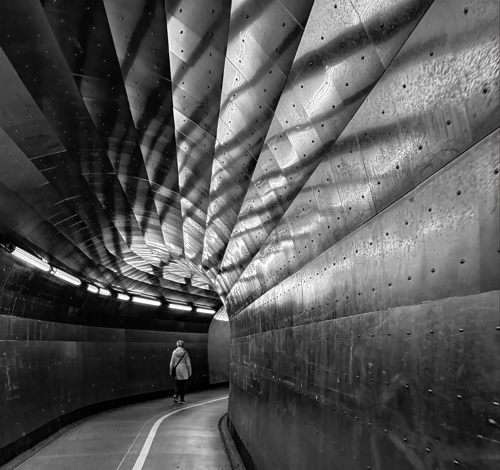
HM Digital Mono – Susan Chi
I love the lines leading me into the person in this image! I do not think this image would be as strong without the person. Great choice including them! Great lines, great light!
HM Digital Mono – Julia Gary
I really like the storytelling aspect of this one! I wonder where they are, what they are doing, etc. I also love that you kept separation between the two people in the frame.

HM Digital Mono – Chris Baker
Great action shot! Wonderful exposure with very little noise! I am assuming this was taken at night. From experience, I know this is hard to pull off. Great job!
1st Mono Print – Joy Henderson

2nd Mono Print – Henry Smith
3rd Mono Print – Joy Henderson
HM Mono Print – John Shriver
HM Mono Print – John Dillingham
HM Color Print – K. Deal
1st Color Print – Chris Baker
2nd Color Print – John Dillingham
3rd Color Print – Jane Reneau
HM Color Print – Casey Johnson
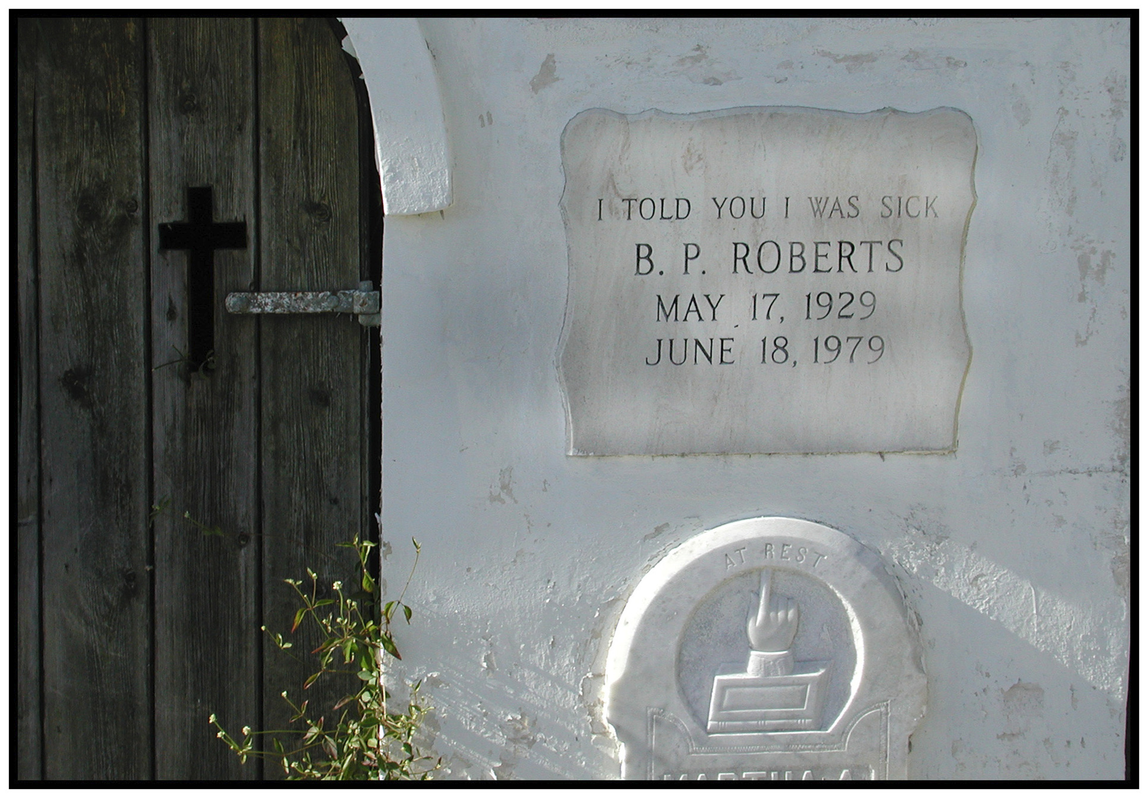
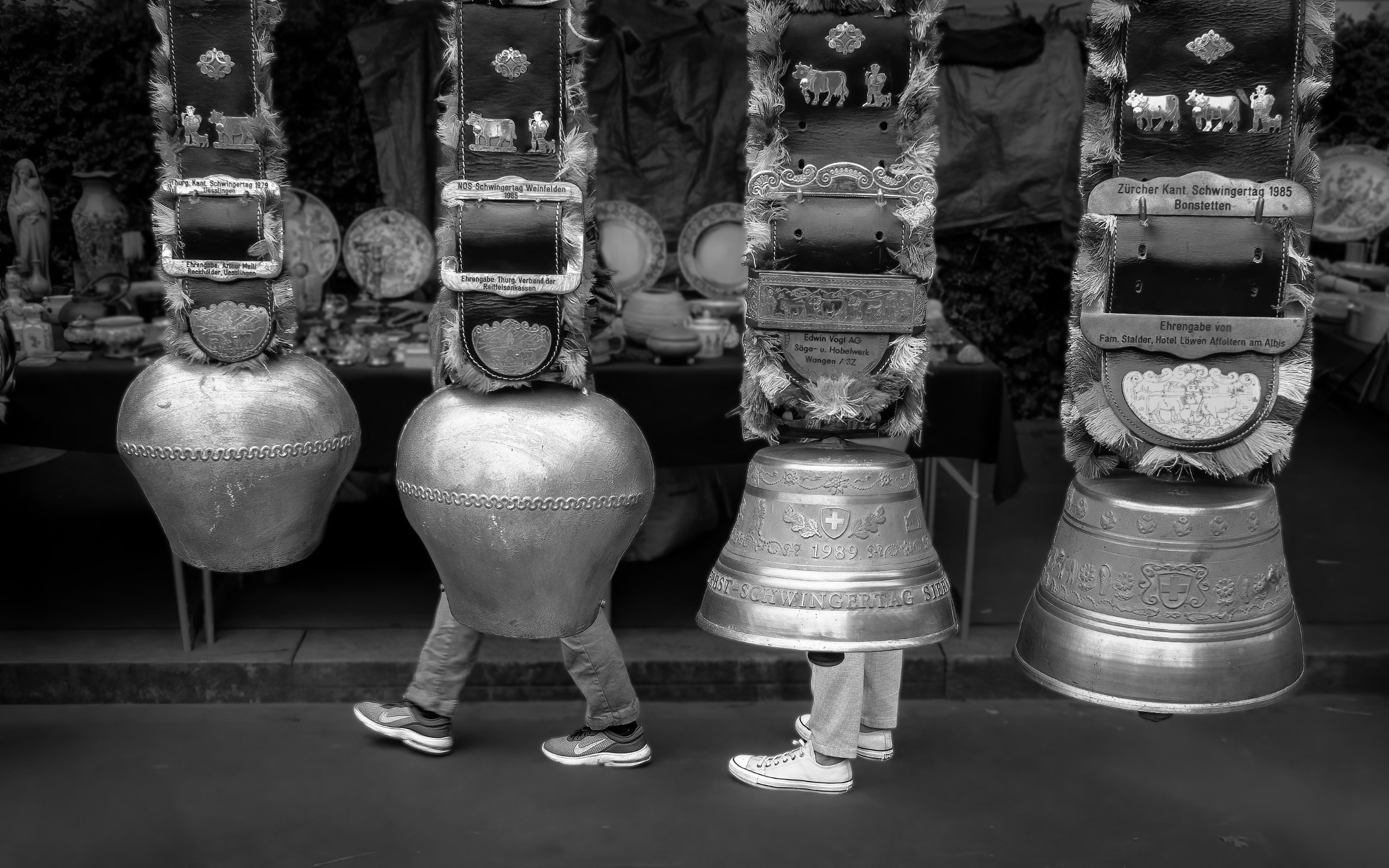
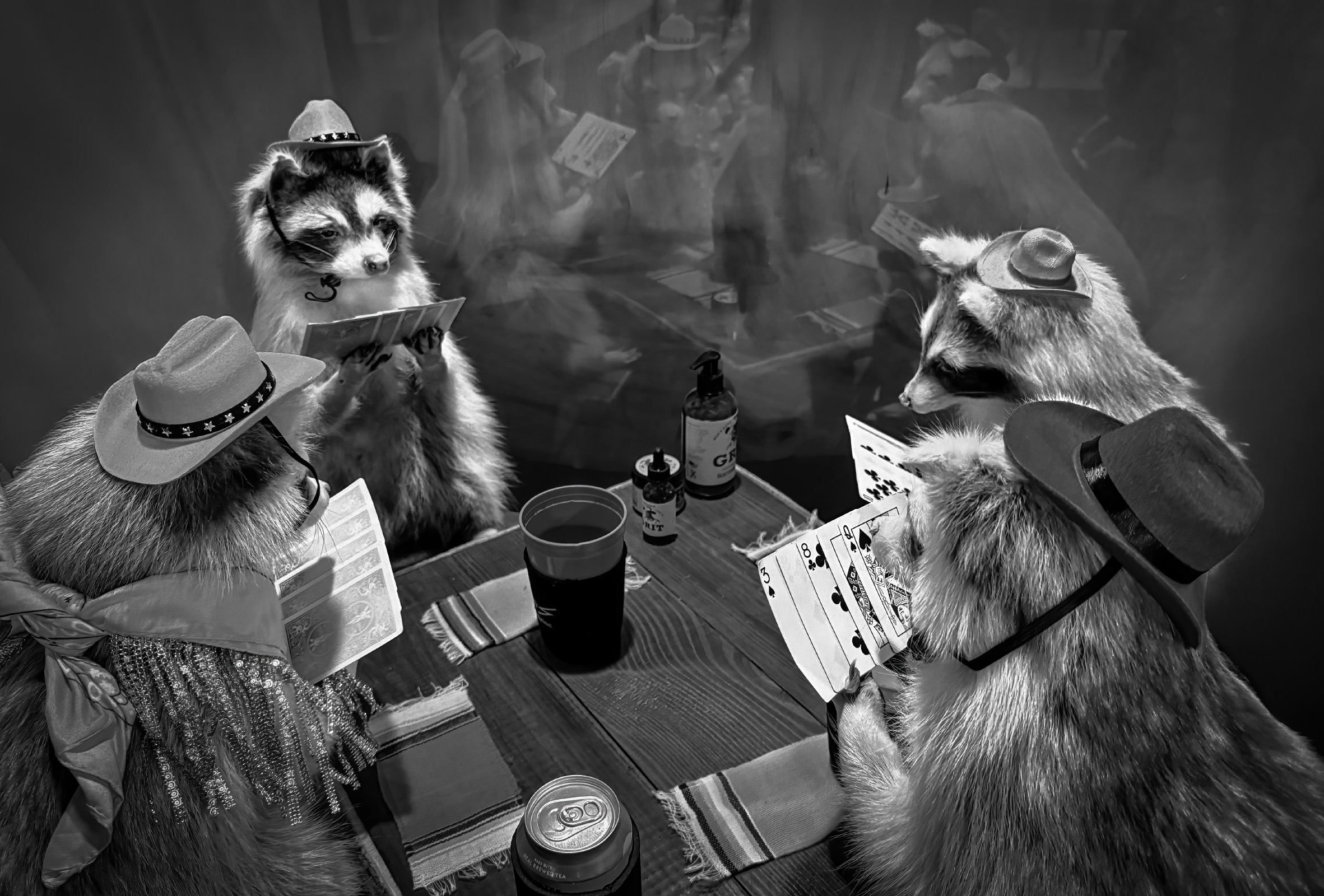
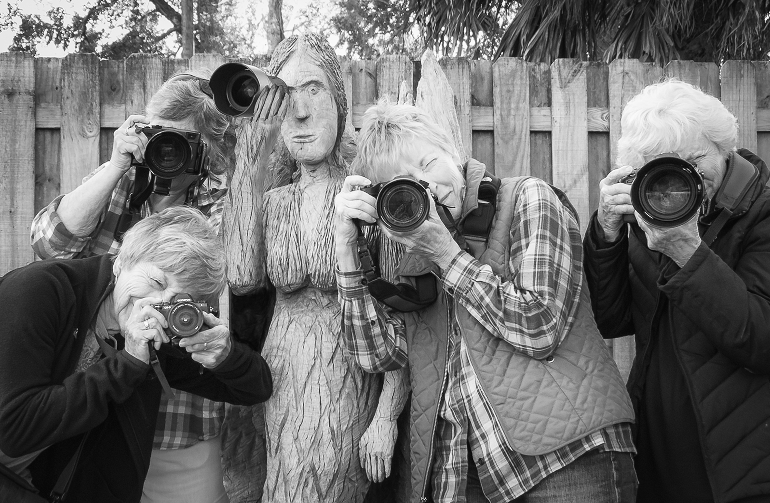
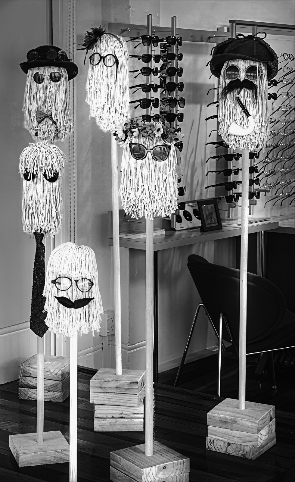
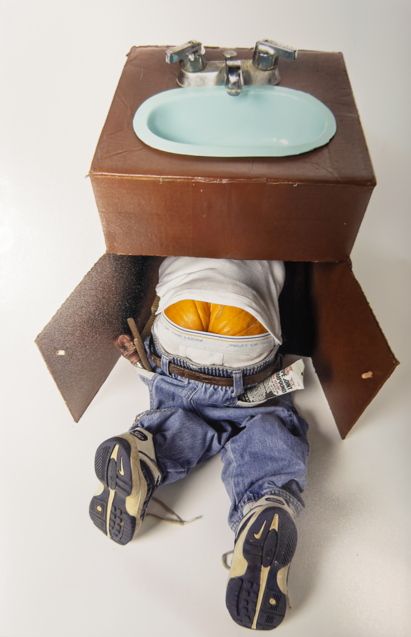
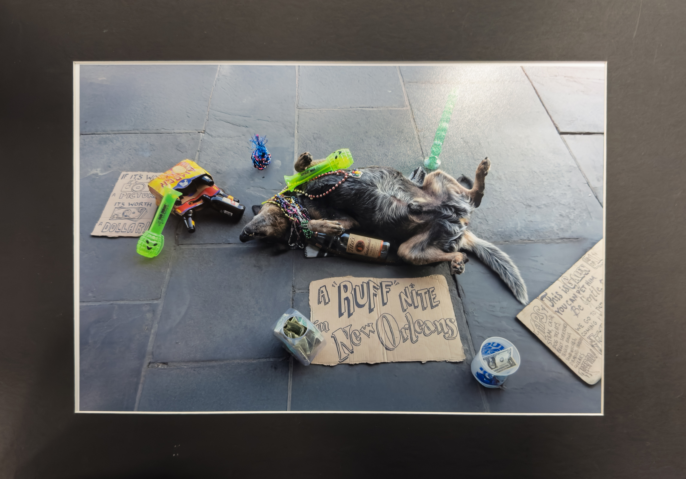
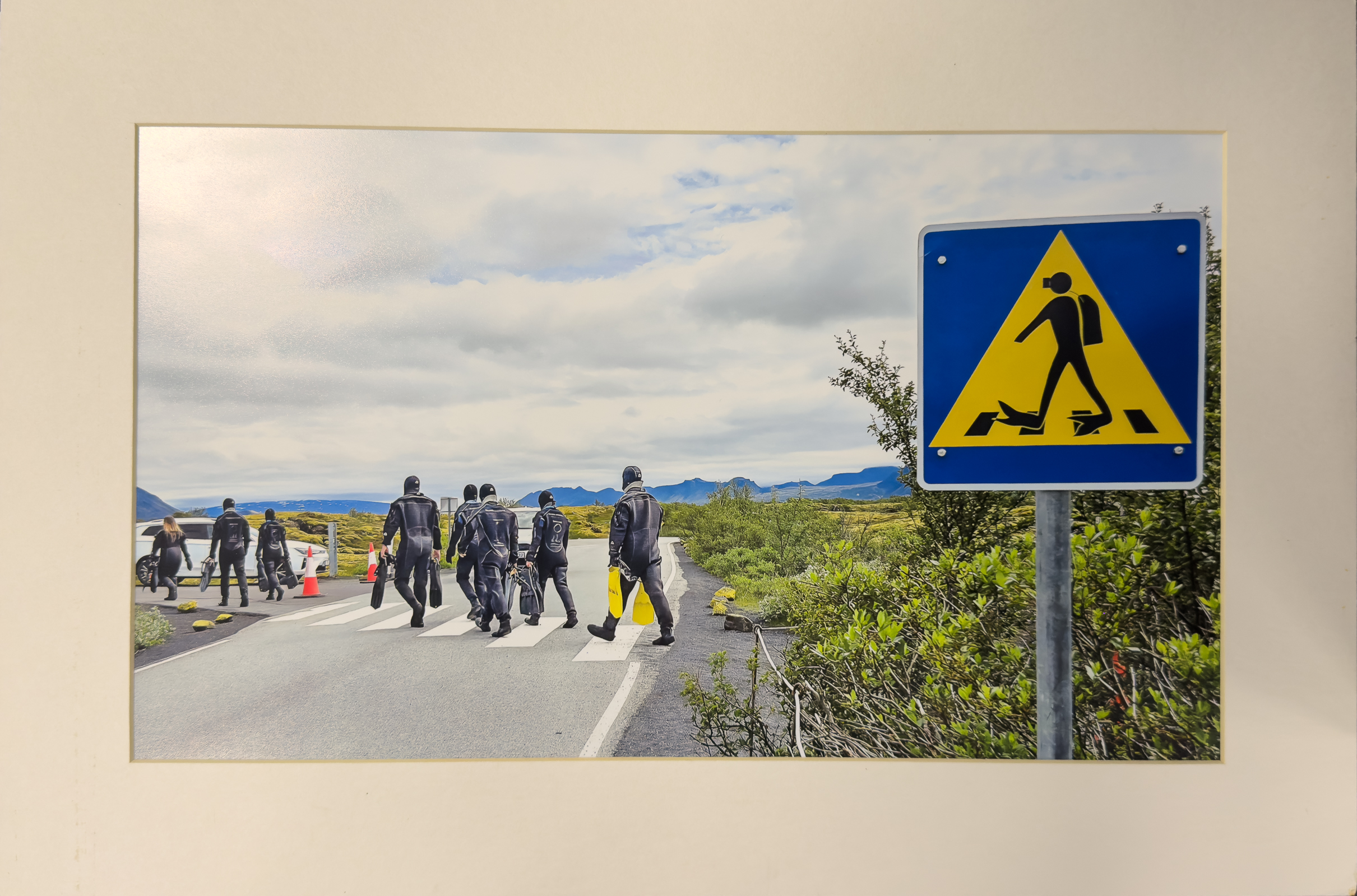
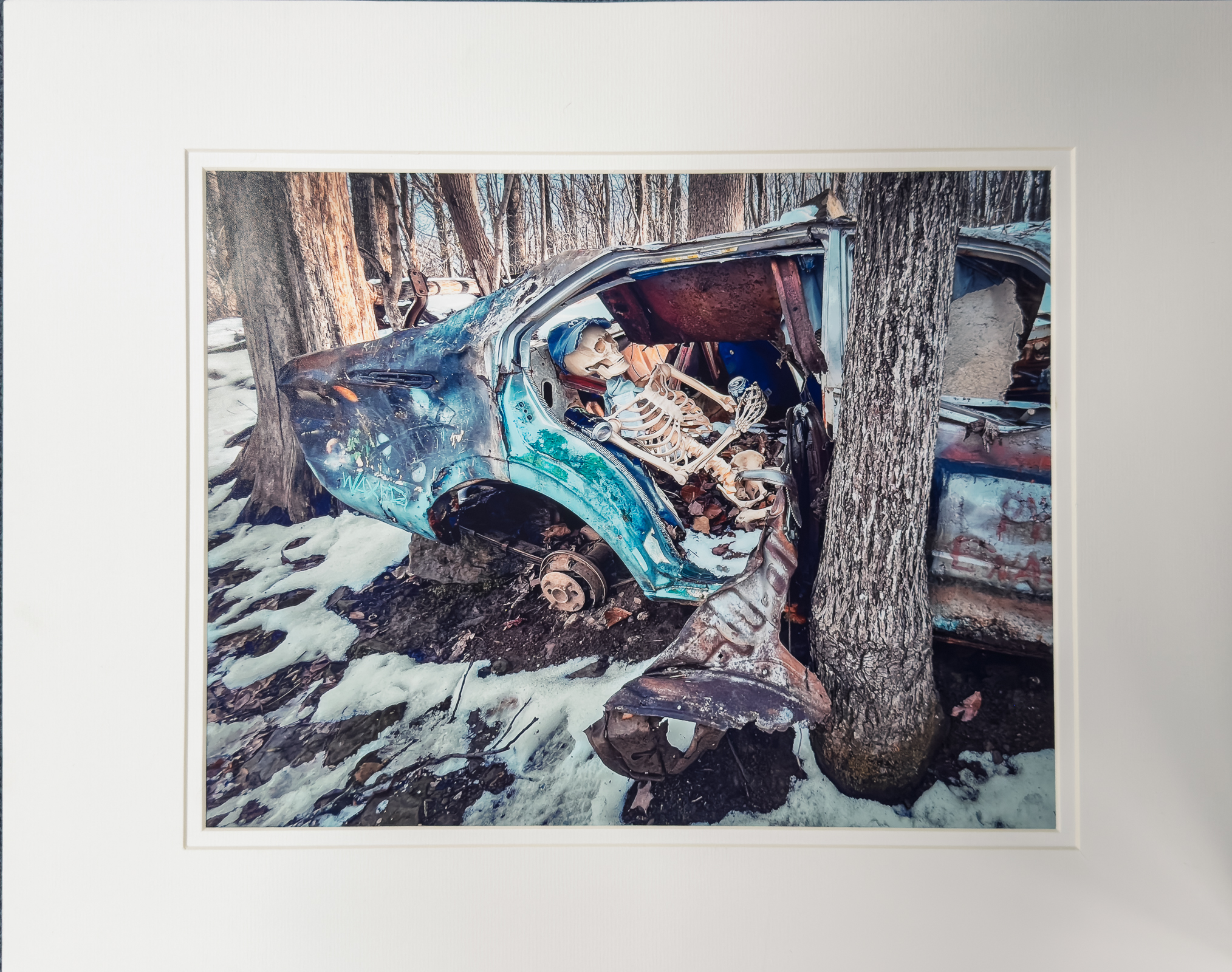
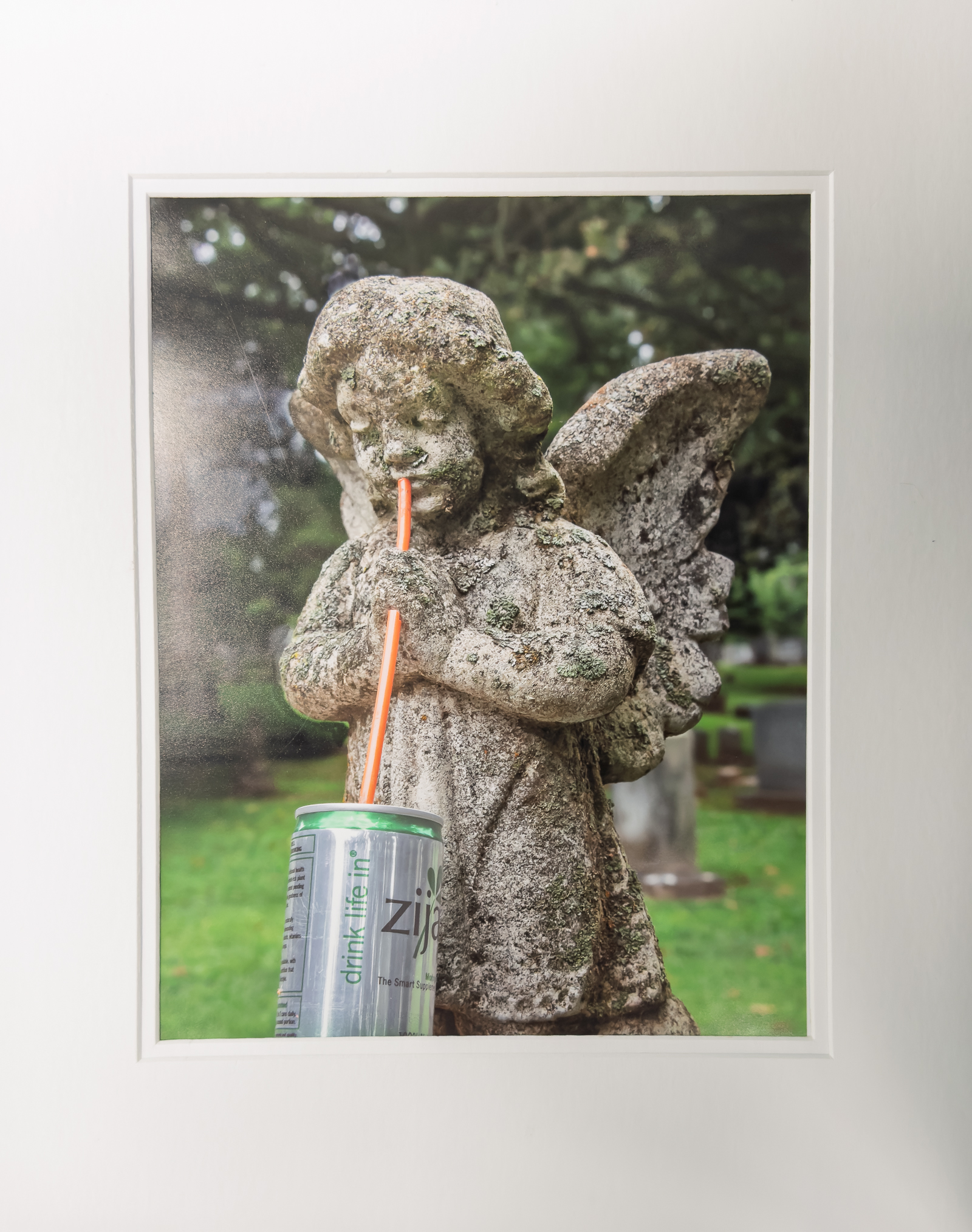
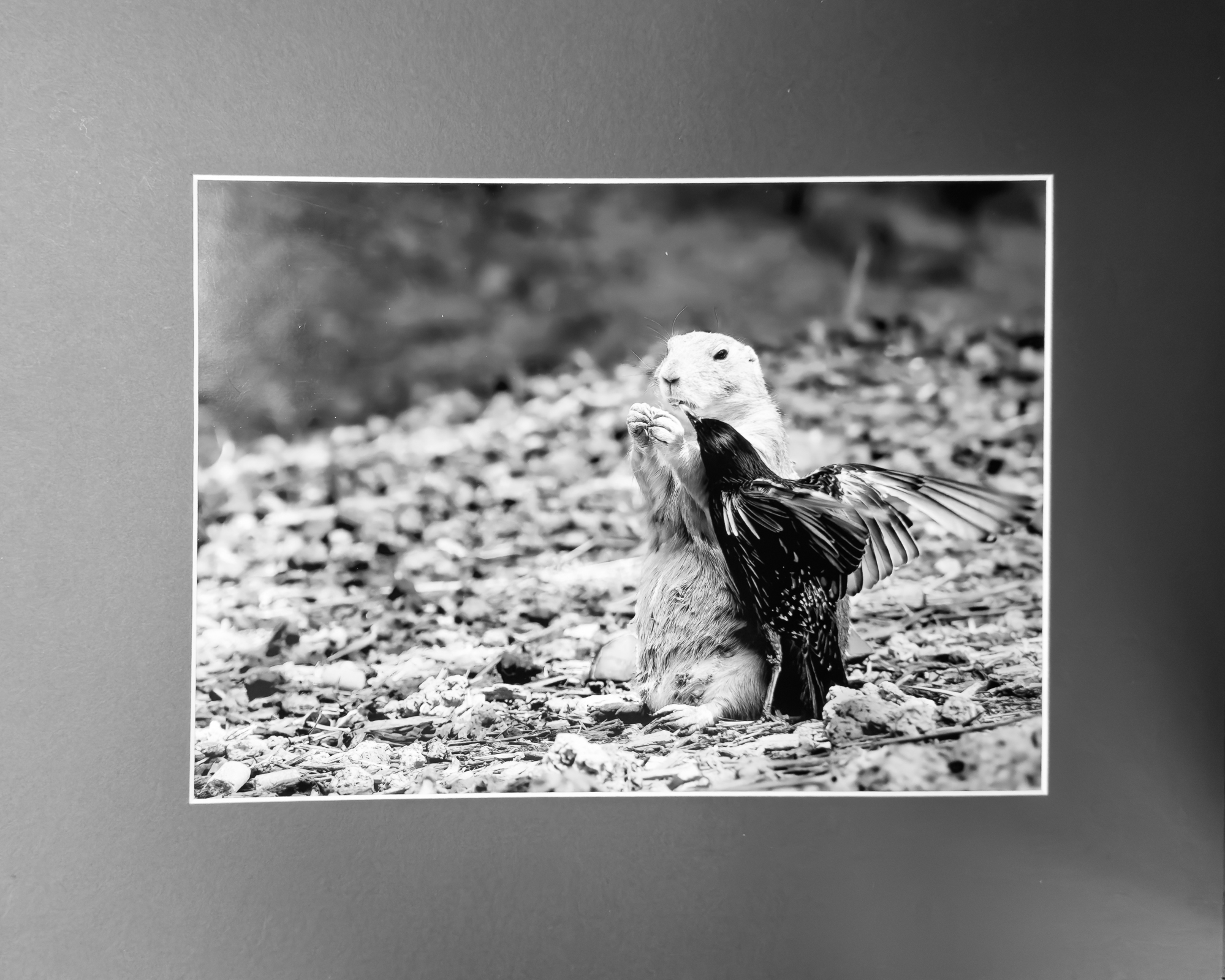
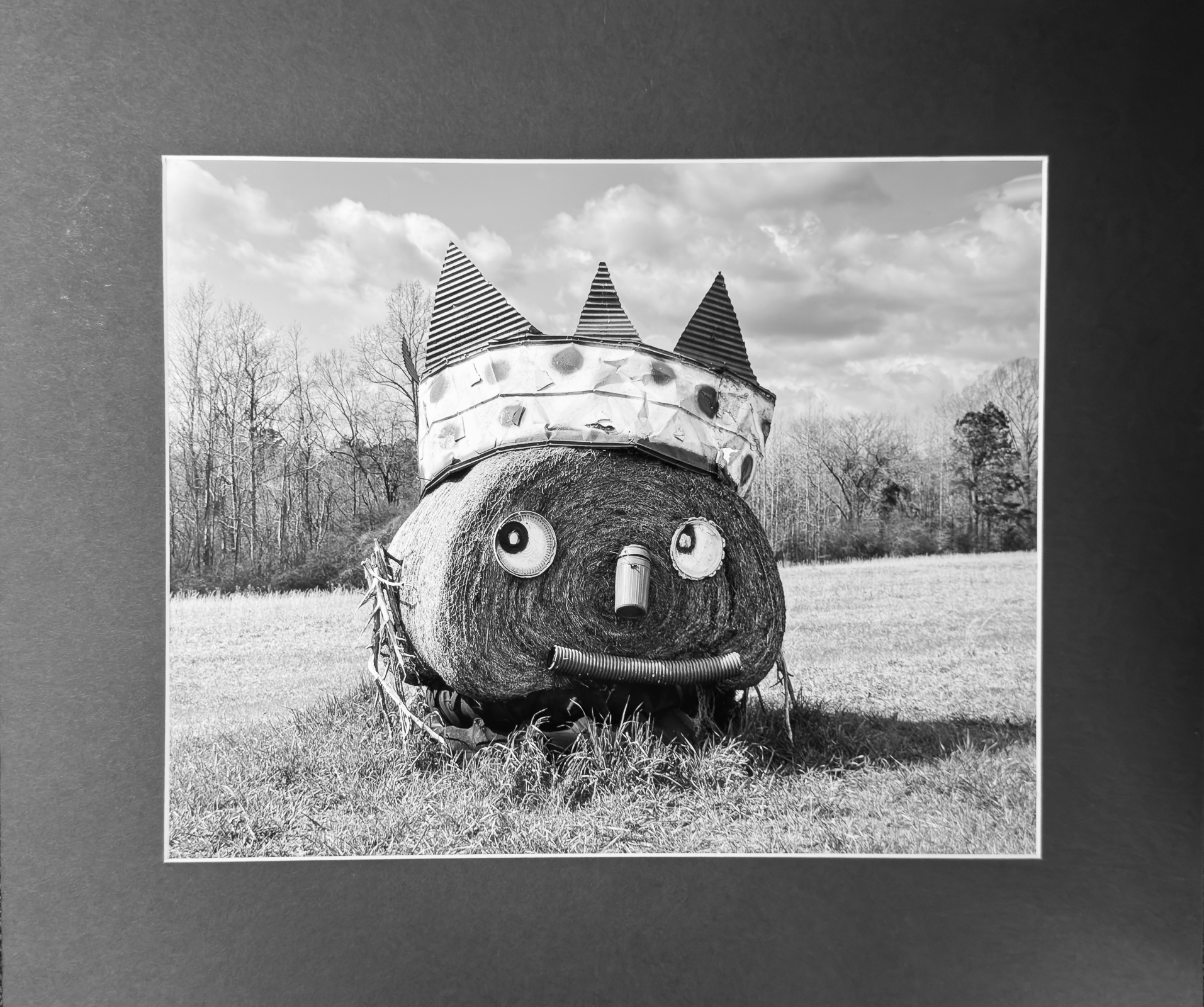
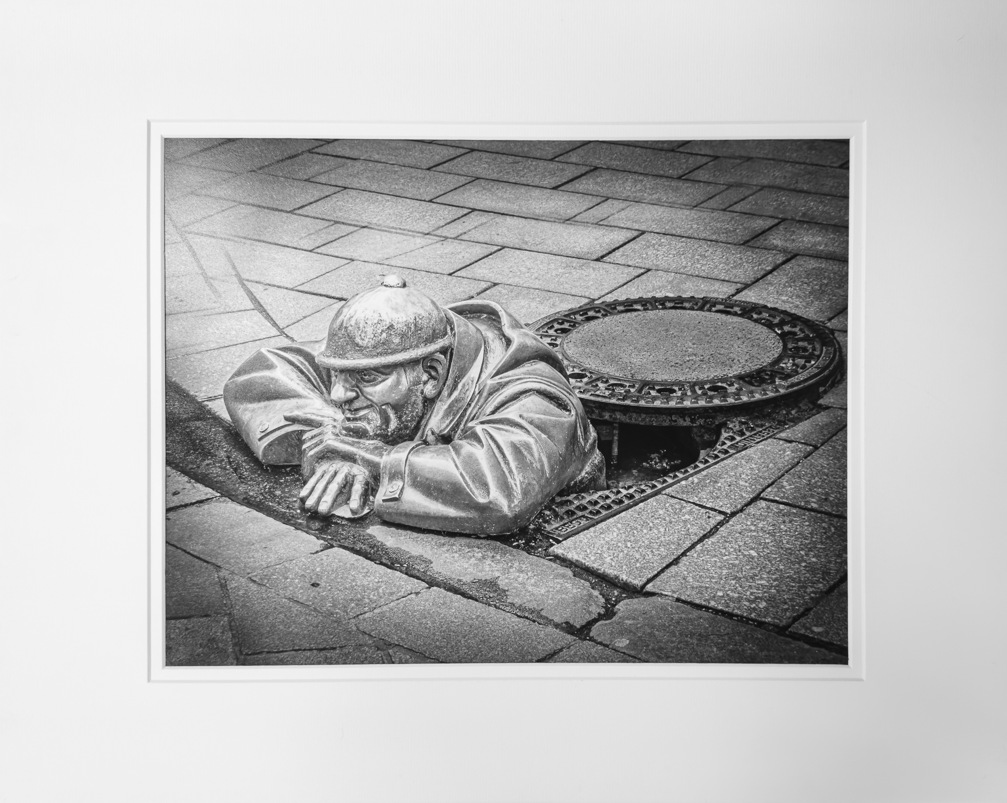
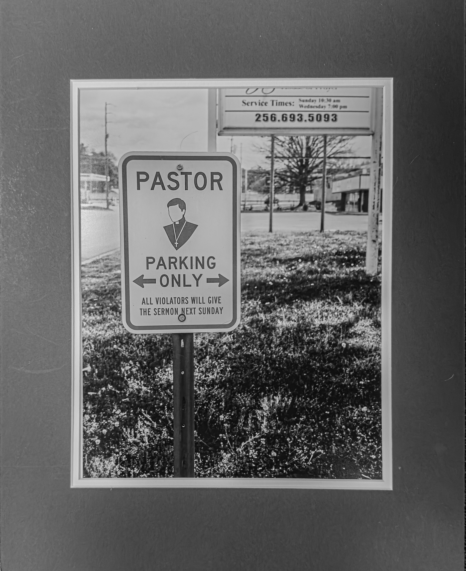
November – “Humor”
Total Entries: 120 ; Color Digital: 47 ; Mono Digital: 36 ; Color Prints: 21 ; Mono Prints: 16 ; Judge: Cindy Shaver

1st Digital Color – Chris Baker
Great depth of view and composition.

2nd Digital Color – Susan Poston
Love the composition and story telling.
3rd Digital Color – Julia Gary
This is SO my husband! Love the composition/inclusion of door with cross!
HM Digital Color – William Farnsworth
HM Digital Color – Susan Poston
I’m not a fan of selective color, but here it tells a great story.
HM Digital Color – Jack Eidson
Cute capture.
HM Digital Color – Carol Eidson
A bit over exposed, but a story for sure.
HM Digital Color -Alice Searcy
This is a great submission. Changes for future reference would be to keep horizon line from center (top or bottom third is so much stronger), and have the sign on the right third line.
1st Digital Mono – Susan Chi
great capture/timing
2nd Digital Mono – CT Chi
Great storytelling, and I love that the story continues in the background.
3rd Digital Mono – Carol Eidson
I’m not a fan of the post processing on this image, but that’s the maker’s choice and I will respect that. Great story telling.
HM Digital Mono – Susan Chi
This would be a stronger image (IMHO) if the maker had straightened the white background/frame behind the bird. But the bird’s expression is great.
HM Digital Mono – Philip Hallmark
Is this something an engineer tried???? Just sayin’
HM Digital Mono – Emlly Saile
HM Digital Mono – Eddie Sewall
1st Color Print – Bob Gathany
2nd Color Print – Doris Leverett
3rd Color Print – Lara Deal
HM Color Print – Barbara Staggs
HM Color Print – Tom Bryant
1st Mono Print – Joy Henderson
2nd Mono Print – Doris Leverett
3rd Mono Print – Bob Gathany
HM Mono Print – Barbara Staggs
HM Mono Print – Henry Smith
End of Year
Total Entries: 289 ; Color Digital: 94 ; Mono Digital: 82 ; Color Prints: 57; Mono Prints: 56 ; Judges: Joe Fikes, Eric Mittman, Jose Betancourt

1st Mono Print – Casey Johnson

2nd Mono Print – Barbara Staggs

3rd Mono Print – Barbara Staggs

HM Mono Print – Joy Henderson

HM Mono Print – John Shriver
HM Mono Print – Doris Leverett
HM Mono Print – Barbara Staggs

HM Mono Print – Barbara Staggs

1st Color Print – Joy Henderson

2nd Color Print – Barbara Staggs
3rd Color Print – Barbara Staggs
HM Color Print – Joy Henderson
HM Color Print – John Shriver
HM Color Print – Henry Smith
HM Color Print – Emily Saile

HM Color Print – Casey Johnson
1st Digital Mono – Chris Baker
2nd Digital Mono – Jack Eidson
3rd Digital Mono – Jane Reneau
HM Digital Mono – William Farnsworth

HM Digital Mono – Susan Poston

HM Digital Mono – Susan Chi
HM Digital mono -Jack Eidson

HM Digital Mono – Jack Eidson (2)
HM Digital Mono – Chris Baker

HM Digital Mono – Chris Baker

HM Digital Mono – Chris Baker

1st Digital Color – Chris Baker

2nd Digital Color – Chris Baker

3rd Digital Color – Chris Baker

HM DIgital Color – Susan Poston

HM Digital Color – Susan Chi
HM Digital Color – Jack Eidson
HM Digital Color – CT Chi

HM Digital Color – Chris Baker
HM Digital Color – Chris Baker

HM Digital Color _ Chris Baker

HM Digital Color – Casey Johnson
